Probably the only thing that remained unchanged in the Sunsilk logo throughout its long history has been the name of the brand.
Meaning and history
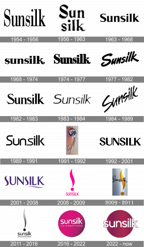
The number of updates that the logo has gone through since 1954 when it was first introduced has reached forty. The style, palette, and pictorial icon have changed profoundly. You can come across versions with strict, simple typefaces and versions featuring a creative script. Black-and-white designs and colorful variations. Simple wordmarks and emblems showcasing a stylized exclamation mark.
What is Sunsilk?
unsilk is the name of a Unilever brand, established in the middle of the 1950s, and specializing in the production of hair-care products, mainly shampoos, and conditioners. The products of the brand are sold in the Asian market, including Russia, Malaysia, Thailand, and Singapore.
1954
The very first Sunsilk logo was created in 1954 and featured a simple elegant black inscription set in the title case of a geometric serif typeface with elongated thin rectangular serifs and clean straight lines of the letters. The inscription was laconic yet evokes a sense of professionalism and confidence.
1956

The redesign of 1956 brought some softness to the Sunsilk visual identity, redrawing its logotype in two levels and switching its typeface to a bolder and smoother one. Now the inscription featured rounded angles and elongated curved lines.
1963
In 1963 the Sunsilk logo was redesigned again, and this time the composition was completely changed — the new badge featured a blue color yellow and white color palette, where the thin blue lettering was placed on the white background in the upper part of a sleek oval emblem, with a yellow stylized “S” coming through it.
1968
The brand came back to monochrome in 1968, and the logotype was rewritten in the lowercase of a chick serif typeface with the tail of the “K” elongated and smoothly curved. It was a playful yet solid emblem, which evokes a sense of style and quality.
1974
In 1974 the logo was set in the title case, written in the typeface, derived from the previous version, but with the contours cleaner and bolder. The confidence and power were the qualities, reflected by the new Sunsilk emblem.
1977
In 1977 the logotype was placed diagonally and rewritten in a fancy and modern sans-serif font with thick smooth lines. It was a new style, with a young fresh mood. The first “S” had its tails curved and looked very welcoming and inviting.
1982
The Sunsilk logo, designed in 1982 was based on the original version of the emblem, but written in a more modern and sharp serif typeface with slightly elongated lines and cleaned contours. The mood was still all about professionalism and stability.
1983
In 1983 the monochrome logotype was rewritten in a modern sans-serif typeface with thin lines of the rounded letter shapes. The emblem had a lot of air in it, which added lightness and freshness to the whole composition. This was a nice and simple logo version, which only stayed with the brand for a few months.
1984
In 1984 the brand modernized its logo from 1977, making the lines of the diagonally set inscription thinner yet longer. Now the lettering looked like a signature and made the brand’s product packaging stand out on the shelves of supermarkets all over the globe.
1989
The logo, created in 1983 was strengthened and modified in 1989. The lines of a smooth sans-serif logotype were emboldened and cleaned, getting a more solid and confident look and reflecting quality and values of beauty and style.
1991

In 1991 Sunsilk placed its logotype vertically and elongated the lines of the last letter, making it merge into a bold rounded emblem, placed on top of the logo. It was an experimental version, which only stayed with the brand for a year, though it looked very feminine and sophisticated.
1992
The new minimalist logotype was introduced by the brand in 1992. It was a black sans-serif inscription, which came and stayed for nine years. The thick lines of the capitalized letters looked sleek and contemporary, showing the character of the brand and its growth.
2001
The redesign of 2001 brought not only a new typeface to the uppercase inscription, but also switched its monochrome color palette to a purple and white one. The lettering in a custom font was complemented by a smooth curved line in a lighter shade of purple color placed under the “Silk” part of the brand’s name.
2008
In 2008 purple was changed to fuchsia and the composition of the logo became vertical. Now the delicate capitalized inscription was placed under an enlarged emblem, which depicted a stylized exclamation sight with its vertical bar curved, just like a short underline from the previous version. The new emblem looked bright and impressive, and the intense color palette added elegance and style.
2009
The exclamation sign changed its color to gradient yellow and gold and the lettering was rewritten and placed on the upper part of the emblem, overlapping the golden curve. The new inscription featured a handwritten cursive with smooth lines and was colored into dark chocolate shades which looked sleek and luxurious.
2011
The redesign of 2011 brought back the original monochrome palette to the Sunsilk visual identity. The composition remained almost untouched — with the stylized exclamation sight as the main element of the logo, and the inscription in a modern sans-serial typeface placed under it. The “Co-creations” tagline was added to the badge, written on a horizontally stretched solid rectangle.
2016
In 2016 the Sunsilk logo was refreshed and simplified. The new badge features a circular shape with a gradient fuchsia background and white lettering on it. The contrast between the two colors is strong and eye-catching and the delicate sans-serif typeface looks powerful yet fine and tender at the same time.
2022 – Today
The redesign of 2022 has kept the solid pink roundel as the main part of the Sunsilk badge, but switched the size and the typeface of the white lettering, enlarging it and making look stronger and more modern. The new inscription is not accompanied by any tagline and is written across the center line of the roundel, with the first and the last letters of the wordmark coming out of the circle.
Font and color
The custom Sunsilk typeface from the emblem, created for the brand in 2016, featured clean soft lines with distinct cuts and softened angles. The font of the logotype is pretty close to such types as ITC Bauhaus Pro Medium and Oxo, but with the ends of the lines modified and sharpened.
The fuchsia and white color palette of the Sunsilk emblem is a representation of femininity, style, and beauty. The combination of colors evokes a sense of luxury, caress, and passion for the brand, and guarantees a great result.


