RCB is the name of an Indian cricket team, established in 2008 by the Royal Challenge, a beverage company (hence the name of the team — Royal Challengers Bangalore, for the founding brand and the city the club is based in).
Meaning and history
RCB is not the champion team, but it is also not an outsider in the Indian cricket championship list. The team has always done pretty ok, often taking a position in the top five. The club was established in 2008, just a few months after the foundation of the Indian cricket Premier League.
What is RCB?
RCB is an abbreviation for Royal Challengers Bangalore, Ana Indian cricket club, which was established in 2008, and owned by United Spirits Limited, a large beverage producer. The club has Sanjay Bangar as the main coach.
As for the visual identity of the cricket club, it is ornate and puts the “Royal” part of the team’s name into the core of the badge’s design. The emblem uses an elegant and chic color combination, which looks good on the uniforms of the cricket players (RCB has three types of uniforms: the main one in red and black, the alternate green and black, and the blue kit, adopted in 221).
2008 – 2015
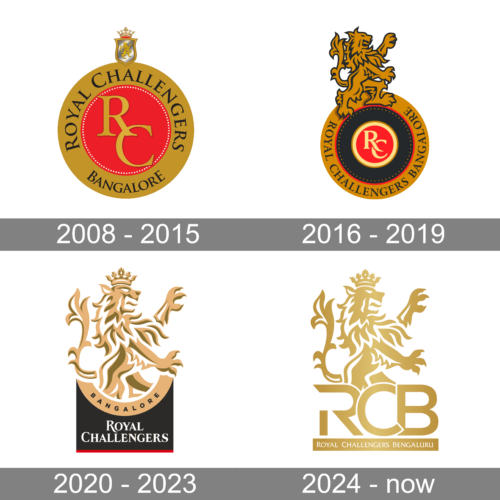
The initial logo of the Royal Challengers Bangalore cricket team was designed in 2008 and stayed unchanged for the first seven seasons of the club. It was an elegant circular medallion in shred and gold (where gold was used for the wide outline), with the sophisticated gradient gold monogram placed in the center of the badge, and the uppercase serif name of the club written in black letters around the golden framing. The upper part of the logo was decorated by a glossy silver crest in a golden outline and a golden rampant looking on it. A massive silver, gold, and red crown were set on top of the emblem.
2016 – 2019
The redesign of 2016 modernized the circular RCB badge, adding black to the color palette and replacing the glossy silver crest with a massive golden Lion rampant in black outline. The “RC” monogram was rewritten in white and gold, with the bolder lines, and the whole black inscription was now set in a straighter and stricter serif typeface.
2020 – 2023
The circular shape of the RCB badge was changed for the first time in 2020. The new concept is backed on a vertically oriented black banner with a light gold Lion rampant set on top of it. The black body of the banner is underlined with red and has a wide gold arch separating it from the Lion. Along the arch, there is a black “Bangalore” written in capitals, and the “Royal Challengers” part is set in two levels, executed in white serif capitals.
2024 – Today
When the Royal Challengers Bengaluru took over the reins, the team’s logo received a regal makeover. While the lion remained the centerpiece, its image received a luxurious upgrade. Gone were the previous colors; now, everything gleamed in a rich gold. The text underwent a dramatic shift as well. Replacing the previous design, a bold, sans-serif RCB monogram now stands proudly beneath the lion. This monogram is then accentuated by a slender, golden banner inscribed with the team’s full name in elegant white capital letters.


