Nokia is a Finnish manufacturer of smartphones and telecommunications equipment for various types of IP networks. Established in 1865 as a small paper mill, in the 1990s Nokia has become one of the strongest telecommunications companies in the world, being the manufacturer of the best-selling cell phones.
Meaning and history
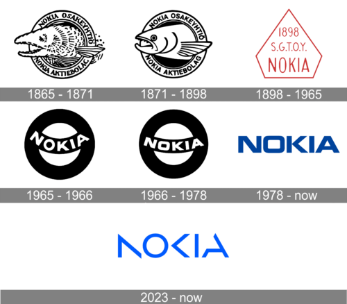
The original Nokia logo appeared in 1866. It depicted a fish supposed to be the salmon fish of Nokianvirta River. The emblem was in use for around a century without any notable alterations. It was only in 1965 that Nokia Osakeyhtiö’s logo was given a facelift. Due to it, the picture became more transparent and minimalistic.
However, as soon as a year later a new Nokia symbol was introduced. The black-and-white emblem featured the name of the company inside a round shape.
Having merged with Finnish Cable Works and Finnish Rubber Works in 1966, Nokia unveiled its ‘Arrows’ logo. It looked very similar to the current one, except for the typeface, the lighter shade of blue, and the image of an arrow.
Once the “Connecting People” slogan was introduced in 1992, the emblem was slightly altered. The slogan used the ‘Nokia Sans’ type, created by Erik Spiekermann. In 2006 the Nokia emblem’s type and color were slightly modified, while the latest modification, which took place in 2011, included the removal of the slogan.
1865 – 1871

The original Nokia logo appeared in 1865. It depicted a fish supposed to be the salmon fish of Nokianvirta River. The emblem was in use for around a century without any notable alterations. It was only in 1965 that Nokia Osakeyhtiö’s logo was given a facelift. Due to it, the picture became more transparent and minimalistic.
1871 – 1898

The logo created several years earlier was refined. The fish had fewer and cleaner details, while the background was now a solid black color. The fish has a rounder shape and a more serious look. Although it is slightly sticking out of the round emblem, there are no more water splashes and drops beyond its border. The inscriptions on the emblem were kept unchanged.
1898 – 1965
The logo, designed for Nokia in the end of the 19th century has stayed with the brand for almost seventy years, becoming the most long-lasting badge in the company’s history. It was a pentagonal badge in a shape of a Diamond, with the plain white background and a thin black outline. The main part of the logo was taken by a three-leveled lettering in a simple handwritten font, also in black.
1965 – 1966

However, as soon as a year later a new Nokia symbol was introduced. The black-and-white emblem featured the name of the company inside a round shape.
Having merged with Finnish Cable Works and Finnish Rubber Works in 1966, Nokia unveiled its ‘Arrows’ logo. It looked very similar to the current one, except for the typeface, the lighter shade of blue, and the image of an arrow. The arrows were used as the symbol of the company’s progress and advancement in telecommunication industry.
1966 – 1978
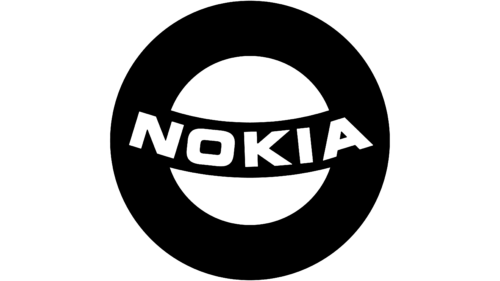
This time the company has done only very minimal updates to the logo. The curved line across the ring was straightened out a bit. The inscription was slightly adjusted to fit the new shape, which made the letters appear shorter. The update made the logo look more balanced
1978 – 2023
The current logo showcases the name of the brand in a minimalist sans. The letters are bold enough to convey such messages as “reliability” and “quality.” The “O” is a rectangle with rounded corners rather than a more ordinary oval or round.
The highlight of the wordmark is the “K” looking like an arrowhead. It resembles the “play” button, thus creating a link with the industry in which Nokia works. And of course, they take up the meaning of the three arrows from the previous logo symbolizing progress and advancement.
2023 – Today
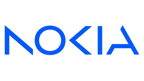
In 2023 the Nokia logo was redesigned, creating a very stylish and progressive image of the company. The new concept is based on a sharp uppercase lettering in a bright shade of blue, with some bars of the “N”, “K” and “A” missing. Only the “O” and “I” have their contours complete, and it makes the logo look very unique and edgy. The clean lines and sense of the unfinished story balance the distinction and geometry, and hike the color catches attention and makes the brand stand out in the list of its competitors.
What is the worst emblem?
In comparison with the sleek, minimalistic, yet recognizable logo the company uses today, its first two emblems (designed in 1865 and 1898 respectively) may seem absolutely awkward. Yet, if you put them side-to-side to logotypes of other well-known companies working at the same historical period, you may notice that they are not that bad at all. However, the roundel emblem adopted in 1965 could not hold a candle to its “contemporaries”.
Font and Color
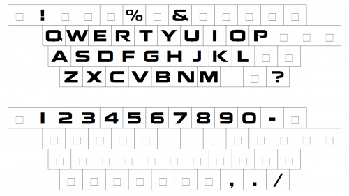
In the context of Nokia’s transformation into a business technology company, the unveiling of the new Nokia logo at the Mobile World Congress in Barcelona marked a significant milestone. This rebrand, led by CEO Pekka Lundmark, reflects Nokia’s evolution from its humble beginnings to a leader in the convergence of networks and cloud technologies. The modern uppercase lettering of the company’s new logo is set in a bold geometric sans-serif typeface, reminiscent of the heritage of the previous logo but with a completely different thing in mind: innovation. The bars of some letters are creatively erased, suggesting the exponential potential of networks and the brand’s commitment to industrial digitalization. The closest fonts to the one used in this insignia, with modifications, are probably Rexton Light and Frontage, embodying legibility and design elements crucial for a successful mobile phone brand now pivoting towards broader technology horizons.
The color palette of the Nokia visual identity, now representing not just a mobile phone brand but a pioneering business technology entity, is based on a bright and vivid shade of blue. This color not only symbolizes professionalism and quality, akin to Nokia’s legacy and its market share achievements but also reflects the energy and progressiveness of the Finnish company. This new brand identity, introduced on a Sunday at the Mobile World Congress, where mobile phone brands and technology companies showcase their latest innovations, is a symbol of collaboration and the company’s vision for the future. It represents Nokia’s commitment to sustainability, its role as one of the pioneers of digital transformation, and its ambition to gain a competitive advantage by redefining how networks meet cloud. The new logo design, therefore, is not just a visual update; it’s a testament to Nokia’s vision to transform people’s minds about what the company stands for in the modern era, moving beyond its legacy as a mobile phone business to become a linchpin in the era of digital and networked innovation.


