Mumbai Indians are the name of a professional cricket club from India, which was established in 2008, and by today has grown into one of the strongest teams in its country, playing in the Indian premier league, and having won five of its titles over the years.
Meaning and history
Mumbai Indians are one of the most titled teams in the Indian Premier League, the first-tier organization in cricket. Since its foundation in 2008, the Mumbai Indians club has won five IPL championships.
Today the club, based in Mumbai, has two home arenas — Wankhede Stadium with a 33 thousand capacity, and Brabourne Stadium, with a 25 thousand capacity, both are located in Mumbai. The club has Rohit Sharma as the captain and Mahela Jayawardene as the head coach.
What are Mumbai Indians?
Mumbai Indians is an Indian professional cricket club, founded in 2008 in Mumbai, and playing in the Indian Premier League, the most popular cricket league in the world. The club had won the most titles in the history of the IPL.
As for the visual identity, the professional cricket club from India, Mumbai Indians, has always been very consistent and conservative, having its logo redesigned a couple of times throughout the years, but keeping the original idea and colors where they initially were. The logo of the club is based on an image of a Sudharshan Chakra, which is a sharp weapon, used by the most famous Hindu god, Vishnu.
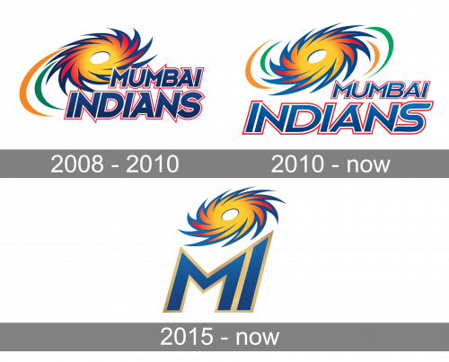
2008 – 2010
The very first Mumbai Indians badge was introduced in 2008 and featured a combination of an emblem with a sharp-edged weapon, and stylized lettering placed under it. The Chakra was drawn in a dark blue and gradient yellow-to-red palette, supported by the blue and red lettering with an internal white outline of the characters. The emblem was accompanied by two arched strokes in orange and green, the colors of the Indian flag, placed on the left, and framing the whole logo, making it complete.
2010 – Today
The redesign of 2010 has refined and brightened up the logo of the Mumbai Indians cricket club, enlightening its color palette, and turning the Chakra in the other direction. If on the original version the sharp blades on the weapon were turned to the left, now the Sudharshan chakra is swirling to the right. The two strokes in orange and green got supported by two more, on the right of the emblem, and the lettering gained lighter blue gradients, with the contours of the characters refined and modernized.
2015 – Today
In addition to the logo, designed in 2010, the club decided to create one more badge, with the shortened name, MI, to use along with the primary badge. The emblem was minimized to only the chakra, with no strokes, drawn against a white background, and placed above the stylized “MI” lettering in blue and calm gold, with clean lines and sharp angles of the glyphs. The badge looks very modern and bright, perfectly reflecting the character of the club and its roots.
Font and color
The bold stylized lettering from the primary badge of Mumbai Indians is set in a custom outlines sans-serif, with the bold stable letters slightly italicized. The interesting contours look unique due to some elongated lines, with straight cuts and angles. The closest font to the one, used in this insignia, is, probably, Asbury Park Oblique NL, but with most contours modified.
As for the color palette of the Mumbai Indians’ visual identity, it is composed of the primary scheme, consisting of blue, red, and yellow, a mix of shades, standing for energy and power, and an additional patriotic tricolor, showing the roots and heritage of the club, and the main colors of its motherland, India.


