

Rap is one of the most popular genres in the modern world. Such popularity this direction received back in the 90s of the last century, after which it became very firmly entrenched in show business. Then this style was a phenomenon because it did not resemble others at all, but very quickly became loved by people around the world. Music that came from the streets quickly gained popularity, and the authors received millions.
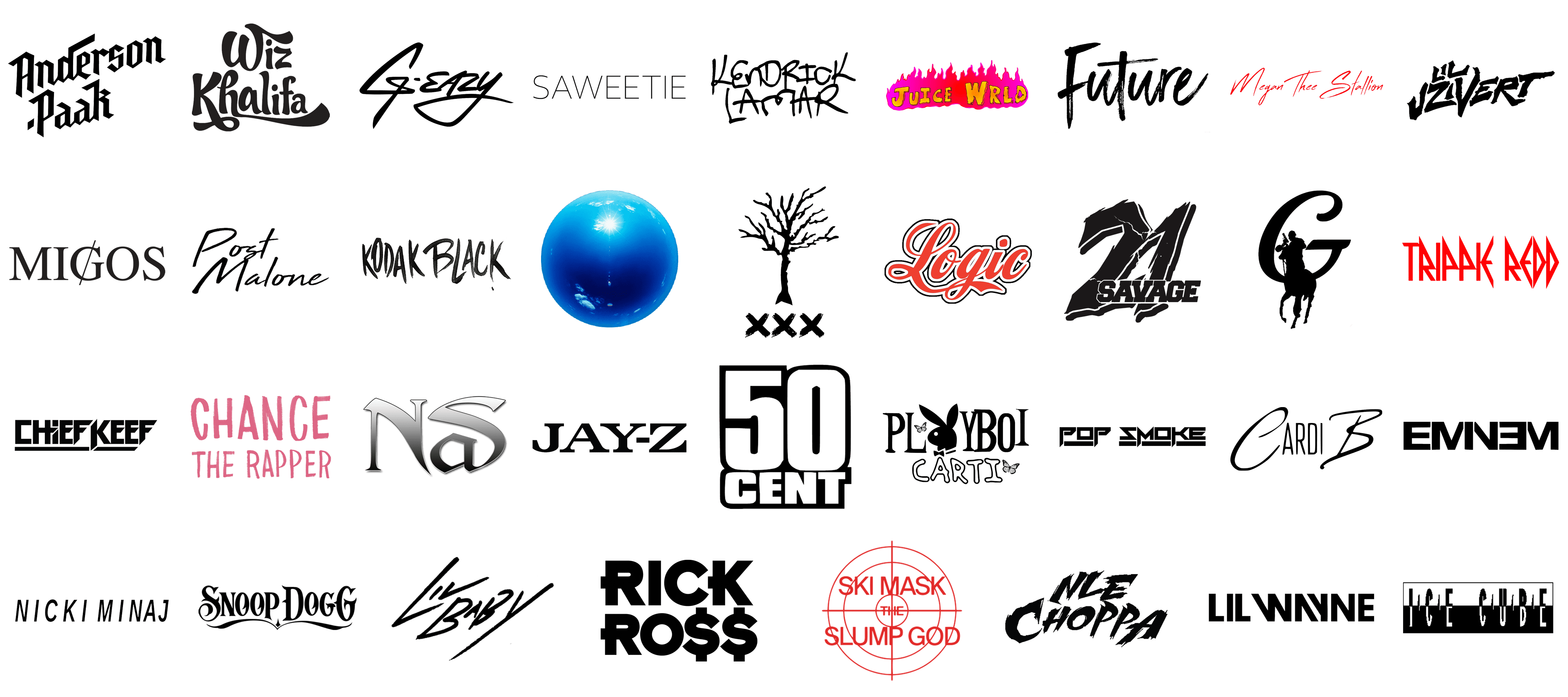
Rap has spread not only to music but also to fashion. This style is a type of street style that has quickly gained popularity. More often than not, clothing is decorated with logos of popular rap artists and groups. And it is about logos from this trend that we are going to talk about today. After all, the Logo becomes the basis and starting point for promoting a music artist, reaching a wider audience, and forming a strong association with music.
As with most logos, the key characteristics of a memorable iconic logo are simplicity, harmony, and flexibility. Moreover, as we noted above, music logos often adorn clothing, so they need to look cool and readable when massaged. Let’s see if the logos we’ve compiled for you in the list below fulfill all of these criteria.
Kanye West
![]()
The logo features a striking and bold design that represents the multifaceted artist Kanye West. The logo is a spherical depiction of a clear blue sky with the sun shining brightly at the center. This imagery symbolizes enlightenment, creativity, and a broad vision, all qualities associated with Kanye West. The sphere’s reflective surface captures the essence of his innovative approach to music, fashion, and art. The bright blue color signifies depth, wisdom, and tranquility, contrasting with the sun’s intense brightness to highlight the duality of Kanye’s personality—calm yet intensely creative.
The use of the sky and sun also reflects Kanye’s influence and reach, suggesting that his impact is as vast as the sky and as powerful as the sun. This logo encapsulates Kanye’s journey from a groundbreaking musician to a global cultural icon. It’s a visual representation of his ever-evolving artistry and his ability to inspire and influence people across various domains. The simplicity of the design, combined with its profound symbolism, makes it a perfect emblem of Kanye West’s legacy and his continuous quest for innovation and excellence.
Juice WRLD
![]()
The logo for Juice WRLD is vibrant and eye-catching, designed to reflect the energetic and passionate essence of the late rapper’s music. The text “JUICE WRLD” is displayed in bold, uppercase letters with a unique, hand-drawn style that gives it a raw and authentic feel. The color scheme transitions from a fiery red at the top to a warm orange at the bottom, symbolizing the intense emotions and dynamic range present in Juice WRLD’s music. The letters appear to be engulfed in flames, adding an element of intensity and urgency that mirrors the rapper’s expressive and often poignant lyrics. This design effectively captures the essence of Juice WRLD, conveying both his artistic creativity and the powerful impact of his music on fans worldwide. The flames also represent the burning passion and the legacy he left behind, despite his untimely passing. This logo is not just a visual representation but a tribute to Juice WRLD’s contribution to the rap and hip-hop genre.
Trippie Redd
![]()
The Trippie Redd logo features a striking, angular typeface that immediately draws attention. The red color of the text is bold and intense, aligning with the artist’s vibrant and sometimes rebellious persona. Each letter is crafted with sharp, jagged edges, giving the logo a fierce and edgy appearance that reflects Trippie Redd’s unconventional style and his boundary-pushing music. The design is minimalistic yet impactful, allowing the boldness of the letters and the choice of color to take center stage. This simplicity combined with the aggressive styling of the text captures the essence of Trippie Redd’s artistic identity—unapologetically bold and fiercely original. The logo’s striking visual appeal is a perfect representation of Trippie Redd’s influence in the rap scene, symbolizing his powerful presence and his dedication to creating music that resonates with authenticity and raw emotion.
Playboi Carti
![]()
The Playboi Carti logo is a playful and artistic representation that perfectly aligns with the rapper’s avant-garde style. The logo features a combination of bold and whimsical typography, with “Playboi” in a sophisticated, elegant font, and “Carti” in a more playful, childlike script. This juxtaposition highlights the duality in Playboi Carti’s music—both stylish and carefree. The incorporation of the iconic Playboy bunny, complete with a bow tie, adds a touch of irony and cheekiness, reinforcing Carti’s playful and rebellious nature. Additionally, the butterflies around the text symbolize transformation and beauty, elements that Carti often explores in his work. The black and white color scheme maintains a classic and timeless aesthetic, while the overall design exudes an artistic and edgy vibe. This logo effectively encapsulates Playboi Carti’s unique persona and his innovative approach to music and fashion.
XXXTentacion
![]()
The logo for XXXTentacion is somber and haunting, reflecting the deep and often dark themes present in the late rapper’s music. It features a barren, leafless tree, symbolizing desolation and introspection. Below the tree are three bold, black Xs, which not only represent the rapper’s stage name but also convey a sense of mystery and intensity. The minimalist design and stark black color palette emphasize the raw and unfiltered nature of XXXTentacion’s music. This logo is a powerful visual metaphor for the struggles and emotional depth that characterized his lyrics and artistic expression. It serves as a poignant reminder of XXXTentacion’s impact on the music world and his enduring legacy, evoking a sense of reflection and contemplation in the viewer. The simplicity and symbolic richness of this logo make it a fitting tribute to the complex and influential artist.
G-Eazy
![]()
The G-Eazy logo is sleek and stylish, embodying the rapper’s cool and sophisticated persona. The text is rendered in a smooth, cursive script, giving it a refined and polished appearance. The flowing lines and elegant curves of the lettering convey a sense of effortless charm and confidence, traits that are synonymous with G-Eazy’s image and music. The black color of the text adds a classic and timeless quality to the design, ensuring its versatility and appeal. This logo captures the essence of G-Eazy’s brand—smooth, stylish, and effortlessly cool. It effectively communicates his approach to music, which blends contemporary rap with a nod to classic styles. The overall design is both modern and timeless, making it a perfect representation of G-Eazy’s artistic identity and his place in the music industry.
Eminem
![]()
The Eminem logo is bold and unmistakable, much like the rapper himself. The design features the name “EMINEM” in a stark, uppercase font that exudes strength and authority. The clever use of negative space creates an inverted ‘E’ in the middle, adding a unique and memorable twist to the otherwise straightforward typography. This design choice reflects Eminem’s innovative and clever approach to his music and lyrics. The black color of the text reinforces the strong, no-nonsense aesthetic, aligning with Eminem’s reputation for hard-hitting and uncompromising rap. This logo is a powerful visual representation of Eminem’s dominance in the rap industry and his relentless pursuit of excellence. It captures the essence of his brand—bold, innovative, and instantly recognizable. The simplicity and effectiveness of this logo make it a perfect embodiment of Eminem’s legendary status in the music world.
Saweetie
![]()
The Saweetie logo is elegant and minimalist, reflecting the artist’s chic and modern style. The text is displayed in a clean, uppercase font that exudes sophistication and confidence. The thin, elongated letters give the logo a sleek and stylish appearance, perfectly aligning with Saweetie’s polished and fashionable image. The black color of the text adds a touch of classic elegance, ensuring that the design remains timeless and versatile. This logo captures the essence of Saweetie’s brand—stylish, confident, and effortlessly cool. It effectively communicates her approach to music and fashion, which is characterized by a blend of contemporary trends and timeless appeal. The overall design is both simple and impactful, making it a perfect representation of Saweetie’s artistic identity and her place in the music and fashion industries.
Wiz Khalifa
![]()
The logo for Wiz Khalifa features a playful, artistic font that embodies the rapper’s creative and laid-back persona. The name “Wiz Khalifa” is presented in a flowing, cursive style with a touch of urban flair. The first letter, “W,” is stylized with an extended swirl, giving it a unique and recognizable appearance. The letters are bold and closely spaced, creating a sense of cohesiveness and energy. The overall design is both eye-catching and memorable, reflecting Wiz Khalifa’s vibrant music and personality.
Snoop Dogg
![]()
The Snoop Dogg logo is a striking and bold representation of the iconic rapper’s brand. The text “Snoop Dogg” is rendered in a distinctive, gothic-inspired font that exudes a sense of authority and timelessness. The letters are intricately designed with sharp edges and elaborate flourishes, emphasizing Snoop Dogg’s strong presence in the music industry. The logo’s symmetrical layout and the subtle underlining of “Snoop” create a balanced and visually appealing composition, perfectly capturing the essence of Snoop Dogg’s influential style and persona.
Ski Mask the Slump God
![]()
The logo for Ski Mask the Slump God is dynamic and visually arresting, featuring a bold, red crosshair design that immediately draws attention. The name “Ski Mask the Slump God” is centered within the crosshairs, with each word stacked vertically. The letters are in a blocky, sans-serif font, adding to the logo’s modern and edgy feel. The use of red and the crosshair imagery convey a sense of intensity and focus, aligning with the rapper’s high-energy performances and distinctive style. This logo effectively represents Ski Mask the Slump God’s unique identity in the rap scene.
Megan Thee Stallion
![]()
Megan Thee Stallion’s logo is sleek and elegant, reflecting her powerful and confident persona. The name “Megan Thee Stallion” is written in a sophisticated, italicized script that exudes a sense of movement and grace. The bright red color of the text adds a touch of boldness and passion, highlighting Megan’s dynamic presence in the music industry. The elongated strokes and fluid curves of the letters create a harmonious and aesthetically pleasing design, capturing the essence of Megan Thee Stallion’s fierce and glamorous image.
Kodak Black
![]()
The logo for Kodak Black is raw and striking, featuring a bold, graffiti-inspired font that reflects the rapper’s gritty and unfiltered style. The name “Kodak Black” is presented in large, uppercase letters with a hand-drawn appearance, giving the logo an authentic and streetwise vibe. The black color of the text adds to its stark and powerful impact, while the irregularities in the lettering convey a sense of rebellion and individuality. This logo perfectly encapsulates Kodak Black’s unapologetic and edgy musical identity.
Polo G
![]()
Polo G’s logo is minimalist yet impactful, featuring a bold, stylized “G” accompanied by the silhouette of a figure on horseback. The letter “G” is designed with a strong, angular font that conveys strength and determination. The silhouette of the rider, positioned within the curve of the “G,” adds a dynamic element to the logo, symbolizing Polo G’s journey and resilience. The black and white color scheme maintains a classic and timeless aesthetic, reflecting Polo G’s grounded and introspective approach to his music.
Anderson .Paak
![]()
The logo for Anderson .Paak is modern and distinctive, featuring his name in a unique, angular font that stands out. The text “Anderson .Paak” is arranged in a stacked format, with the period before “Paak” adding a quirky and memorable touch. The letters are bold and sharp, giving the logo a contemporary feel that aligns with Anderson .Paak’s innovative and eclectic musical style. The black color of the text ensures clarity and versatility, making the logo easily adaptable for various uses while maintaining its striking visual appeal.
50 Cent
![]()
50 Cent’s logo is bold and straightforward, featuring his name in large, blocky letters that convey strength and confidence. The text “50 Cent” is presented in a simple, sans-serif font with thick lines and clean edges, ensuring maximum readability and impact. The white text on a black background creates a high contrast, making the logo stand out prominently. This design choice reflects 50 Cent’s powerful presence and straightforward approach to his music and brand, encapsulating his reputation as a formidable figure in the rap industry.
Lil Baby
![]()
The Lil Baby logo features a dynamic, handwritten-style script that exudes a sense of raw energy and authenticity, perfectly capturing the essence of the rapper’s persona and music. The lettering is bold and slightly slanted, giving it a forward motion that signifies progress and ambition. The strokes are uneven and organic, which adds a personal and intimate touch to the design, reflecting Lil Baby’s down-to-earth yet impactful approach to his craft. The choice of black for the text enhances the logo’s readability and timelessness, making it versatile across various media. The overall design is minimalist yet powerful, mirroring Lil Baby’s ability to convey profound messages through straightforward lyrics and compelling beats. This logo not only represents the artist’s name but also encapsulates his journey from the streets of Atlanta to international stardom, resonating with fans who appreciate authenticity and hustle.
Lil Uzi Vert
![]()
The Lil Uzi Vert logo is a bold and striking representation of the rapper’s unique and eclectic style. The text is designed in a jagged, almost graffiti-like font that conveys a sense of rebellion and nonconformity, which are key elements of Lil Uzi Vert’s artistic identity. The sharp edges and irregular spacing between the letters create a chaotic yet controlled visual, reflecting the artist’s genre-blending music and energetic performances. The use of black for the text ensures high contrast and visibility, making it stand out in any context. The logo’s overall aesthetic is edgy and futuristic, aligning with Lil Uzi Vert’s forward-thinking approach to music and fashion. It captures the essence of an artist who continuously pushes boundaries and defies expectations, making it a fitting emblem for his brand. This design is instantly recognizable to fans and serves as a symbol of Lil Uzi Vert’s influence in the rap and hip-hop scenes.
Lil Wayne
![]()
The Lil Wayne logo features a modern and sleek design that reflects the rapper’s long-standing impact and evolving style in the music industry. The text is rendered in a bold, sans-serif font with unique cut-out elements in the letters, giving it a contemporary and innovative look. This design choice symbolizes Lil Wayne’s ability to stay relevant and ahead of trends throughout his career. The use of black for the text ensures clarity and versatility, making the logo adaptable to various applications, from album covers to merchandise. The clean lines and geometric shapes within the letters add a sense of precision and sophistication, mirroring Lil Wayne’s lyrical prowess and meticulous attention to detail. Overall, the logo is a testament to Lil Wayne’s legacy and influence, encapsulating his blend of street credibility and mainstream success. It serves as a powerful visual identity for an artist who has consistently pushed the boundaries of hip-hop and inspired countless others.
Logic
![]()
The Logic logo is designed in a vibrant, cursive script that exudes a sense of creativity and artistic flair, perfectly capturing the rapper’s versatile and introspective style. The text is rendered in a bold, flowing font with a distinct retro vibe, which adds a nostalgic touch while maintaining a modern appeal. The red color of the text is striking and energetic, symbolizing passion, determination, and the dynamic nature of Logic’s music. The white outline around the letters enhances the readability and provides a polished finish, making the logo pop against any background. The overall design is both stylish and approachable, reflecting Logic’s ability to connect with his audience through relatable lyrics and engaging storytelling. This logo encapsulates the essence of Logic’s brand—innovative, heartfelt, and impactful—resonating with fans who appreciate his honest and thought-provoking approach to rap. It is a fitting representation of an artist who continually strives to inspire and uplift through his music.
Migos
![]()
The Migos logo is a sleek and modern representation of the famous rap trio. It features the group’s name in bold, black, capitalized letters with a unique typographic twist. The “M” and the “G” are connected by a diagonal slash that runs through the center, creating a sense of motion and energy. This design choice reflects the dynamic and influential nature of Migos’ music. The use of a serif font adds a touch of sophistication, contrasting with the edgy slash, symbolizing the group’s ability to blend high fashion and street culture seamlessly. The minimalist design ensures the logo is easily recognizable and versatile, suitable for various media, from album covers to merchandise. Migos, consisting of members Quavo, Offset, and Takeoff, has become a significant force in hip-hop, known for their unique flow and cultural impact. This logo captures their essence, combining boldness with a refined edge, perfectly embodying the group’s brand.
Nas
![]()
The Nas logo is a striking and bold representation of the iconic rapper Nas. It features the artist’s name in a stylized, gothic-inspired font that evokes a sense of timelessness and gravitas. The letters are black and slightly shadowed, giving them a three-dimensional appearance and adding depth to the design. The elongated “N” and “S” frame the shorter “a,” creating a balanced and visually appealing composition. The use of sharp angles and clean lines in the typography reflects Nas’s precision and lyrical prowess in his music. This logo exudes a sense of authority and respect, much like Nas himself, who is renowned for his profound impact on hip-hop culture and his ability to convey powerful narratives through his lyrics. The logo’s simplicity and strength make it easily recognizable, symbolizing Nas’s enduring legacy in the music industry. It is a perfect representation of an artist who has consistently pushed boundaries and set new standards in rap.
Nicki Minaj
![]()
The Nicki Minaj logo is a bold and straightforward representation of the renowned rapper and pop icon. It features her name in uppercase letters, using a clean, sans-serif font that emphasizes modernity and confidence. The black lettering against a white background creates a strong contrast, making the logo easily readable and visually striking. The straightforward design reflects Nicki Minaj’s unapologetic and assertive personality, as well as her versatility in the music industry, where she seamlessly blends rap, pop, and R&B. The simplicity of the logo allows it to be versatile, fitting well on various media platforms, from album covers to social media profiles. This logo encapsulates Nicki Minaj’s brand, highlighting her as a powerful and influential figure in the music industry. Her ability to reinvent herself while maintaining her distinct identity is mirrored in the timeless and adaptable nature of her logo, making it a perfect emblem of her career.
NLE Choppa
![]()
The NLE Choppa logo is a dynamic and edgy representation of the rising rapper’s brand. It features his name in a stylized, jagged font that exudes energy and intensity. The letters are black with sharp edges and irregular shapes, creating a sense of movement and rebellion. This aggressive typography reflects NLE Choppa’s raw and unfiltered style of music, which often tackles themes of street life and personal struggle. The design’s ruggedness symbolizes the artist’s journey and resilience, resonating with his fan base that appreciates authenticity and grit. The logo’s unique and bold appearance makes it easily recognizable and memorable, aligning with NLE Choppa’s distinctive presence in the rap scene. This logo captures the essence of NLE Choppa’s music and persona, highlighting his youthful vigor and the uncompromising nature of his artistry. It serves as a powerful visual representation of his brand, ready to make a lasting impact in the music industry.
Pop Smoke
![]()
The Pop Smoke logo is a bold and futuristic representation of the late rapper’s brand. It features his name in a highly stylized, angular font that exudes a sense of modernity and strength. The letters are rendered in black, with sharp edges and geometric shapes that give the logo a dynamic and almost industrial feel. The design is clean yet impactful, reflecting Pop Smoke’s distinctive style and the powerful beats of his music. The use of negative space within the letters adds a layer of complexity and depth, making the logo visually intriguing. This logo perfectly encapsulates Pop Smoke’s influence on the drill music scene and his ability to blend hard-hitting lyrics with innovative sound. The futuristic and aggressive look of the logo aligns with his image as a trailblazer in the rap industry, resonating with his fans’ sense of loyalty and admiration. Overall, the Pop Smoke logo is a fitting tribute to an artist who left a lasting impact on the music world.
Post Malone
![]()
The Post Malone logo is a stylish and relaxed representation of the eclectic artist’s brand. It features his name in a cursive, handwritten-style font that exudes a sense of casual elegance and personal touch. The black lettering on a white background creates a simple yet effective contrast, making the logo easily recognizable. The flowing lines of the script reflect Post Malone’s versatility and laid-back persona, as well as his ability to effortlessly blend genres such as hip-hop, rock, and pop. This logo’s simplicity and elegance highlight Post Malone’s approachability and the authentic connection he shares with his audience. The logo’s handwritten style suggests a personal, intimate feel, resonating with fans who appreciate his honest and emotive music. Overall, the Post Malone logo is a perfect visual representation of an artist known for his unique style, musical versatility, and genuine connection with his fans.
Rick Ross
![]()
The Rick Ross logo is a bold and imposing representation of the iconic rapper’s brand. It features his name in a large, all-caps, sans-serif font that exudes power and confidence. The black letters are thick and blocky, creating a strong visual impact. The two “S” letters in “Ross” are replaced with dollar signs, emphasizing Rick Ross’s association with wealth and success. This design choice reflects his luxurious lifestyle and themes of affluence that permeate his music. The straightforward, no-nonsense font mirrors Rick Ross’s authoritative presence and commanding voice in the rap industry. This logo’s simplicity and strength make it highly recognizable, symbolizing his status as a heavyweight in the music world. It effectively communicates Rick Ross’s brand, which is synonymous with opulence, ambition, and dominance. The Rick Ross logo is a powerful emblem of an artist who has made a significant mark on the hip-hop landscape with his larger-than-life persona and chart-topping hits.
Chief Keef
![]()
The Chief Keef logo is a striking and angular design that perfectly encapsulates the raw and gritty energy of the rapper’s music. Featuring his name in bold, black letters, the logo uses a highly stylized font with sharp edges and geometric shapes. The letters are tightly spaced, giving a sense of cohesion and strength. A distinct feature is the underline that runs below both words, further grounding the logo and adding a layer of emphasis. The design’s boldness and sharpness reflect Chief Keef’s influential role in the drill music scene, where his aggressive beats and unfiltered lyrics have garnered a massive following. The futuristic and almost industrial appearance of the logo mirrors the raw, unpolished nature of his sound and the street culture he represents. Overall, the Chief Keef logo is a powerful visual representation of an artist who has significantly impacted modern rap music with his distinctive style and unapologetic attitude.
Future
![]()
The Future logo is a dynamic and expressive representation of the rapper’s brand. It features his name in a bold, brushstroke-style font that exudes a sense of creativity and movement. The black lettering has a rough, hand-painted look, adding a personal and artistic touch to the design. This choice of font reflects Future’s innovative approach to music and his ability to constantly evolve and push boundaries within the rap genre. The fluid and energetic strokes of the letters convey a sense of spontaneity and freedom, much like Future’s music, which often explores themes of personal experiences and emotions. The simplicity of the black and white color scheme keeps the focus on the striking typography, making the logo easily recognizable and versatile for various uses. Overall, the Future logo captures the essence of an artist known for his futuristic sounds, emotional depth, and relentless creativity, making it a fitting emblem for his influential career.
Jay-Z
![]()
The Jay-Z logo exudes simplicity and boldness, reflecting the rapper’s significant impact on the music industry. The logo features the name “JAY-Z” in uppercase letters, emphasizing strength and confidence. The font used is a clean, serif typeface, which adds a classic and timeless quality to the design. The bold black color of the text contrasts sharply against any background, making the name stand out prominently. The choice of a minimalist design aligns with Jay-Z’s persona as a straightforward and influential figure in hip-hop, who lets his music and business acumen speak for themselves. The logo’s straightforward presentation suggests an air of authority and professionalism, qualities that Jay-Z embodies as a successful rapper, entrepreneur, and cultural icon. This logo is not just a representation of a musician but also a brand that signifies excellence, ambition, and enduring legacy in the entertainment industry.
Kendrick Lamar
![]()
The Kendrick Lamar logo captures the essence of the artist’s unique and innovative style. The logo showcases the name “Kendrick Lamar” in a handwritten, graffiti-like font, which reflects a sense of raw creativity and individuality. The black text appears to be hand-drawn, giving it a personal and authentic touch that resonates with Kendrick Lamar’s approach to music and storytelling. The irregularity and boldness of the strokes convey a sense of spontaneity and artistic freedom, qualities that are central to Lamar’s work. The choice of a graffiti-inspired design pays homage to hip-hop culture and urban art, highlighting Lamar’s deep roots in these traditions. This logo encapsulates the essence of Kendrick Lamar as an artist who is not afraid to push boundaries and challenge conventions. It represents his commitment to originality and his influence as a transformative figure in the music industry. The logo, with its distinctive and edgy appearance, perfectly aligns with Kendrick Lamar’s persona and his impact on contemporary hip-hop.
Cardi B
![]()
The Cardi B logo is a striking representation of the rapper’s vibrant and dynamic persona. The logo features the name “Cardi B” in an elegant and stylish script, with a mix of bold and delicate lines. The “C” and “B” are prominently large, with flowing, cursive strokes that give a sense of movement and flair, reminiscent of Cardi B’s energetic performances and bold fashion statements. The remaining letters, “ardi,” are rendered in a slimmer, tall, sans-serif font, providing a contrast that highlights the initials even more. The black color of the text is sleek and sophisticated, allowing the unique font style to take center stage. This combination of script and sans-serif elements in the logo reflects Cardi B’s ability to blend different styles and genres, showcasing her versatility as an artist. The overall design is both modern and chic, capturing the essence of Cardi B’s fearless and unapologetic approach to her music and public image.
Chance The Rapper
![]()
The Chance The Rapper logo is a reflection of the artist’s down-to-earth and creative spirit. The logo displays the name “CHANCE THE RAPPER” in a playful and informal handwritten font, colored in a soft pink hue. The all-caps text has a casual, almost childlike charm, with each letter slightly irregular and unique, much like a hand-drawn sign. This choice of font and color creates a warm, approachable feel, mirroring Chance’s reputation for being relatable and genuine in his music and public persona. The texture of the letters, with their imperfect edges, adds a tactile quality that suggests authenticity and a DIY ethos. The pink color is both distinctive and inviting, setting Chance apart from other artists with a softer, more heartfelt visual identity. This logo encapsulates Chance The Rapper’s blend of sincerity, creativity, and positivity, making it an apt representation of his brand and the uplifting messages often found in his work.
Ice Cube
![]()
The logo of the musician, known under the pseudonym Ice Cube is all about brutality and masculine geometry. It is composed of a narrowed uppercase wordmark inscribed on a rectangle, horizontally divided into white and black halves. The top parts of the characters, which overlap the white part of the banners are colored in red, and vice versa at the bottom. But this is not all: there is quite a lot of space in between the letters of the inscription, and this space is decorated by short black-and-white vertical cut lines.
21 Savage
![]()
This brutal and dramatic logo of 21 Savage brilliantly represents the style of the musician and his attitude. You can find boldness, sassiness, and confidence in this simple black-and-white badge. The main element here is the enlarged “21l with a double outline and a pattern, resembling lightning bolts. The number is overlapped by an uppercase “Savage” lettering in a clean geometric typeface, similar to the ones, used for collegiate emblems.
Conclusion
Rap, the music that came out of the streets, became incredibly popular, performers earned millions, while the subculture itself remained underground for a long time. The fashion world was cautious about new stars, and not everyone was in a hurry to cooperate with rappers. their style representatives of the hip-hop movement created themselves. And in the end, it turned into a whole fashion trend. But it’s not just wide pants and oversized sweatshirts, it’s also rappers’ logos, the recognizable handwriting of musicians, and the massive shapes of emblems.


