Jergens is an American cosmetics brand, which was established in 1901 and became popular for its moisturizers. Today the brand has different skincare lines and is distributed its products through the website and the retail stores across the globe.
Meaning and history
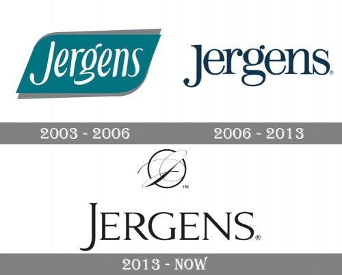
Jergens’s visual identity changed several times during the brand’s long history. It was always text-based, but the style and color palette were getting more and more elegant throughout the time.
The older versions of the Jergens logo featured different shades of blue in its palettes, some had italicized typeface, some had geometrical shapes as a background, but the current logo is one of the minimalist brand’s designs yet the most elegant and sophisticated.
The Jergens wordmark is all the capital letters is executed in a classic and fine serif typeface, which looks sleek and luxurious in black color. The first “J” of the brand’s name is elongated and adds beauty and femininity to the logo.
Another element of the Jergens visual identity is a circular emblem, placed above the nameplate. The rounded frame has a monogram enclosed. The thin smooth lines of the cursive “J” adds glamour and represent the brand as a high-end and professional one.
2003 – 2006
The Jergens badge, used by the brand at the beginning of the 2000s, featured a dark turquoise and white composition, with just a wordmark set on a smooth horizontally oriented banner. The turquoise part had its sides softened from one side and sharp from the other, resembling a leaf shape and was shadowed by gray lines. As for the logotype, it was written in the title case of an elegant smooth typeface with some of the bars slightly curved and rounded. It looked very girly and light, although the strict color palette added a sense of professionalism and stability.
2006 – 2013
The redesign of 2006 changed the concept of the Jergens logo, making it look more modern and cool. Now it was only a dark turquoise logotype written in the title case over a plain background. The typeface was changed to a more traditional serif, with full-shaped letters, clean contours, and distinct serifs, with solid dots on the ends of the lines, which added elegance and playfulness to the inscription. It was minimalistic, also sophisticated too, and the interesting choice of color made the logo stand out in the list of competitors.
2013
The logo, created for Jergens in 2013 is more elegant than all the previous versions, executed in thin black lines and composed of two parts, a logotype in the uppercase and a traditional monogram emblem, enclosed into a circular frame and placed above the inscription. The wordmark is executed in a fancy and sophisticated serif typeface, with the letter “J” vertically stretched. As for the emblem, it features a handwritten “J” with its lines elongated and beautifully curved. The badge looks good on any possible background and the brand’s products’ packaging.


