No matter how hard you try, you will hardly find anything that can help you distinguish Japanese fashion logos from those of clothing companies based in other countries.
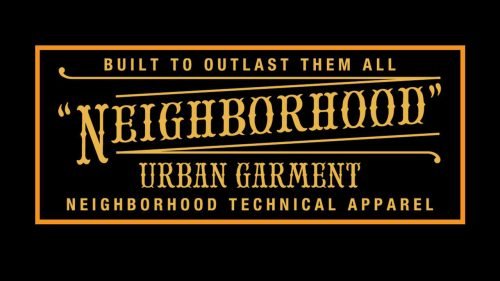
Neighborhood
The brand was established in 1994 in Harajuku, Tokyo. Its rather simple logo does not have anything saying “Japan” in it. It features a heavy, bold sans with the letters standing very close to each other. The varying width of the line gives it a unique touch. The lack of distance between the glyphs slightly damages the legibility, although the name of the brand remains pretty legible.
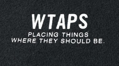
WTAPS
The full wordmark would have looked totally generic if not for the unusual name of the brand itself. The type is a utilitarian sans where the line forming the glyphs has an equal width at every part of the letters.
Undercover
The icon features the white “U” and a small horizontal bar below. The wordmark is even simpler: just the lettering “Undercover” (first line) and “Jun Takahashi” (second line). The type is a generic minimalist sans (Helvetica) that has been used in thousands of logotypes. What makes the design unique is the “U” emblem inside a circle, which is placed at the top right corner.
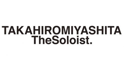
TAKAHIROMIYASHITATheSoloist
There is hardly anything memorable about the wordmark – you can see just another minimalist sans serif type. And yet, the very length of the brand’s name and the way the letters are capitalized make it stand out. Also, there is a dot at the end, which adds a distinctive touch.
Visvim
The icon features the letter “V” inside a black hexagon with the white filling. As for the wordmark, it is typically given in black over the white background. The letters are lowercase and rather bold. While there is hardly anything unusual in the type, the two “i’s” add a visual rhyme.
Ramidus
The Tokyo-based brand uses an abstract emblem formed by a combination of three right angles. As for the name of the label, it is placed to the right. The type has traditional proportions and is neither too bold nor too light – just the most appropriate weight to ensure decent legibility. The word “Ramidus” is given in larger letters, while the word “Tokyo” below features smaller letters.
Mastermind Tokyo
While the design of the logo is simple, it stands out among many other Japanese fashion logos. Unlike the competitors’ wordmarks, this one features a serif type. The width of the strokes varies within every glyph, which adds an old-school elegance.
A Bathing Ape
One of the very few Japanese logos that needs no introduction. The logo features the muzzle of an ape. The muzzle is the centerpiece of Bape’s iconic print known as Cloud Camo.
Comme des Garçons
While Comme des Garçons is currently based both in Tokyo and Paris, it is originally a Japanese brand. It was founded in 1969 in Japan, while the debut in Paris took place only in 1981. The brand is known for its icon featuring the heart with the eyes.
Yohji Yamamoto
The wordmark can be given in a minimalist sans or written by hand. There is also a “Y’s” emblem.
Kenzo
The design gets a unique touch due to the fact that the letters are formed by three parallel lines. The diagonal bar of the “N” creates a visual center.
Issey Miyake
While Issey Miyake is among the most recognizable Japanese brands, its logo is utterly simple with its generic sans serif font.
Uniqlo
The original version of the logo looks by far more distinctive, although even the English one stands out among Japanese fashion logos. Both are based on a red square with the name of the brand placed inside.


