

Black has long been used to denote strength, elegance, and dignity. This emoji here is timeless and trendy, it is always relevant, and for many is the king of all colors. As early as the Renaissance, masters of painting tried to get black paint and concluded that it was impossible to make it from other paints. So they used burnt bones, from the soot of which they made the paint a matte black tone. Today, black paint is made industrially from natural carbon pigments such as graphite and carbon black.
In our article, we will try to give the fullest account of the meaning and variations of black, as well as consider the possible options for obtaining it.
Definition of Black
Black and white are considered the actual absence of color. Therefore, the question of how to get black can be answered that it is only possible to get a tint close to it by mixing a few.
To the artist, this tint denotes the darkest, and to scientists, the absence of color. Black is an achromatic shade that absorbs all light. In terms of light absorption, it is opposite to white, which reflects all the light and radiation falling on it.
Natural black (charcoal) is, in fact, the absence of color – so say the scientists. This achromatic tone is the exact opposite of white. If the latter reflects the vast majority of light rays, then black, on the contrary, tends to absorb them. There is no absolute black color in the world, while the darkest carbon is very close to the “ideal” – it absorbs 99.965% of the sun’s rays, microwaves and radio waves. That is, this material reflects the minimum possible amount of light, which is why it is considered the blackest on Earth. It is impossible to get such a tone from other dyes because any of them are lighter.
Black dye is made from various carbons, and it is these substances that make it possible to obtain all kinds of dyes of the desired tone. The most commonly used are soot and graphite. Artists used to get matte black from burnt bone, and a darker tone did not exist. Nowadays the minerals are used on stream, that’s why in every art store you can buy darker color paint, pencil, plasticine or felt-tip pens.
For a real artist black is the most saturated and complex color, which helps in reflecting the following;
- Transmission of volume. Very often to create a pronounced relief of a flat image, many masters use black tones to achieve the goal. Sharp transitions from light to shadow create a sense of palpable volume in paintings.
- To solve compositional and creative problems, experienced artists use black tones. They create the effect of contrast and emphasis, attracting the viewer’s attention to the right places in their works. In Kuindzhi’s work, we can’t see the black color because of the bright moon, which is just blindingly in the background, like a searchlight in the night.
- Very often dark tones are used to convey silhouettes and contours. In the poster, animation, decorative and graphic art, this is one of the most popular techniques.
- Creating the background. For portrait painters, black is like a life-saving wand that removes all distractions from the main portrait. Most of the famous portraits are done against this background.
As you can see, black is achromatic and unique, because no composition can capture its richness and saturation. But achieving maximum intimacy is quite possible. The main thing is not to be afraid to experiment and mix new combinations. But a little advice – make the right amount of paint right away, because it is impossible to repeat any shade of black all over again.
Shades of Black

Many shades differ slightly from the classic black which will allow the artist to add originality to their work. Professional artists distinguish several shades of the darkest tint. If there is a grayish admixture, the color is called aspid, if there is luster, it’s called anthracite. If a reddish tone is noted, the color is called the “bull’s blood”.
A soft charcoal tone is obtained by adding pink and yellow dyes to turquoise and a drop of black store dye. If the artist requires a medium charcoal, he combines ultramarine with reddish and a lighter shade of yellow, then adds a drop of ready-made store dye. It is possible to create a black and blue by mixing in twice the amount of blue to the store’s charcoal dye.There are also tones with a greenish, purplish hue.
Many shades are obtained by introducing whitewash. Here are interesting variations of the dark tone: soft charcoal – to create it, they mix turquoise, pink, and yellow, add a drop of ready-made black; medium charcoal – combine ultramarine, reddish, light yellow, add some blackness; black and blue – combine brown and blue, and the second color must be twice as much.
Professionals distinguish an array of shades of the darkest dye. Not so long ago, artists designated such tones: aspic (with an admixture of gray); anthracite (with glitter); bull’s blood (mixed with red). Now colorists and painters create very different colors, their range has seriously expanded. When different colors are introduced, charcoal will not be so dark, but brownish, bluish, or with a touch of violet.
CMYK and RGB color models
Many artists today have traded brushes for keyboards and mice and pencils for contact sticks. Digital technology is becoming more and more popular in art. So let’s go over the letter labels of different color schemes on the computer together. Let’s remember how to get a shade of soot on a palette. To do this, you have to mix the basic paints: blue, red, and yellow. But to achieve the same effect on the computer monitor, you have to remove the feeding of the basic computer colors on the screen.
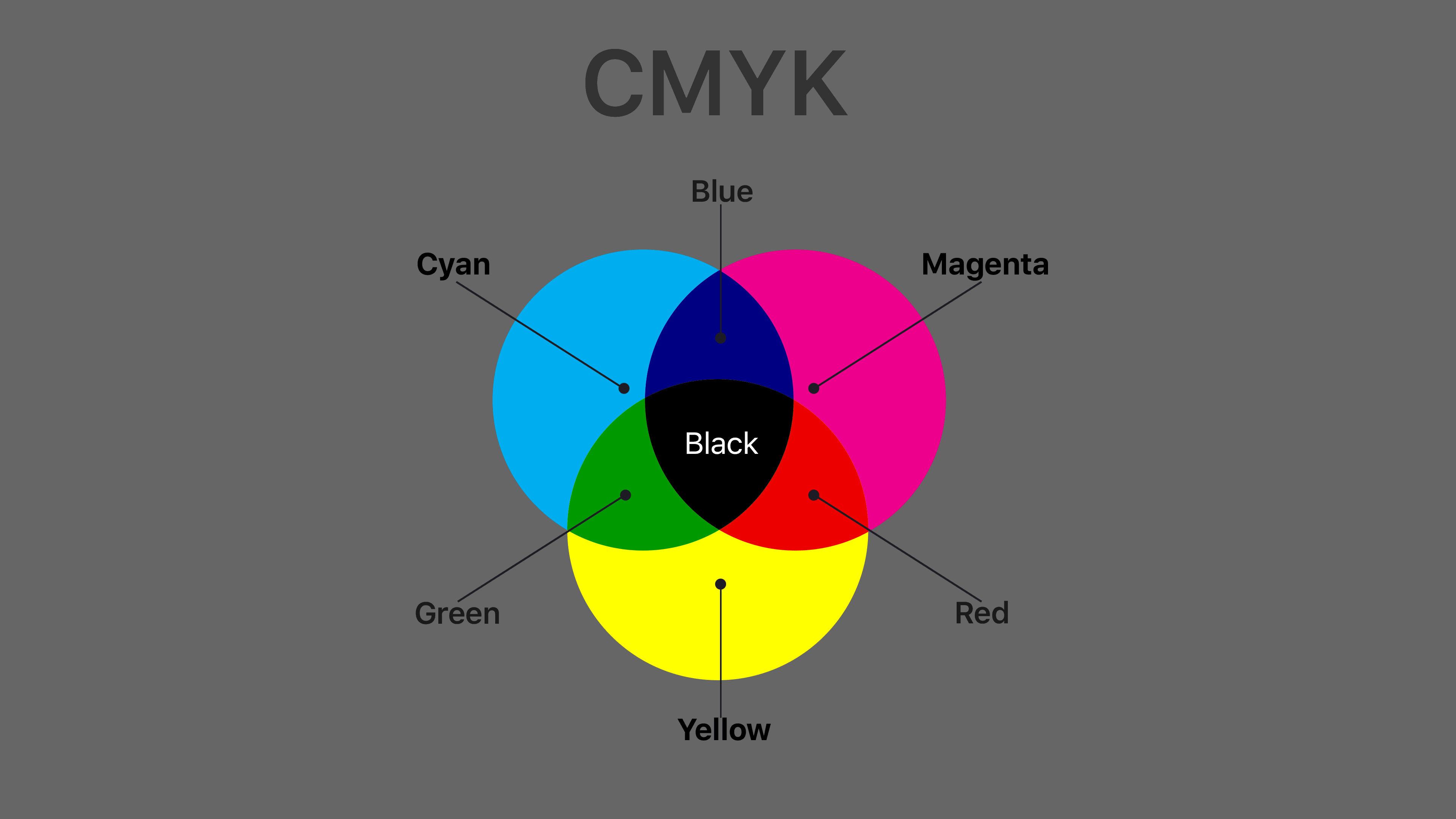
In contrast to black, white is formed with one hundred percent saturation of Red, Green, and Blue, so you get a color model RGB. To print the resulting picture, you have to go back to the application version. Programmers have found a way to solve this problem with numbers. The opposite colors from the main color circle are printed. For red, it is blue (Cyan), for green — Magenta, and blue, yellow (Yellow). The letter K represents our hero (BlacK). The result is the CMYK color model. The last letter of BlacK is taken to avoid confusion with blue.
There is, however, one problem: CMYK printing uses transparent colors, which causes them to overlap when printing. This means that 100% black in CMYK does not seal the area with an opaque black layer. The same thing happens when you create a gradient from any color to black: black looks gray and “diluted.
So, let’s summarize. In practice, the two basic color models are:
- RGB – additive, the basis of which is the superposition of rays reflected from the surfaces of objects. It is used in computer monitors and contains basic colors: R-red, G-green, and B-blue. The other colors and shades are obtained by superimposition.
- CMYK is a subtractive model, which is based on the physical mixing of pigments, where white is the absence of color, and pure black is obtained by mixing cyan (C), magenta (M), and yellow (Y) tones, K (blacK), being the key color. This system is used in the printing industry and printing on printers.
As you probably know, your computer monitor as well as web pages use a different color mode: RGB. This abbreviation is based on the first letters of the colors of the visible spectrum: Red, Green, and Blue. In this color model, black has the meaning of “dark” or “no light” because it is represented by a zero value for all three colors: R:0; G:0; B:0. black is displayed as the darkest color on the monitor.
Black in CMYK, however, represents an entirely different concept: colors are created by mixing printing inks. This color model is subtractive. A subtractive color formation scheme involves an overlay of colors in which the final color becomes darker and tends to be black. Because it is virtually impossible to form pure black using only cyan, magenta, and yellow, black is added to the other three colors in CMYK. RGB, on the other hand, is an additive color model, where colors are produced by addition, and the final color tends to be white.For example, to create red in CMYK, you have to use a mixture of yellow and magenta. Adding black will make the red darker.
Pantone and CMYK Black

Not all projects are the same. When printing materials whose color scheme consists of only black and red, for example, it would be most practical to use two inks instead of four. Pantone colors are the most common for printing such projects. The various Pantone color palettes are divided by the type of paper (coated, offset, etc.), as well as by the type of printing (silkscreen, clothing printing, etc.).
The vast majority of Pantone inks are opaque, while CMYK inks have glaze-like properties. In certain cases, the use of semi-transparent inks can be of great service. For single-color printing with, say, only black, it is sufficient to use only Pantone black.
The basics of color mixing
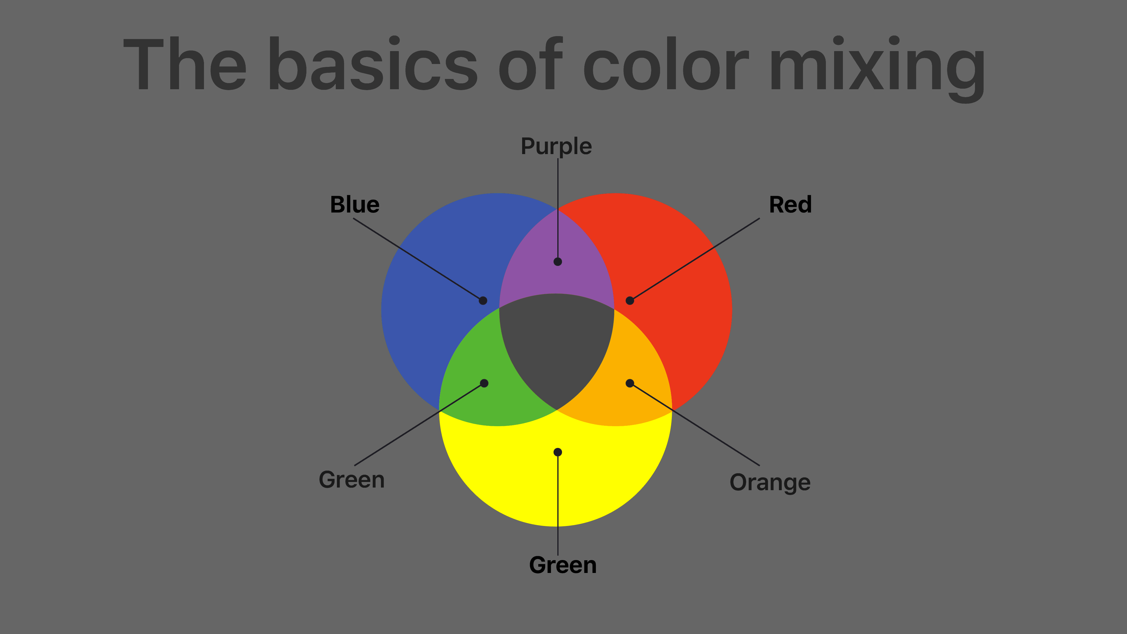
There are 3 basic colors that you can’t make with a combination of others. These are red, blue, and yellow. The tones obtained by combining the two colors are called complementary tones. In cases where 2 complementary tones have to be mixed for the desired paint, the result is called a shade.
There are also 3 basic achromatic (colorless) tints: black, white, and gray. You cannot make the first two at home. Artists are only able to create close to the desired shade. Gray is made by mixing black and white in different proportions. The more white will be in the mixture, the lighter will be the dye.
Pure colors
According to early theory, the pure colors were red, blue, yellow, and green. It was believed that they could not be obtained by mixing other shades. Later, with the development of technology, it became clear that the three primary colors that could not be obtained were magenta, cyan, and yellow.
The modern color theory distinguishes between three primary colors, three secondary chromatic colors, and one achromatic color: black. What colors to mix to get black varies. Everything from mixing primary hues to mixing red, blue, and yellow or even red and green works in comparison.
The secondary colors are green, blue, and red. Green comes from mixing yellow with greenish blue. Magenta and blue give you blue. And mixing magenta with yellow gives you red.
In theory, the question of how to get black from paint is solved by mixing the three primary colors in their ideal shades. These are cyan, magenta, and yellow. However, it is practically impossible to obtain perfect black by combining other chromatic colors. In typography and painting, natural black is used.
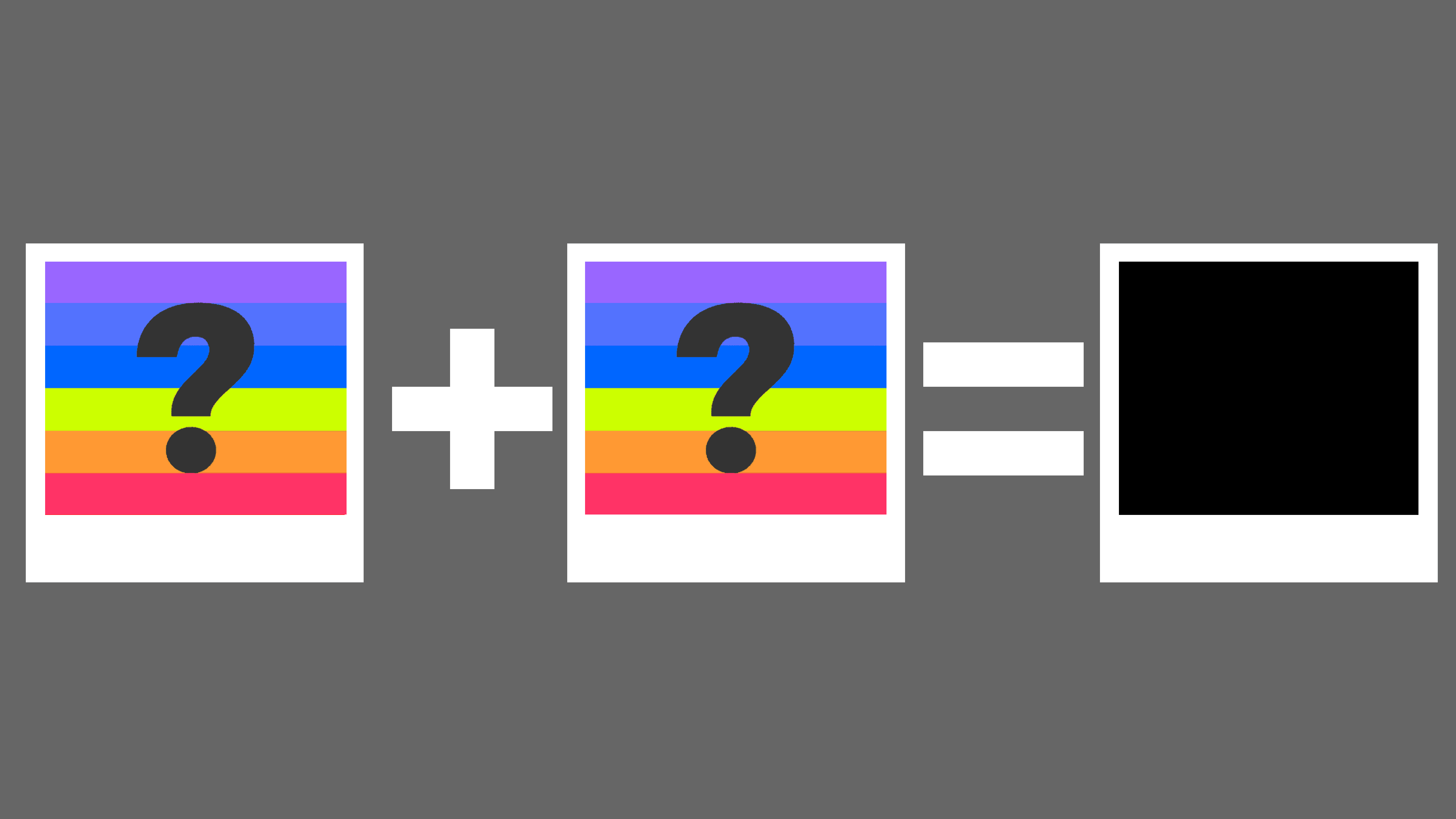
How toget Black
Dyes of this color are produced based on hydrocarbons. In most cases, graphite or soot is used. In the past, artists had to burn bones to achieve the desired shade. The result was not very dark and matte, but other ways to create this color had not been invented.

Perception of color is highly individual and depends on how the human eye perceives rays reflected from different surfaces. Some surfaces do not reflect the rays but absorb them. When they are absorbed, a person sees black. This is why black is called a “dead” color or “no color”.
So the answer to the question of how to get black from paints is this: true black cannot be obtained by mixing any other shades of the spectrum. However, it is possible to create very dark shades that, in contrast with others, create the feeling of black. To find out which paints you need to mix to get black, it’s worth turning to art theory and the psychology of color perception.
What colors to mix to get the Black color
Even a beginner knows that all shades can be made with only three basic colors – blue, red, and yellow. You only need to know the rules for combining paints and the right proportions. But in practice, everything can be more complicated, and instead of the desired color, you get a grayish, achromatic tone. It is also difficult to find the right way to get a black color by mixing colors. The finished paints will look like it, but not anything like it.
If you read the manuals for beginner painters, you can find instructions everywhere: no combination of colors will not give a 100% black tone. But there are tables with information on which paints should be mixed to create the darkest possible shade close to black. The easiest way involves combining red, blue, and yellow paints. Gouache and oil are the best, but watercolor will be too transparent and will not give the necessary depth.
Any basic set of paints will do, though artists more often take cyan, magenta, cadmium yellow, royal blue, and alizarin red. The instructions are as follows: place a drop of each color on a white palette (take an equal amount of all colors) at a small distance from each other; mix colors gently with a brush, and spatula; mix materials for at least 15 seconds, so that there are no streaks, using circular motions.
The reason these three colors will turn black is that colors are subtractive. In other words, the more you try to put them together, the less light will be reflected, and the dimmer they will become.
A darker, richer color will come out if you use magenta, yellow and blue instead of the basic colors. You can take other shades of the color palettes. The darkest tone you get when you mix purple, brown, and blue. Take 1:1 darker shades of gray and brown will also give a rich blackness.
There are also simpler schemes for creating a given color from 2 colors.
To get a black color that is close to perfect, you can go by mixing the paints of the following colors:
Blue + Burnt Sienna = Warm Black
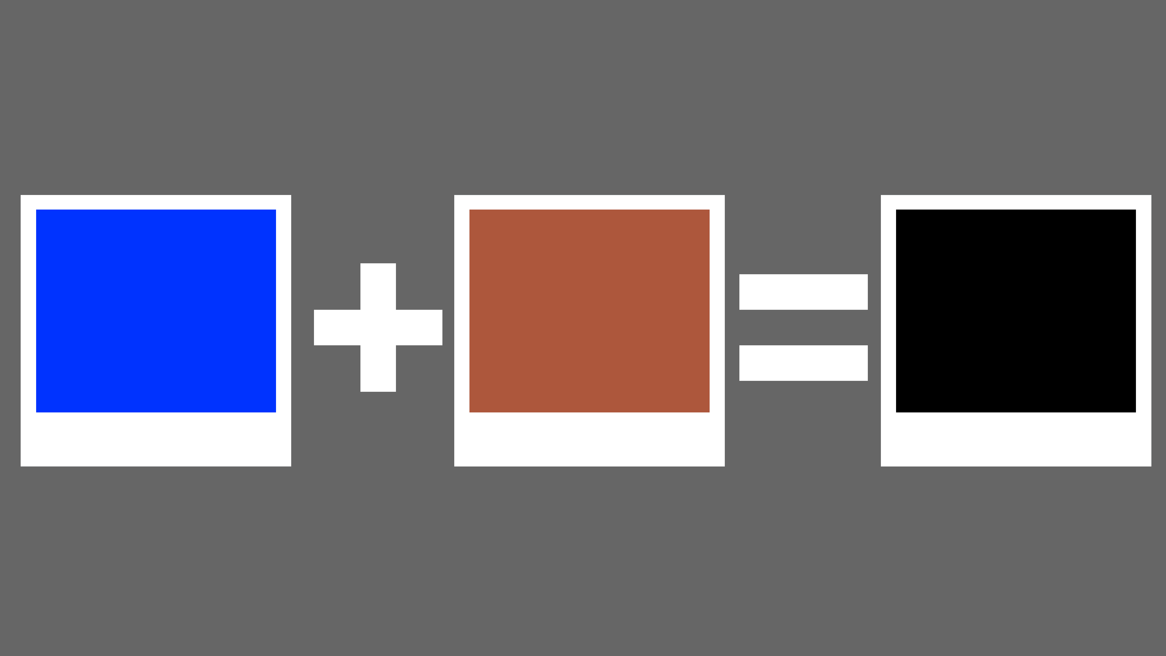
Another black paint color combination is Blue and Burnt Sienna. Mixing these two colors gives a warm black. That is, the mixture of burnt sienna along with ultramarine blue gives a darker shade of black compared to ultramarine blue with burnt umber. Burnt sienna is reddish than burnt umber and is considered an earth tint.
Blue + Orange = Black
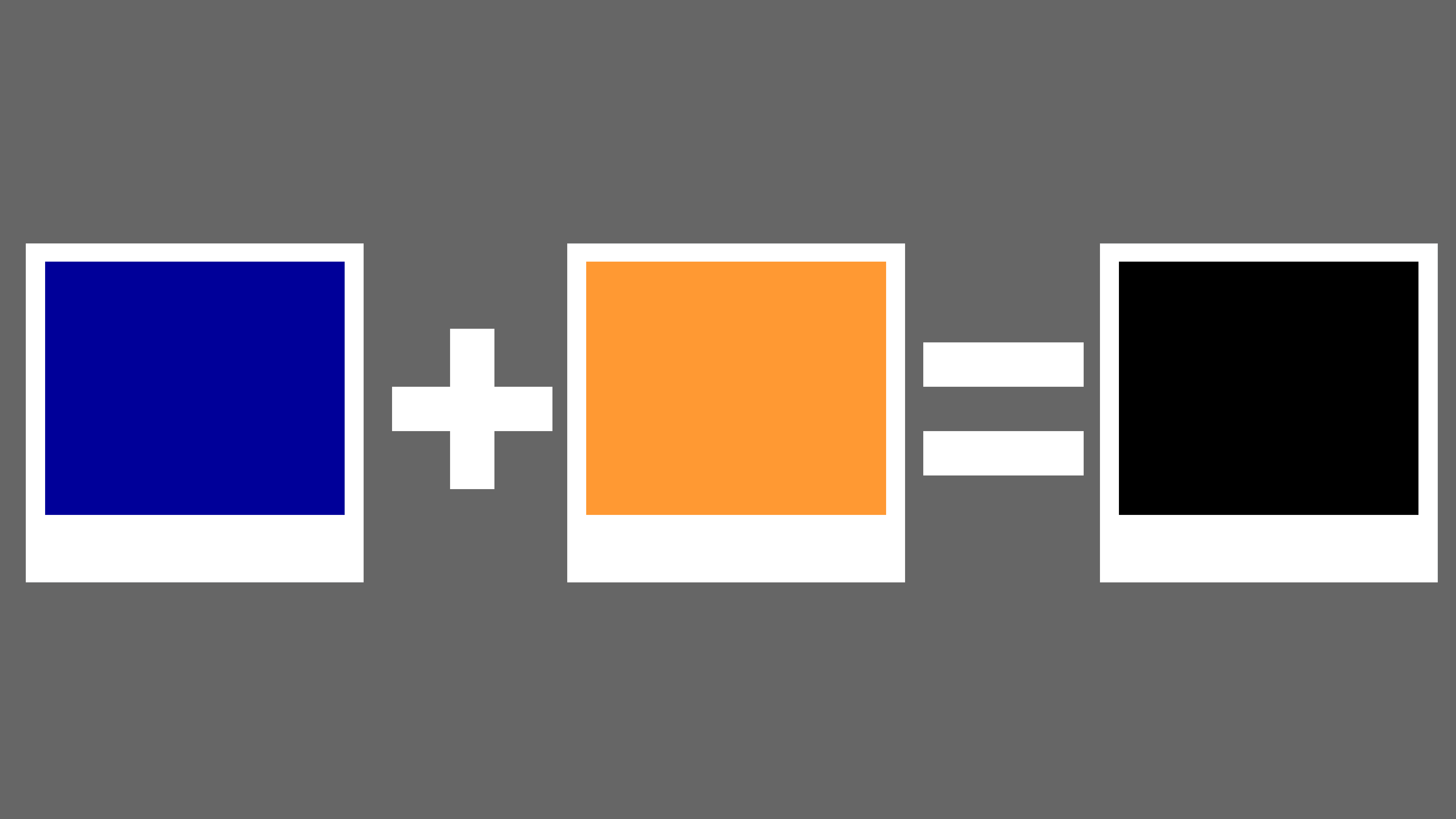
In the same vein, when Cobalt Blue and Translucent Orange dyes are mixed, they produce a vivid black color. If the resulting black color does not satisfy you, you can add a little blue dye to the mix until you are satisfied. The big advantage here is the blue, so you can add a little more of it, but try it with equal parts first. Also, mix them in the same direction, and place them separately from each other.
Yellow + Purple = Black
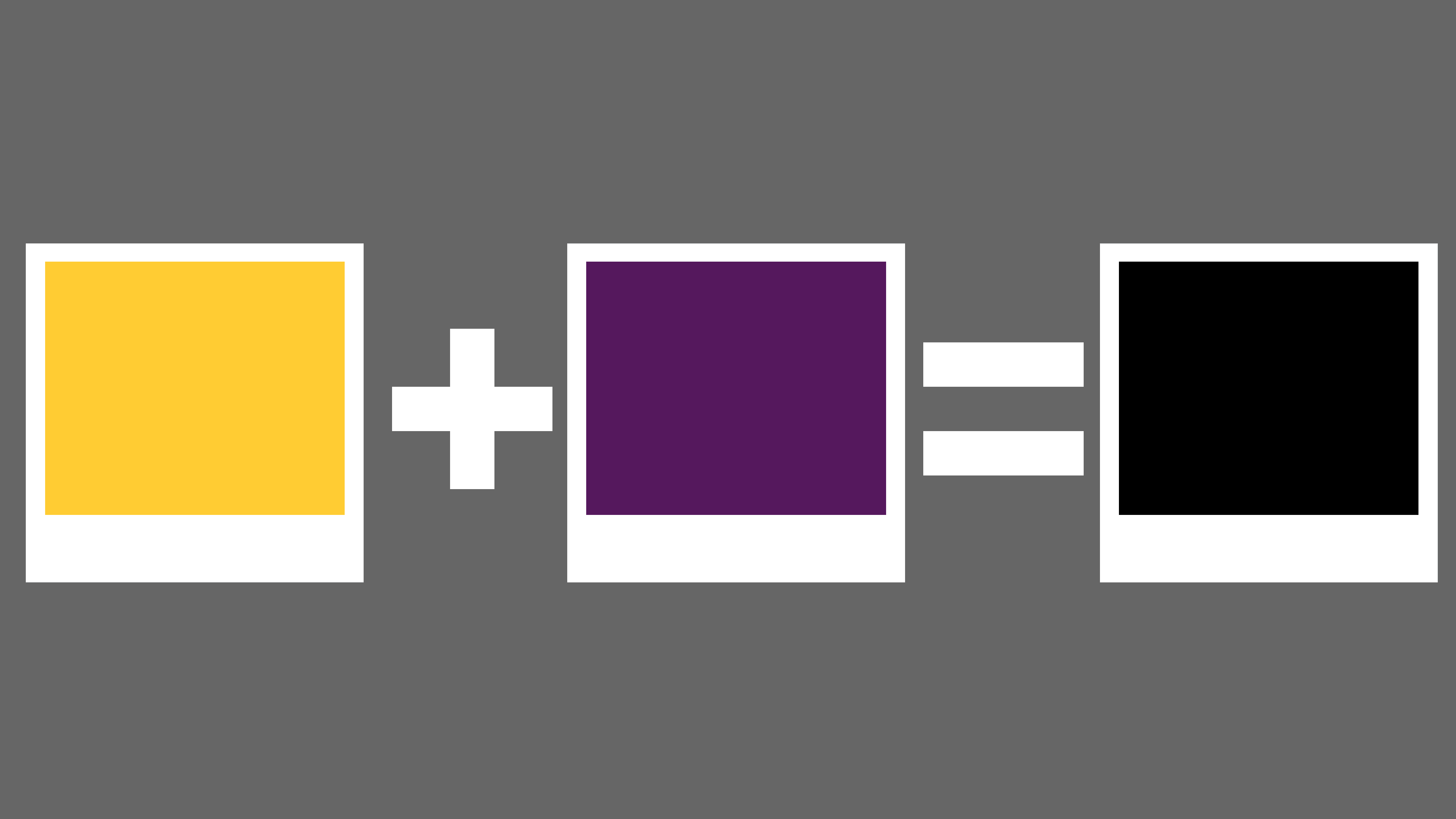
If you can’t find the black paint you want, and you need it, you can mix yellow paint with purple paint to get the results you want. Adding 40 percent yellow paint and 60 percent purple paint creates at least the desired black quality.
And if you must use purple, you must mix purple with cadmium yellow to get black. In general, if you mix primary and secondary colors, you can get many different color combinations to get black.
Green Phthalo + Magenta Dioxazine = Black

What’s more, green phthalo and purple Dioxazine paint have a unique dark color blend that makes this color combination so intriguing. If you’re not impressed with the result, you can balance it out with a little purple paint. After all, green is a powerful shade.
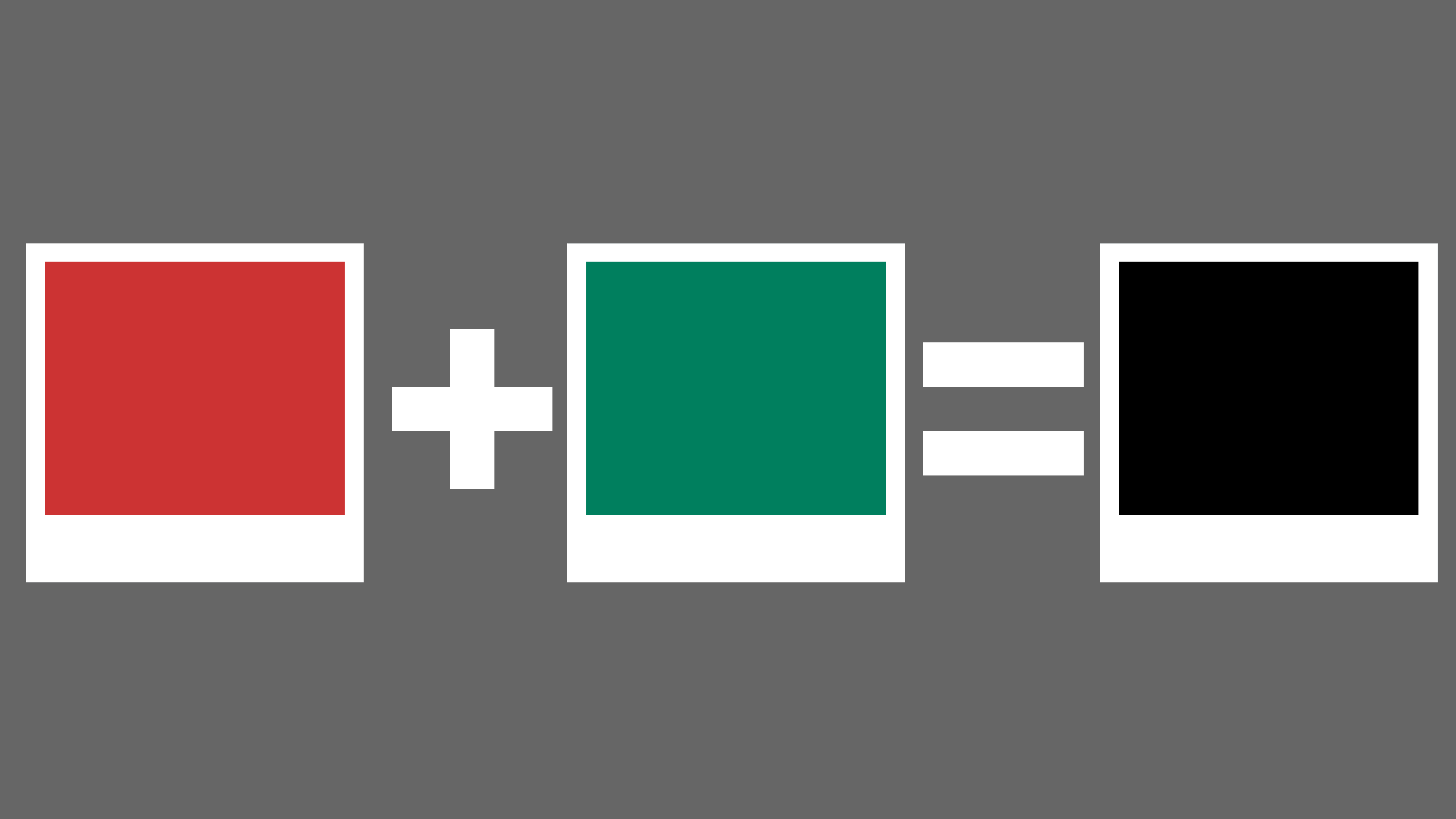
Red + Green = Black

The colors at opposite ends of the color wheel neutralize each other. Thus, when mixed or blended, it gives a darker shade. However, you can create a black background by choosing between red and green. These two colors are considered strong and often act as competitors between each other. To get the desired result, you have to mix carefully, adding one and then the other. Although it is difficult to do, you can try. Mixing Phthalo Red along with Naphthol Green paints is another great way to get monochromatic black paint.
Dark Cadmium Red + Viridian = Black
Perfect black can also be obtained by combining the color viridian with dark red cadmium. If used and mixed in the correct proportions, a completely neutral blacking effect can be achieved, most suitable for many applications.
Brown + Blue = Black
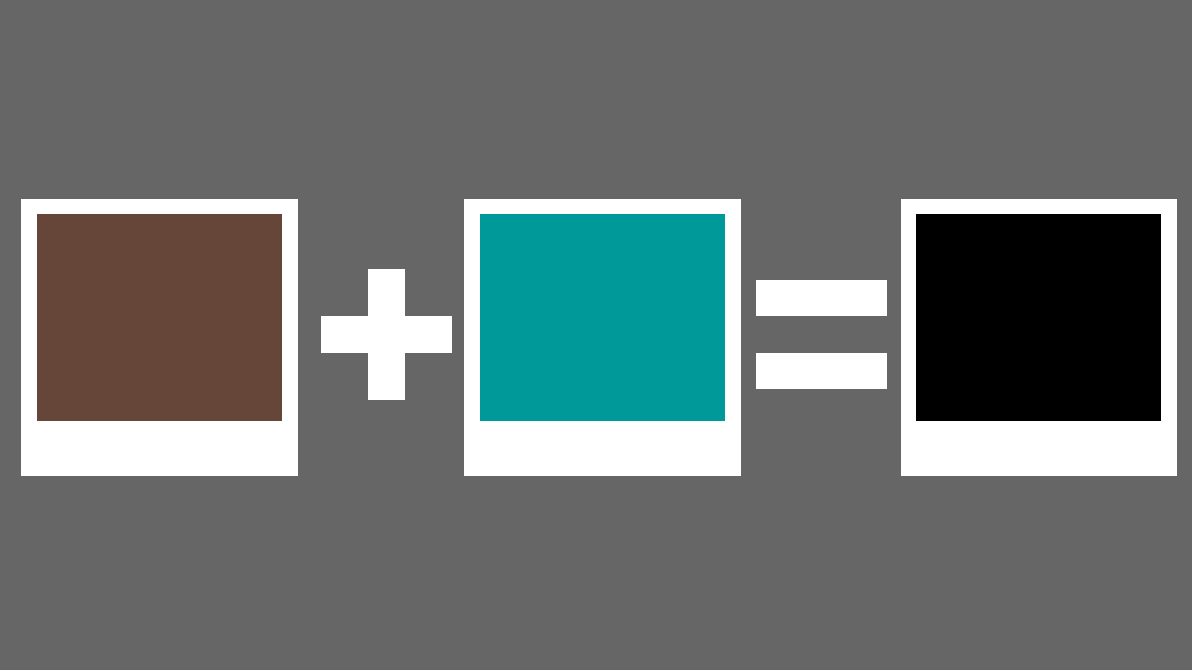
The last method we’ll share on how to make black is to mix brown with blue on the palette. If you have a good understanding of onion color, mixing these two colors to get the black color you want is very easy and simple. This is the most successful way to blend. This method is quick, accurate, and effective no matter what pigments are used.
If it is necessary to lighten the black a little, a drop of white dye is put into it. A drop of blue or purple pigment is added at a time to give a natural sky tone. To draw the night forest, a little green is added to the black, and to draw the rays of the sun on the dark surface – a little orange. Of course, the expressiveness of such black will be less, for a saturated tone it is better to buy a ready-made tint in the store.
All tones obtained will be close to blackness, but not perfect, on closer inspection, it is easy to identify “fake”. According to artists, the best tint is obtained by mixing blue and brown paint, regardless of its brand and specific type. In this case, the more brown, the “warmer” the blackness will be. On the contrary, blue strongly “cools” the finished tint. Diluting this color with water gives an excellent gray tone.
Conclusion
Natural black is made from soot and graphite. And remember – no pigment can completely recreate black. And the catch is that black is the absence of light because all pigments are completely absorbed. And no bright shade is capable of fully reflecting the rays.
But there are small tricks that will help recreate the closest possible black tint:
- The most common option is to combine blue, red, and yellow. The proportions should be taken in equal percentages. But keep in mind that each painting in its way will set the shade of black. Really, if you look closely, it will be more like a very dark brown tone or dark ochre.
- Brown, blue and purple will also work. But these are already combinations of complex colors that must also be brought out beforehand.
- Secondary colors such as brown and gray will render black with incredible accuracy. After all, gray is also in the achromatic group and can absorb. Naturally, they should be taken as dark as possible and in equal proportions.
- Absorption comes from contrast. Therefore, take colors that are opposite on the color wheel. For example, red and green. The result will be a very dirty brown, which will be similar to the black color. But keep in mind that a lot of red tones can make the shade brown.
- A mixture of orange and blue paint works the same way. But in this matter, you need to catch the faint pigment of the orange tint and a saturated shade of blue. You already need to select the proportions, depending on the richness of color. But blue must dominate.
- If you add 40% yellow to 60% of purple paint, the result will be black. But add yellow gradually. If you add it all at once, you might get black with an overly gray cast.
- You can also get black by combining all the colors from your palette. Green, purple, gray, red, or blue can help make a black background. Well, you should not introduce light shades, because there will be just a dirty gray color that will be only close to a black shade.
- To make the resulting shade of black by any means more saturated, add a drop of “Prussian blue”. This will achieve a color like the night sky.
- To enhance the resulting color, it does not hurt to add burnt umber, which has a rich brown tone, or ultramarine. And ideally, add a couple of grams of soot, then you will definitely get a real black pigment.


