Grab is an international technological company, established in 2012, and based in Singapore. The company’s services are related to taxing, vehicle renting, food, grocery, and package delivery, as well as online payment. The main user operations are carried in their mobile app named Grab. The Grab target market is Thailand, Cambodia, Vietnam, Myanmar, and Oceanian countries, where they have 180+ million users and 2.8 million drivers.
Meaning and history
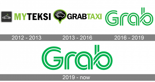
Founded in 2012 by Anthony Tan and Tan Hooi Ling, Grab was initially known as MyTeksi and located in the capital of Malaysia. The next year, MyTeksi was rebranded into GrabTaxi. For the next 3 years, the company advanced its operations, started to provide delivery services, and became the largest taxi company in the region. To show this dominance, they changed their name to simply Grab in 2016.
What is Grab?
Grab is a transnational company based in Singapore. Their main services include taxing, as well as vehicle renting, and products transiting. The target market of the company is the Southeastern Asia and Oceania. The Grab operations take place in their special mobile application named Grab, through which you can pay online, order a house delivery, and rent a car online.
2012 – 2013
The MyTeksi logotype depicted a black square with a gray frame. On the square, there were white contours of a taxi car with Wi-Fi waves coming from it, supposed to reflect that you can easily order your taxi via Internet. To the right from the square, they wrote the capitalized sans-serif brand name with the green ‘My’ and black ‘Teksi’ part.
2013 – 2016
With the rebranding into GrabTaxi, they also made a new logo. It featured a black bubble with a bold green outline. On the square, there was a taxi car contour with two lines at its left part. It’s supposed to mean that the company offers you to grab a smooth and safe taxi car.
To the right, there was the brand’s name, written in the same typeface as in the previous logotype. But this time the ‘taxi’ part was green, while ‘grab’ was black.
2016 – 2019
After the third renaming, they had developed a new mark. It featured the brand name styled as a highway road. The letters consisted of green and white double lines, which intertwined one another. All characters except for ‘g’ were merged and smoothly went into one another.
2019 – today
The next logotype featured the same inscription, but in a bit darkened and thickened color palette.
Color
Traditionally, the brand’s graphical identity was executed in black, white and green. The black and green featured the letters of the name and some small lines in the first two logotypes. The black was used to symbolize authority and quality, while green stood for safety. The white shade has been used since 2016 to depict one of the two lines used to describe the letters. It always reflected openness and brightness of the company.
Font
In the crests, they used two scripts. The first one featured the MyTeksi and GrabTaxi names. It had capitalized sans-serif letters with small gaps in between. The 2016 logotype uses Nordic Pro Incline font. It has sans-serif characters as well, but rounded a bit. The first ‘g’ is capitalized, while the following ones are lowercase.


