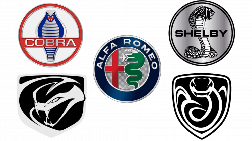
Snake was used by several prominent car brands and carmakers. There are generally two motivations for this. One is some sort of connection to the founders or a region where the carmaker is from. The other is a simpler take on snakes as agile, fast and dangerous animals.
What are the car logos with a snake?
For centuries there have been arguments on whether a snake is a symbol of something good or bad. Many people are afraid of these animals, thinking of them to be the most dangerous creatures in the world. But snake also stands for rebirth, immortality, and the ability to change. So the brands that chose a snakes as their symbols, such as Shelby and Alfa Romeo, point to their longevity and timelessness.
Alfa Romeo
Alfa Romeo is a classic Italian carmaker, established in Milan in 1910. They are known primarily as a producer of high-performance cars, including tourers, grand tourers and typical sports car. Besides this, they also make a variety of other models, including luxury, executive cars, normal family vehicles and much more.
They famously use a snake on their long-time logo. It has a long history to it, same as for other elements of the same emblem. It all takes root in Milan, where this carmaker is from. All the different parts of the logo are derived from Milanese symbols, one way or the other.
The snake is directly taken from the coat of arms of the Visconti family, a dynasty that ruled this region in the Middle Ages. On the crest, it’s depicted eating a man alive. It’s used in the same form on this emblem, although the details slowly faded away with every new evolution.
The snake on the logo is now a thick, green mass that looks like a spiral. There aren’t many distinct serpentine features, except for a long mouth with the man inside (it’s just a small white figure now). Above the serpent, there’s also a simplistic crown. Before, it was a detailed golden ornament taken from the same Visconti crest. Now, it’s just a white line with several dots.
The snake occupies the right side of the emblem, while the left one is taken by a tall, red cross. It’s taken directly from the flag of Milan, which is a white cloth with such a cross, akin to the English flag. Two elements are then framed by a wide blue ring with the words ‘Alfa Romeo’ written in white along the top edge.
This emblem is often used as a badge for Alfa Romeo cars, but it’s also a long-time logo they used as a company for many years now. They have a wordmark of sorts, but it’s generally been replaced by the one depicted on the outer frame on this emblem.
Shelby Mustang
Shelby Mustang is a popular car brand, established in the 60s. It’s basically a more powerful version of a classic Ford Mustang, but designed by Shelby American. Interestingly, it’s still manufactured now, even though the modern models have little to do with either original Shelby Mustang or Fords.
The iconic cobra emblem used by most Shelby Mustang variants took shape in 1968, when the first of the Shelby Cobras appeared on world stage. The reasoning behind the name isn’t too clear, but that’s when they decided to put snake on the emblem of these cars. The current logo is different from the original design, but the general idea is pretty similar.
It’s a ring with the word ‘Shelby’ written in the middle. The centerpiece, however, is a big, detailed cobra image behind the name wordmark. It occupies the height of the entire ring and much of its width. It’s depicted as coiled, but ready to strike, creating an aggressive, threatening sight.
The lower part is a pretty normal image of the snake’s body. They styled scales as rhombs of varying sizes with a little dot in the center of which of them. Close to the top, they become bigger and actually turn into square horn-like clumps near the reptile’s head, making it even more menacing.
The upper part becomes gradually wider and darker. They basically made the entire head and neck area black with some white additions here and there. That includes the mouth, which is a wide-open black hole with long fangs ready to strike.
It’s the official logo is this car series, but it’s not used in this precise way on the cars themselves. The cars are usually given the snake image in all its glory, but made of metal. The wordmark and the surrounding ring are not included, most of the time. So, it’s just a big metallic snake attached to the bonnet for many of Shelby Mustangs.
Dodge Viper
Dodge Viper is one of the primary lines of sports cars by Dodge, a subsidiary of Chrysler. The first of these was designed in the 90s, and the production of new models barely stopped then. In short, it’s a brand of (normally) smaller sports cars, which reflects the name well, seeing how vipers are also small and quick.
Since the beginning in 1991, there have been 3 versions of the Viper logo. The current one has been designed in 2013 for a 5th generation of Vipers. Like before, it’s a shield shape with the snake’s head and neck visible inside it. However, it’s way more detailed than just that.
The shield is a wide pentagon shape with rounded angles. The main color is black, but most snake details are made using the color grey. It’s used to highlight the edges of the shield, and the snake itself originates from the left corner. Its body acts as an extension of the frame on the left side.
It’s basically extending into the neck, which is then curled back left to expose the head. The head is drawn with a lot of effort. The eyes look hateful and very human. The mouth is somewhat open, but the fangs are fully drawn and seem ready to strike. All of it is done using grey. Much of the body, the mouth and some other elements are made using the color black.
The color scheme is, as said, black and grey. However, some variations may also use red, blue and other choices. The bottom line: the image is what’s important. Moreover, sometimes the color scheme correlates with the color scheme of the color it’s placed onto.
This emblem is very often used as a badge for cars. They are placed right below the tips of their bonnets, usually without any other elements, like the name of the model or the brand. Some are given special rectangular plaques that specify what the model is (like some Viper SRT variants). These are black and use metallic letters.
AC Cars
AC Cars is a British carmaker, established in 1901. It’s still one of the primary British car brands. They are known particularly for their grand tourer, tourer and sports cars. One of these models is AC Cobra, produced in the 60s. This car was based off the Shelby Cobra, produced by Shelby American.
The car was designed using the help from the latter, and it turned out of the most famous cars this brand ever made. Although AC Cars doesn’t have any snake-inspired logos itself, this car and its offspring do. These cars were designed with a special emblem attached to the bonnet, featuring a cobra.
The emblem features a red ring with a line of the same color going through the middle. It doesn’t really go through the very center, but it’s slightly realigned to the bottom. Anyway, that’s where they used to put the name of the brand – ‘Cobra’. The name was written in silver letters in a regular sans-serif font.
The central image is a cobra. It’s rather simplistic, because there are just a handful of elements. It’s basically a frontal picture of the snake. They made a grey silhouette for it and lined its ‘belly’ with blue lines to make it look like what you expect a cobra to look like. Besides that, there’s also a red mouth, wide-open with 4 white fangs placed on its perimeter. Lastly, there are also two black eyes above it all, and that’s pretty much it.
The coloring could change slightly depending on what model you’re looking at. It affected the name wordmark in particular, but not too many other elements. The shades changed a lot, though. Moreover, there are many variants that sport too much blue on the snake and the letters.
This emblem was normally used as badges for these cars. Some of these used the usual AC badges, but normally it would be this snake image, molded into a badge. The design is exactly the same.
Zarooq Motors
Zarooq Motors is a car manufacturer from Saudi Arabia, established in 2016. They largely produce sports cars, which is actually the reason why they picked snake as their primary symbol. ‘Zarooq’ is a type of snake native to the deserts of this country, and it’s famous for being extremely quick.
They placed the snake on their logo, although it’s actually more of a badge for their cars. Like many of their counterparts, this image uses a shield shape as basis. It’s a basic triangular shape without any surprises. The background is mostly black, but also scaly, which resembles both a snake and a tire.
The frame around is silvery-metal. That’s also where the snake image inside comes from. In fact, it doesn’t look all that much like a snake. Most of these are just grey strokes with two parallel lines that form a neck. On top of it, naturally, sits the head. They didn’t give it much detail.
It’s just a general outline of a snake’s head if you look at it dead-on. There are some details, like a hollow bit where the mouth is supposed to be. They outlined it with grey on both sides to make the appearance more believable. There are small fangs protruding from the mouth, but they share the same black space as the mouth.
The eyes are the same hollow spaces, but further up. They tried making them look threatening by adding some brow-like cuts from the eyes to the inner head, which is also blank. Everything besides the edges of the head is black, and you can see the black scaly background as a result.
They seem to place these on the bonnets of their cars. The brand itself doesn’t have a proper emblem or a logo. They don’t use this one for any purposes besides decorating their cars, in fact. At the same time, these badges are instantly recognizable because Zarooq cars use bright colors exclusively, making a little black spot stand out instantaneously.
Conclusion
In the vibrant world of automotive branding, the symbolism of the snake has woven its way through the emblems of several iconic car brands, marking its presence with a blend of elegance, power, and mythology. From the sleek curves of the Ford Mustang Shelby to the emblematic serpents adorning Italian luxury car brands, snake logos encapsulate a legacy of transformation, performance, and allure that transcends borders, from Italy’s storied streets to the bustling highways of the UAE and the historic roads of the UK.
The snake, often associated with fertility, creativity, and a creative life force, finds a powerful expression in the car logos that it graces. The Cobra logo, with its open mouth and aggressive stance, signifies the high-performance variant of the Ford Mustang, a car that has become synonymous with car racing and sporty vehicles. Meanwhile, the Alfa Romeo car logo, with the head of a snake depicted on the emblem of Milan, embodies the expressiveness of the snake, marrying adaptability and creativity in a design that stands out on the front grille of vehicles known for their horsepower and sleek designs.
The story of the snake in automotive emblems is rich and varied, touching upon elements of legend and history, such as the Biscione, a heraldic symbol representing the giant serpent, emblematic of Milan and the Alfa company, and the Asclepius, which signifies healing and is part of Alfa Romeo’s storied badge. This narrative extends to the UK, where the Shelby nameplate, with its Cobra logo, and the Dodge Viper RT, with its new Stryker logo and sneaky Pete badge, highlight the adaptability and gracefulness of these designs in the competitive arena of high-performance cars.
Automotive companies across the globe, from Stuttgart to Dubai, have embraced the snake motif to symbolize qualities like speed, danger, and transformation. Whether it’s through the luxurious showrooms of Lamborghini and Porsche or the emblematic designs of British-American sports cars, the snake logo has become a symbol of power, luxury, and the relentless pursuit of excellence. With each iteration, from coupes to convertibles, these emblems tell a story of heritage, performance, and an unyielding drive towards innovation.
As we click to see examples of these magnificent designs, we are reminded of the variety of businesses that have embraced the snake, from supercars to sporty vehicles, each finding a unique expression in the symbolism of this ancient creature. The snake logos, set against eye-catching shades and often highlighted with red elements on a white background, speak to a legacy that combines the thrill of the drive with the profound narratives of history and culture.
In conclusion, the incorporation of snake motifs into car logos is more than a mere design choice; it’s a testament to the enduring appeal of these symbols, representing not just the cars themselves, but the legend, creativity, and dynamic transformation inherent in the automotive world. From the streets of Italy to the deserts of the UAE, these logos invite us on a journey of discovery, power, and the infinite possibilities that lie within the creative life force of the automotive industry.


