Griffin is a mythical creature from Ancient Greece. It’s supposed to be a mix between a body of a lion, wings and a head of an eagle. It’s usually portrayed as a ferocious, brave creature, but also a powerful enemy. Many brands, including some carmakers, consider griffin a symbol of power, speed and other qualities shared by lions and eagles.
What does Griffin mean by car logos?
Griffin is a commonly known symbol of strength and courage and is used as the central element of the logo by some famous automakers, such as Saab, Gumpert, and Vauxhall. All their car brands are known for the reliability and height quality of their cars, thus Griffin for them also represents protection and confidence.
Vauxhall
Vauxhall Motors is one of the prominent English carmakers. It was established in the mid-19th century and started making cars several decades later. In the later years, Vauxhall started concentrating on making compact and family cars. They did it before, but in the 20th century the company enjoyed more variety.
They are also amongst the most recognizable griffin-wearing brands across the world. Vauxhall is instantly recognized by a griffin, surrounded by a mix of white and red. There have been different versions through the years, but the latest is just a circle with part of a griffin inside it.
The main emblem is a red ring with white innards, save for a griffin and a little flag with the letter ‘V’ on it. Before, the creature was depicted in its full might on the emblem. Over the years, they made it smaller and smaller, until finally confining just its head and neck to a circle.
What you can see is just the head, a beak and a thick neck to which the former two are attached. It has a rather mundane expression: a basic white oval for an eye, a slightly open mouth, a single ear (in a shape of a narrow triangle) and dull-looking feathers on the rear of the neck.
The same emblem is used a badge for Vauxhall cars, except in a metallic refashioning. It’s basically the same emblem there, except the blank space is just black, and the red stuff is all made into metal. In fact, this emblem is both a badge and a logo for a brand. The company, however, uses their wordmark as a primary logo.
The wordmark is usually just the word ‘Vauxhall’, written in big, sans-serif letters. They are pretty typical, but seem stretched sideways for some reason, making them rather square in proportion.
The wordmark can be freely used alongside the emblem for official business. Actually, before the emblems had ‘Vauxhall’ written along the edges, but now not so much.
Saab
Saab is a Swedish company, founded in 1937. Until 2016, they produced cars. Nowadays, it’s just a producer of military equipment and aerospace products. Regardless of what they made, each branch of the business used the same logo. The existing Saab still uses the old griffin emblem, just as the carmaker subsidiary did.
The emblem doesn’t depict a griffin in full size, per se. The normal Saab logo displays just the head, placed in a center of a blue circle. The latest griffin-wearing emblem of Saab the carmaker was abolished in 2014. It was still used in association with the brand even after, and it’s still utilized as a general emblem for the cars of this dead brand.
The classic logo is a dark blue circle with the red head of the griffin in the middle. The main color is red, but there were also many white lines, as well as a golden crown on the creature’s head (the Swedes are extremely fond of crowns, it’s even one of their national symbols).
The griffin’s expression is of mild threat: the mouth/beak is wide open, something like a wisp of breath is coming out of it, and the eyes are arranged into a menacing look. Generally, all the small nuances are outlined by the white lines all over the image. That also includes the feathers.
The rest of the logo was either occupied by blank, blue space or by text. The white wordmark would usually be featured on the latest Saab Automobile logo. It was placed below the emblem’s centerpiece using big, white letters. The font was a normal sans-serif font in bold.
The emblem wasn’t really used as a car badge, despite the proper shape. The cars would normally be decorated with plaques, featuring the company’s name in a style similar to what you can see on the logo. The plaque would normally be placed in the middle of the radiator in front. The emblem could also be used for decoration in various places, but rarer.
Scania
Scania is one of the biggest Swedish vehicles manufacturers. The company was established in 1911. They’ve made plenty of vehicular projects over the years, but the later years (including present) are characterized by them making heavy trucks. They in particular are heavily associated with Scania even outside of Sweden.
The company’s history is tad complicated. Since the 70s, they’ve been working closely with Saab, which resulted in two companies adopting similar emblems of a griffin. They have some differences, but it’s generally the same head. The distinctions literally boil down to coloring and some shapes.
The classic Scania logo is a blue circle with a T-like shape imposed onto it. Unlike Saab, this company doesn’t include their name into this figure. It’s solely occupied by the griffin’s head, located directly in the middle. Depicted here are just the creature’s head + the neck.
It looks aggressive. They specifically drew it with a wide-open mouth, a long tongue, a curved beak and a malicious look in the griffin’s eye. There are more nuances like that, including sharp feathers all over the image. The head uses the color red, but the smaller details are highlighted using white.
The only other detail is a typical Swedish crown on the griffin’s head. This one has long been gold, but they recently changed to silver (which often looks white). It’s a regular Swedish crown with thin pikes and small circles all over them. The Swedes love their crowns. They are even on their coat of arms and other national symbols.
The emblem is often used on the front of their trucks – on the left side. Most people will first notice the big word ‘SCANIA’, made in metal letters across the middle. A bit below and to the side, they’d also notice the badge that looks exactly like the emblem described above.
Gumpert
Gumpert is a smaller German carmaker, established in 2004. In 2016, they changed the name and the logo to Apollo, although you can still call the brand their former name and be understood most of the time. Gumpert makes sports and racing cars, and these models are actually amongst the fastest in Europe.
Moreover, some of these cars were made prior to 2016, so it’s correct to call them Gumpert products. Back in the day, that brand used a logo that featured griffin. Now it’s just a black shield with some measuring tools in the middle. Before, it was a mostly red shield with a mentioned creature in the middle.
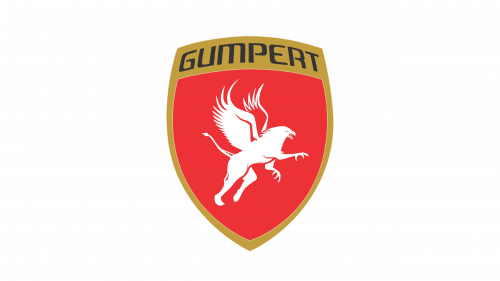
Gumpert logo was a shield shape with a red core and a golden frame. The frame went along the sides and culminated in a golden plaque in the top. That’s where they put the company’s name. The red center, for its part, was occupied only by a white picture of a griffin.
The creature’s image was exquisite, actually. A lot of effort went into it. They drew it leaping forward with claws (the front legs were that of an eagle) outstretched for attack. Much of the rest of the body was lion’s. That included two bent rear paws and a long tail.
The avian bits also included long wings on the back and, naturally, the head. Unlike many of the other griffin depictions, it wasn’t really malicious. The eye was just a red dot, and the beak wasn’t really opened into a terrible shriek. It was just slightly parted, that’s all.
The coloring could differ, but mostly in terms of additional effects. Some variants just remove the shading, curves and illumination effects, making the emblem completely 2D. Apart from that, it’s the same color scheme in most variations.
Lastly, the wordmark featured on top of the emblem was curved to fit the arched edge. The letters were fully uppercase, typically wore the color black and used a unique font that made many parts of these characters look blocky and square.
ISO
ISO Rivolta is a car brand that operated mainly between 1930s and 1970s. The carmaker exists even now, although it’s mostly a revival by other people. Most of the cars produced by the original company were tourers, grand tourers and other high-performance cars, although some normal passenger vehicles were also present.
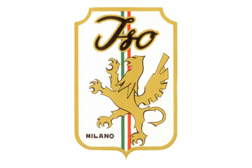
For most of their later years, ISO used a logo that featured a griffin. The same logo is used for cars created under the revived brand. There are some variations, but it’s generally the same white shield with a griffin placed in the center and surrounded by some other details.
The shield is usually a golden frame arranged into a generally rectangular shape with some modifications (cut corners and a little protrusion in the bottom). The background inside the shield is normally white. It’s followed by ribbon that goes vertically through the middle. The ribbon uses the national Italian colors of green, white and red (from left to right, naturally).
The griffin, for its part, is usually located in the center, but closer to the bottom. It occupies ¾ of the shield’s height. They portray it as rearing (or perhaps dancing) and standing on just one leg. The other three are in the air, on various levels. It’s a typical pose for lions and other animals in heraldic.
Normally, the creature is made of gold on the emblem. There are some darker lines here and there for feathers and other small details, but it’s pretty much various shades of gold. There are some darker colors, like the shades on the wings and a straight-up black dot for an eye, but that’s it.
The last element is a big word ‘Iso’ above the griffin. At least, that’s what they usually put there. It’s made using an italic, hand-written font with dark grey letters. Some variations just don’t put it there at all and instead place ‘ISO RIVOLTA’ in black letters below the griffin, but that’s just variations of the same thing.


