

![]() Calgary Roughnecks Logo PNG
Calgary Roughnecks Logo PNG
Sports fans have fallen in love with the Roughnecks because of their high-scoring, fast-paced games. The club won the NLL Cup three times overall, with its most recent victory in 2019. Over the years, it has been proud to have talents like Geoff Snider, Lewis Ratcliff, Taylor Wray, and Tracey Kelusky. Several Roughnecks players received recognition for their services to lacrosse as those selected into the NLL Hall of Fame.
Meaning and History
![]()
The Calgary Roughnecks are a sports team that has been around for over twenty years. Roughnecks started playing lacrosse professionally at the start of a new century in 2001. They have since made a name for themselves as one of the NLL’s top teams. The team founded a non-profit foundation called the Calgary Roughnecks Foundation to aid in the growth of lacrosse in the area.
What is Calgary Roughnecks?
The Calgary Roughnecks, a pro lacrosse team, enjoy support from their devoted fanbase. Throughout their existence, the Roughnecks have enjoyed remarkable success, taking home three NLL Championships.
2000/01 – 2020/21
![]()
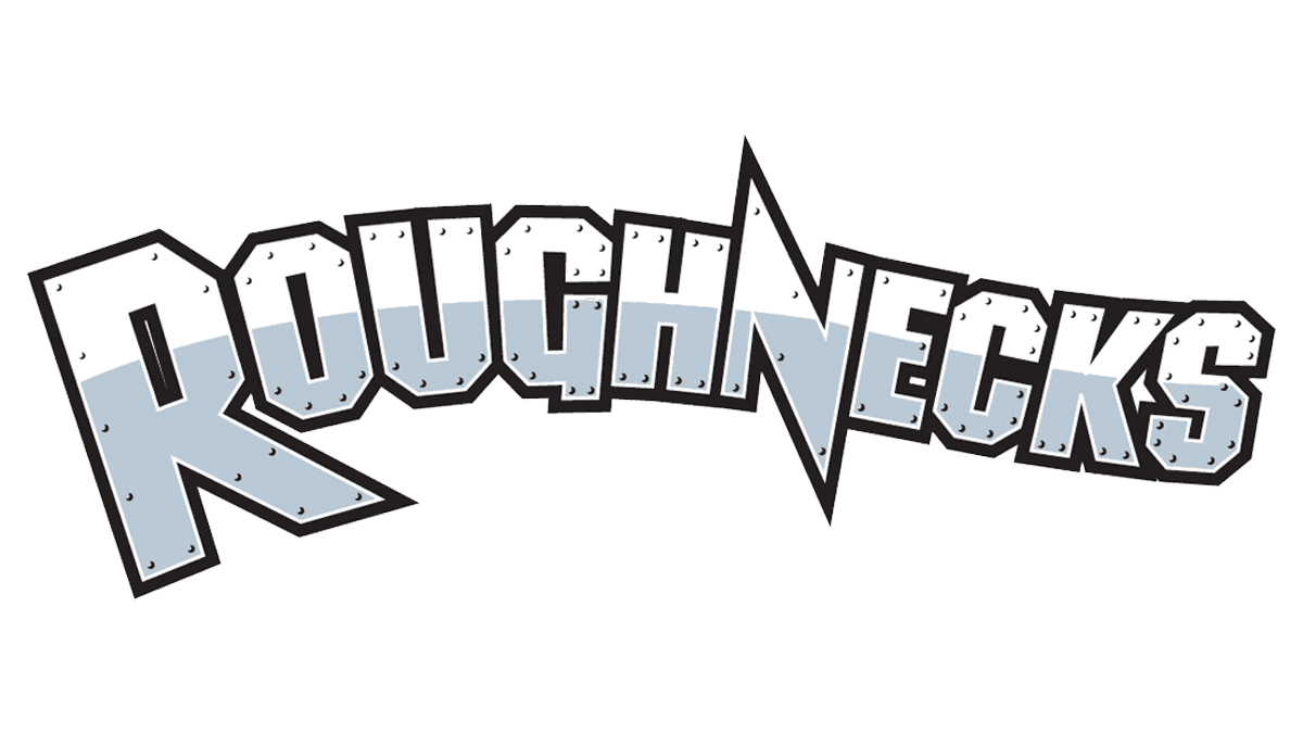
Their logo reflects the team’s passion and determination to win every game. It presents the players as strong and tough individuals. A very muscular man in a red shirt and red gloves with a hard hat and lacrosse stick. An expression on the face of the player shows determination and assertiveness. The designer also added the rocky mountains of Calgary, using different textures and shades to create an abstract image. The name underneath, more specifically the “Roughnecks” line, appears to be made from a metal sheet and even has nails in the upper portion. It is placed on a black background, which matches other black elements in the logo.
2020/21 – Today
![]()
The logo still features a miner with a lacrosse stick. The red shirt and gloves were changed to dark gray. Another update was the removal of a metal-like appearance of the hat and inscription. There are no more mountains in the logo as well. This design version looks more balanced and not as aggressive since there is no more red. This version looks a bit more professional thanks to fewer details and a more reserved color palette.
Font and Color
The original color palette consists of different shades of gray, including metallic gray, black, beige, and red. While black and gray create a rather neutral base and feeling of control and stability, the red brings passion, activity, power, and even anger. It attracts attention to the logo and shows that the player is a dominant character. In the later version, the red is removed, making the logo look less overwhelming, while still preserving a strong and powerful image.
Two fonts are used for the logo. There is a bold, geometric font that has diagonally cut and square corners. There are also characteristic pointed, sharp ends that give boldness and dynamics to an already dashing overall image. A second line features a rather basic sans-serif font. The whole inscription is done in all caps to enhance a strong look.


