

![]() Albany FireWolves Logo PNG
Albany FireWolves Logo PNG
Albany FireWolves is the name of a pro lacrosse team. The wolf has always been associated with leadership, strength, and courage. In addition, they always stay together, which is a perfect way to represent the club’s teamwork. The “fire” portion of the name reminds of the gathering of the local tribes around the fire. Just like they gathered around the fire in the old days, the community gets together to see the Albany FireWolves play lacrosse.
Meaning and History
The Albany FireWolves team name is a modified franchisee name that moved to Albany, which is the New England Black Wolves. They relocated from Connecticut, where they played for five years until 2020. Meanwhile, the wolf character was inspired by an emblem of another lacrosse team that played in Albany earlier. This way, the team was able to bring their own history with them and be relatable to their new location. Although it does not have a long history in Albany, the team was able to bring together a large crowd of admirers and loyal fans.
What is Albany FireWolves?The Albany FireWolves are a pro box lacrosse team representing the Capital Region in New York. They play in what is widely believed to be North America’s best professional indoor lacrosse league – the NLL.
2021/22 – Today
![]()
The logo of the team combines the two parts of its name – a fire and a wolf. The fire serves as the base and holds an image of a wolf head at the top. The wolf has a very aggressive and fearless expression. Surrounded by fire flames, it looks like a true leader who is ready to fight its enemies. Its sky-blue eyes are ready to pierce anyone who would cross the line. The name, of course, is also taking up a prominent place in the logo. The focus here is place on the “FireWolves” portion of the name. The inscription is custom and has all caps. The first and last letters are larger than the rest and drawn in such a way that the inscription looks symmetrical.
Font and Color
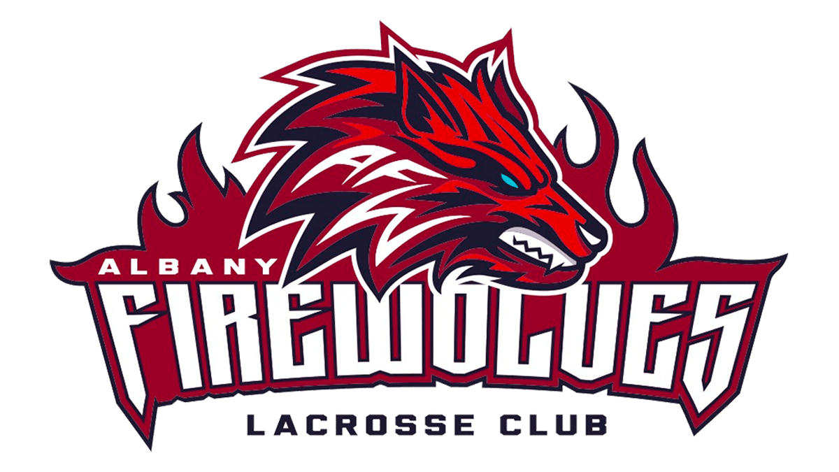
The logo features several different custom fonts. The first word in the name is printed using a basic, sans serif font. The second portion features a more elaborate and fancy font choice. It combines straight cuts, curves, and even pointed elements. There is also a less noticeable tagline that uses a geometric font with bold strokes.
There are several colors featured in the logo. However, the dominant color here is crimson. It is accompanied by a bold and strong black. There is also a color of perfection –white. Some beige and even sky blue are also included in the logo. The combination created a very powerful and impressive image.


