Creating a professional and unique LinkedIn cover photo can hugely impact your profile and online presence. Your LinkedIn profile is an essential marketing tool for you, and you must keep everything perfect. A cover photo is the center of attraction and needs to be well-crafted. One important tool to keep in mind when designing your cover photo is Vista Create, which is an online editing tool with several image editing features such as background removal, image resizing, and more. Here are six tips to help you create an eye-catching and professional LinkedIn cover photo to make your profile stand out and attract potential customers.
#1 – Talk About Yourself
You should be aware that most people will not browse your profile. Thus you must try to capture them only by your cover picture. Try to speak about yourself and provide them with short and simple information about what you do and who you are in the photo. Remember that your cover picture is an advertisement for you, so interact with the people. Talking about oneself boosts your chances of attracting new clients and consumers.
#2 – Make It Visually Appealing
You should choose a colorful, attention-grabbing image that defines your personality and brand. It is wise not to choose stock images as they may seem unoriginal. A high-resolution image is very important to create a good first impact, and you must make sure the picture is linked to your brand or the services you offer in any way.
You should also compare your cover photo to your profile picture and ensure they are cohesive with the same color scheme or theme. Avoid using different colors and themes as they seem unprofessional and do not appeal to the general audience.
#3 – Consider Your Target Audience
Remember that there is no set pattern when selecting a cover photo. It all depends on your audience and the type of audience you want to attract. So, you should focus on themes, colors, and images related to your industry. For example, suppose you are a Mechanical Engineer. In that case, a picture showing mechanical parts will be a good thing to go with, or if you work for a construction site, showing buildings and construction graphics will be the best option. The goal is to create a cover picture representing your personal brand and helping you stand out from the crowd.
#4 – Keep It Simple
Remember not to overcomplicate things and avoid including unnecessary information in your cover picture. If you’ve included text, make sure it’s legible, and the font isn’t too vivid. A cluttered cover with a lot of information is unlikely to capture the viewer’s attention. The cover should have enough information to pique the viewer’s curiosity in viewing the rest of your profile. A basic design with little text will always appear better than a complicated design with large amounts of text.
#5 – Commit to a Color Scheme
Choosing a color scheme that complements your brand is vital to making a cover picture. You must commit to it throughout since it demonstrates professionalism and helps your profile stand out. Colors may quickly convey your personality and the industry in which you work. Bright colors may represent energy and excitement, whereas milder colors, such as blue and green, might indicate trust and reliability.
Choose a color scheme based on your industry. After you’ve developed your cover picture in those colors, keep the color scheme consistent across your profile, including the background and other visuals.
#6 – Optimize for Mobile & Laptop Viewing
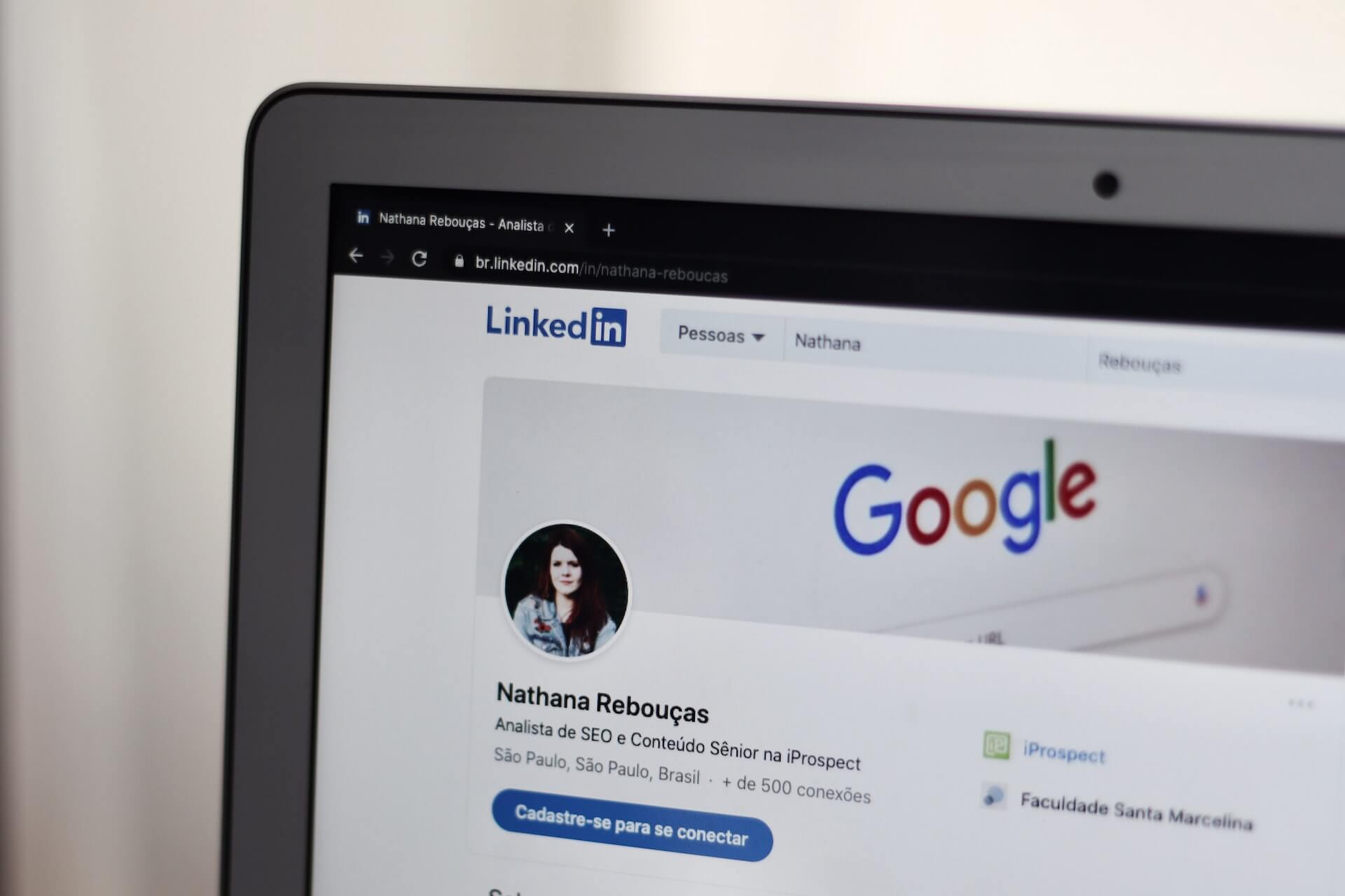
Once you’ve finished your design, ensure it can be seen on both a laptop and a mobile device. How your image appears on various devices might influence your profile, so always verify how your cover photo appears on a mobile device before publishing it. Check your profile on multiple devices, or utilize design tools to test how your photo will look in different sizes. Some text or graphics may not appear on mobile, and you will have to make the necessary adjustments and changes to make sure the picture can be viewed from any device.
Conclusion
Remember that a design has no set pattern, and you can always choose something unique for your brand. You must never underestimate the power of visuals as they have the power to bring in new customers and opportunities. So, be creative with your design and keep these tips in mind.


