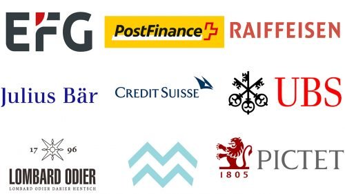
Most Swiss banks’ logos emphasize the long history of the company in one way or another. While they look more cluttered than an average modern logo as a result, these details are important and meaningful. None of them is overly artistic or creative as it is important for any bank to emphasize its conservative (“reliable”) nature.
UBS
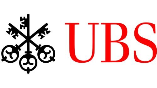
The emblem featuring three keys symbolize the strict bank–client confidentiality and banking secrecy, of which UBS is especially proud. According to the company, the keys represent “confidence, security, and discretion” (which seems to mean the same). We can also mention the historical meaning of this symbol (unlock the doors to wealth, health and luck).
The three keys can be used either as a standalone logo or in combination with the abbreviation “UBS” in red. It features a serif type, which is traditional without being overloaded.
Swiss National Bank
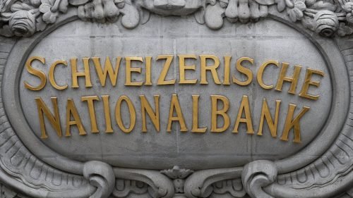
This is probably one of the heaviest bank’s logos. You can see the name of the institution in five languages, which means about 15 words are used. Although the designers have opted for a simple sans serif type, the logo still is pretty difficult to grasp.
The problem is that each new word should bear additional meaning, while here the same meaning is replicated five times. It is an interesting way of addressing the multinational customer, though.
Credit Suisse
The sail-like emblem symbolizes “the pioneering spirit of the entire bank and the heritage of our business,” according to the bank’s official website. The design has gone through multiple updates over the years. The latest version was introduced in 2006.
Julius Baer
This is one of the simplest Swiss banks’ logos – there is only the name of the brand. The type is a rather formal serif one.
The Pictet Group
The emblem contains an explicit indication of the company’s long history (the year 1805). The heraldic lion only reinforces this impression. The type looks modern enough, though.
Mirabaud Group
While the emblem looks like a double “M” (the initial letter of the company name), it also seems to represent the mountains for which Switzerland is known for.
Bank Lombard Odier & Co
The intricate symbol separating the number “17” from the number “96” adds a historic touch, which reinforces the meaning of the numbers. While the bank opted for the simplified name “Lombard Odier Group,” in 2010, the names of the four founding partners are still included in the primary logo.
Raiffeisen Switzerland
The logo known as the Gable Cross was introduced back in 1877 when the founder was still alive. According to the company, the two crisscrossed horse heads represent protection and safety. Interestingly, a long time ago, the so-called roof gable was often used on the roofs of European houses as it was believed to protect against all dangers.
PostFinance
The red cross the logo has been inspired by the long-time symbol of Switzerland, which can be seen in its flag and coat of arms.
EFG International
Unlike most other Swiss banks logos, this one does not emphasize its age or traditions (at least explicitly). It has a totally modern and easy-to-grasp style, although the details bear symbolic meaning.


