
VMware is an American software company, which is specialized in cloud storage and virtualization services. The company was established in 1998 and works closely with both Microsoft and Apple.


VMware is an American company founded in 1998 by Edouard Bugnion, Mendel Rosenblum, Diane Greene, Scott Devine, and Edward Wang. Even then, the company’s mission was to improve the efficiency of computing, and as we can see, VMware is still successfully following the chosen path, which has led to the fact that today the company is a world leader in the development of software based on virtual machine technology and cloud infrastructure.
The company’s first product was Workstation 1.0, a system virtualization software that allowed users to deploy multiple virtual machines on a single hardware computer and run completely different operating systems on them.
Today, VMware provides a variety of software solutions that help businesses optimize infrastructure, improve efficiency and reduce costs. Through advanced virtualization and cloud management technologies, VMware is transforming businesses’ IT infrastructure to make it more flexible, reliable, and secure. VMware has three core businesses: Software-Defined Data Centers (SDDC), Hybrid Cloud, and User Desktop Virtualization (VDI).
As an innovator in virtualization and policy-based automation, VMware simplifies IT infrastructure at all levels of the data center. The company’s virtualization software benefits 500,000 customers worldwide. VMware is one of the fastest-growing publicly traded software companies. Headquartered in Palo Alto, California, VMware is operated by Dell Technologies Corporation.
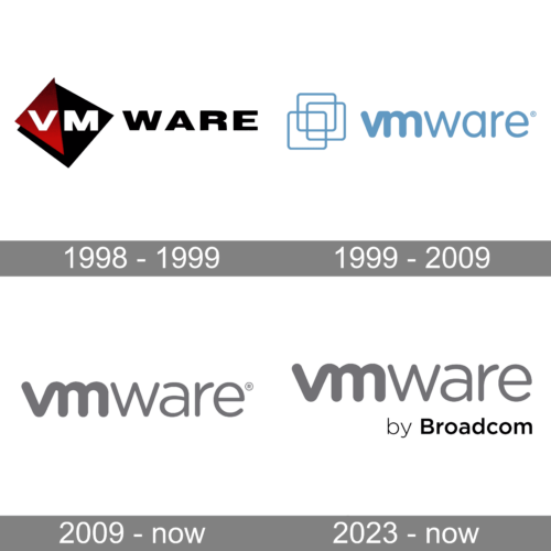
The original logo showcased the “VM” emblem with the lettering “Ware.” The letters in the emblem were white. They were positioned over two triangles, a red and a black one.
The word “ware” was given in black over the white background. The type was a simple sans.
The previous versions of the logo used an emblem, which was placed next to the wordmark, that didn’t change.
The emblem was a combination of three squares with rounded corners. The squares partly overlapped. While the type used for the wordmark was the same as in the current version, the color was different. In contrast to the current gray logo, the previous one was of a muted shade of blue.
The current VMware logo is fully text-based. The wordmark in all the lowercase lettering is executed in a modern sans-serif typeface, where the “VM” part is bold and rounded and the “ware” part is thinner with more distinct lines.
The VMware logo is strict and simple, it uses a classic shade of gray for the wordmark, which is a representation of a serious and confident approach to developing software and the reflection of the company’s stability.
The multicolor version of the emblem is a celebration of the brand’s numerous possibilities and services, which are all of the highest quality.
The redesign of 2023 has only added one small touch to the VMware badge, created in 2009. It is a delicate “by Broadcom” tagline, written in small title case characters in the bottom right part of the composition, using a more geometric style of a sans-serif font, than the main wordmark, and executed in a plain black color, which makes it instantly visible.