
The Toyota Supra is recognized for its exceptional handling, mighty engines, and rear-wheel-drive layout. The latest models incorporate advanced technology, including a range of driver-assistance features and various performance modes that enhance driving dynamics. The continued interest in both the classic and latest models proves its lasting impact. Many owners modify their vehicles, and the availability of aftermarket parts for the Supra is extensive. This has led to a vibrant community focused on upgrades.


The Supra started in 1978 as a derivative of the Toyota Celica, designed for more power and comfort. In 1982, the company introduced a second generation that had a more aerodynamic body and enhanced performance. Its third generation gained significant acclaim for its performance and became a favorite among tuners. Perhaps the most iconic version is the A80 Supra. In 2019, the company started a collaboration with BMW, which marked the release of yet another generation of Supra cars.
What is Toyota Supra?
The Toyota Supra is a well-regarded Japanese sports car that has a rich history. Powerful engines and impressive performance capabilities attract and amaze many. The brand has become an icon of tuning culture, with many models being tuned for enhanced functionality and appearance.
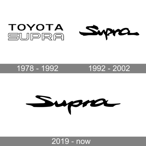
The Toyota Supra logo features the brand name without any other decorative elements. The “Toyota” line is done in a bold, modern font. All the characters are capitalized and have wide spacing between them. The “Supra” part is more stylized as it features more rounded strokes and a double line. This minimalistic logo design creates an image of a sophisticated and respectable brand.
The updated logo looks nothing like the earlier version. It has a handwritten-style cursive font with thick strokes. The letters have a dynamic appearance, which is exactly what a sports car logo needs. It is also worth noting that the “S” looks like a winding road in the desert or between the mountains. Some characters are slightly slanted, while others stand straight. They also have varying sizes. The logo surely has a unique and distinctive appearance that underlines the exclusivity of the Supra cars. Despite this seeming carelessness, the logo looks symmetrical and designed with each stroke being done purposefully to look just the way it looks.
The logo was slightly redrawn but the idea born in 1992 remained the same. The designer made the terminals smoother and more pointed, emphasizing the speed and sportiness of the brand. There is also strength and power of the sports cars reflected with the use of bold strokes. Although it still looked handwritten, the logo acquired a more refined appearance, showing the world that each model gets better while still keeping the brand’s special characteristics.
In the 1978 logo, the company used a font similar to Heading Pro Ultra Wide Bold font or Wedding Gothic ATF Bold font for the “Toyota” line. The “Supra” line, uses a double-line font that resembles Courages Outline Regular font. The font style in the next versions is similar to MoanHand font by Joebob Graphics.
Depending on the model year and variant, the logo can be presented in different color schemes, often featuring red, black, or silver tones. The official and most common color palette is black on white. Relatively recently, it is also possible to see the addition of red. The black color allowed the brand to convey a sense of power and agility, aligning with the vehicle’s image as a high-performance sports car.