Punjab Kings is the name of one of ten teams from the Indian Premier League, the most reputable cricket organization in its country, and the most watched cricket league in the world. The club was established in 2008 and is owned by four reputable Indian people, among whom is a famous actress, Preity Zinta.
Meaning and history
Punjab Kings is not the most successful club, playing in the Indian Premier League, as they only showed up in the playoff in 2014. Although, it is still very popular, and first of all, due to a very interesting team of owners. The club is owned by four bright individuals, who are very famous in India. They are Preity Zinta, an actress, Ness Wadia, the head of Bombay Burmah Trading Corporation, Karan Paul, one of the managing directors of India’s oldest privately-owned business, and Mohit Burman, one of the most well-known and reputable Indian businessmen.
Punjab Kings cricket club was established in 2008, and until 2021 they played under the name Kings XI Punjab, which can easily be traced by the crests of the club. Today the kings have two home arenas — the Inderjit Singh Bindra Stadium in Mohali with a 26 thousand capacity, and Mullanpur International Cricket Stadium, with a capacity of 38 thousand.
What are Punjab Kings?
Punjab Kings is a professional cricket club from India, which was established in 2008, and today competes among the ten strongest teams in the Indian Premier League. The club has Inderjit Singh Bindra Stadium in Mohali as its home arena and Trevor Bayliss as the head coach.
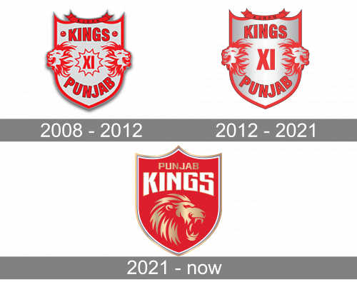
As for the visual identity, the Indian cricket club from Mohali has always been pretty consistent, with just one major redesign of the badge, held in 221, keeping the original symbolism and mood of the crest.
2008 – 2012
The very first Punjab Kings logo, introduced in 2008, has stayed with the cricket franchise for almost four years and became a very elegant and strong basis for future redesigns. The crest, set in silver and red, featured a bold uppercase inscription, set along the top and bottom lines of the shield, the “XI” Roman number in a sharp framing, and two lion heads, going out of the crest to the sides.
2012 – 2021
The redesign of 2012 has kept the original composition of the Punjab Kings logo, but refined and modernized all of the elements, including the body of the crest, which became metallic silver with some slight gradients, making the whole banner look voluminous and cool. The shade of red also got brighter and more powerful, creating a strong contrast and making all contours look cleaner and more distinctive.
2021 – Today
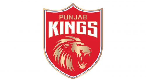
In 2021 the logo of the cricket team from India was redesigned again, with the concept slightly different from the previous one. The main thing about this redesign was the graphical part: the two lion heads turned to the sides, were replaced by one enlarged stylized image of the head, drawn in gradient golden lines in the middle of the badge, against a solid red background. The lettering was moved to the upper part of the logo, with the two lines set in different styles and colors, gold and white.
Font and color
The elegant yet massive and confident lettering from the primary badge of the Indian cricket franchise Punjab Kings is set in two styles of a fancy and modern sans-serif typeface, with interesting contours of the letters and playfully curved lines of some bars. The closest font to the one, used in this insignia, is, probably, Redzone Bold SemiExtd or Serpentine Serif EF Medium, but with some modifications.
As for the color palette of the Punjab Kings’ visual identity, it is based on the combination of three shades: red, gold, and white, which look very elegant and powerful, evoking a sense of strength and reflecting the fighting spirit of the club and its determination.


