

![]() New York Riptide Logo PNG
New York Riptide Logo PNG
Talented athletes who have represented their nations in international competitions make up the roster of the Reptides. The lacrosse team’s devoted supporters are referred to as “Riptide Nation.” During games and other events, fans are entertained by the beloved mascot, Ripper. The team’s robust web presence enables supporters to maintain a feeling of connection and involvement.
Meaning and History
Situated in the New York metro area, the New York Riptide is a club that plays lacrosse professionally. It was one of the newest members when it joined the league in 2018. The next year, they started their road to becoming the strongest team in the NLL. Just like riptide is a strong water current that is hard to predict, the Riptide athletes are powerful players and the opponent does not know their next winning move.
What is New York Riptide?
The New York Riptide is an NLL franchise team. Just like other teams, it has a mascot, who is known as Ripper, and a nickname for its fans. Both make the atmosphere cheerful and energetic, ensuring an exhilarating and electrifying experience.
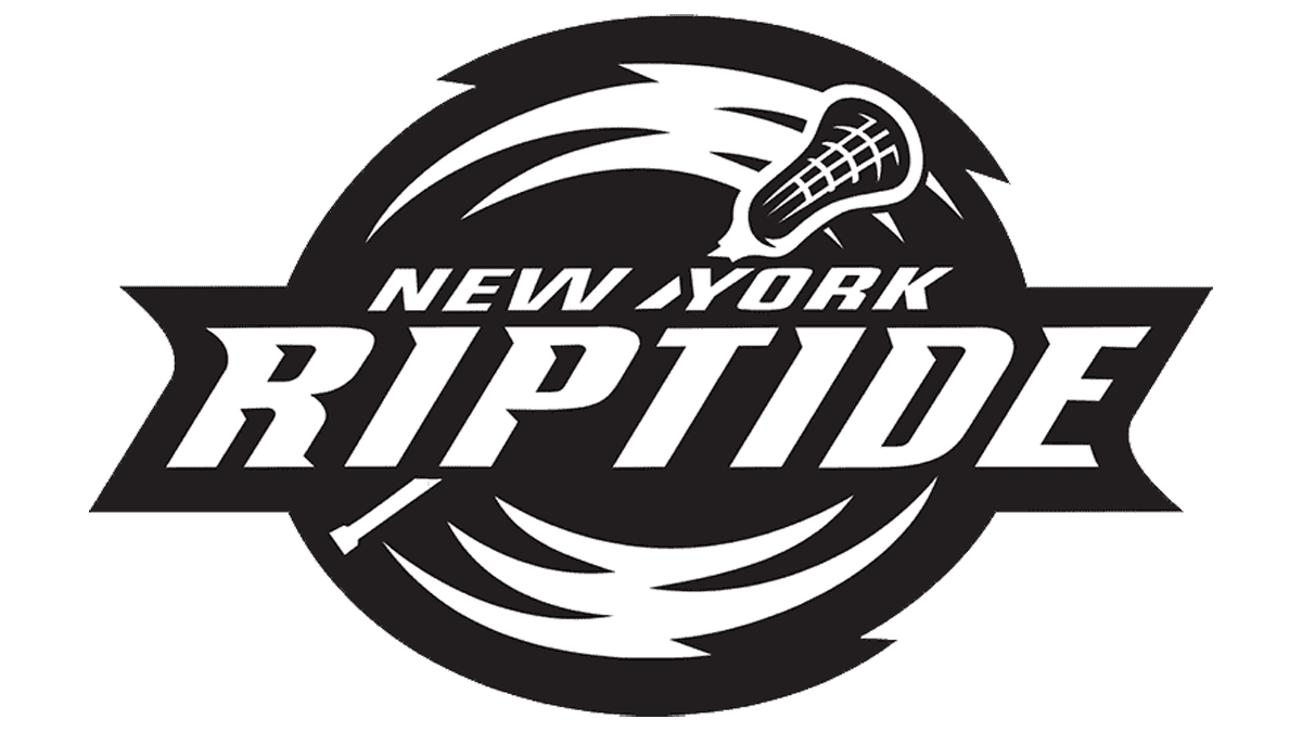
2019/20 – Today
![]()
A bold and colorful logo represents the Riptide. It has an oval shape with a ribbon across it. The ribbon carries “Ripptide” printed in white using a bold, pointy font. The “New York” portion is positioned right above and features a smaller, sans-serif font. This line is done in the same orange shade that is also featured in the logo’s border. The designers did not forget about the fact that this is the logo of a sports team and added swirls for dynamics. These swirls also stand for the riptides, which are powerful water currents. There is also a lacrosse stick placed in the background, which makes it clearer that this is a lacrosse sports team logo.
Font and Color
The logo uses two different fonts. The top line features a sans-serif, italicized font. It uses thick strokes that create a confident look. The second line is also italicized, enhancing a feeling of movement and reflecting the game dynamics. This font has pointed serifs that go well with other logo elements and an overall idea. The font is a perfect combination of smooth curves, straight cuts, and sharp angles.
The logo of the club looks colorful thanks to the bright orange that stands out against a dark blue base, while the teal color complements it. The orange contributes to the feeling of warmth and energy. The color combination not only attracts attention but is also pleasing to the eye.


