Indiana University is among the older varsities in America. They first appeared in 1820 in Indiana and they remain the primary uni for this state ever since. The IU is ranked as the 68th best university in the country. It’s now particularly prestigious, but it’s still among the biggest such establishments in the Midwest.
Meaning and History
The University was established back in 1820, but they didn’t have a proper emblem until the 1970s. For the longest time, their one symbol was the official stamp: a book with the words ‘light and truth’ in Latin around it and the round frame featuring the full name. The coloring was crimson. The emblem was created based on this color scheme, too.
What is Indiana University?
Indiana University is a university, based in Bloomington, Indiana. This uni was founded in 1820, and they currently have a sports branch, called Indiana Hoosiers.
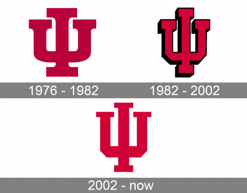
1976 – 1982
They developed the logo by combining the letters ‘U’ and ‘I’ into a single image without borders. As a result, they made a shape similar to a triple candlestick or a trident. The font was a regular college serif with blocky tips, and the color was a light crimson shade.
1982 – 2002
After that, they decided to add more perspective to the logo by rotating it slightly to the right and giving it a black underside. The color was changed to a darker burgundy hue.
2002 – today
The style was then returned to the original flat design, except they made the image taller, narrower and made the font a bit more abrupt and strict. The color is a brighter crimson, compared to the ’76 emblem.


