

![]() Georgia Swarm Logo PNG
Georgia Swarm Logo PNG
One of the NLL’s more recently flourishing teams is the Georgia Swarm. Over the years, a fierce rivalry has grown between the Toronto Rock and the Swarm. The Covid-19 pandemic placed a pause on their success, but the fans were eagerly anticipating their games. There is an entire Swarm Hive of supporters that enthusiastically applaud them while they are playing. Infinite Energy Arena provides the playing field for home games.
Meaning and History
![]()
When the professional lacrosse team Georgia Swarm initially started playing in 2004, they were known as Minnesota Swarm. They moved to the state of Georgia when the lease for the place they were playing at was coming to an end. In 2017, after just two seasons on the new location, they won their first NLL title. It is not surprising as the team has a lot of noteworthy players. For instance, Lyle Thompson received the 2024 NLL Sportsmanship Award with pride.
What is Georgia Swarm?
One of the NLL’s prominent teams is the Georgia Swarm. Many of its players received awards and recognition for their outstanding accomplishments.
2015/16 – 2018/19
![]()
Their logo looks dynamic and lively. It has a shape similar to an oval, which features abstract white swirls on top and bottom that create an impression of speed and movement. The word “Swarm” is printed in bright, energetic yellow across the center. It uses a sans-serif type. The letters are bent in such a way that there is an illusion that it is bending around the base. The words “Georgia” and “Lacrosse” complete the inscription. They are done in white and use a smaller, sans-serif font with rounded corners and straight cuts.
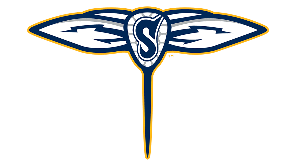
2019/20 – Today
![]()
A modern and more minimalistic logo was presented for the 2019/20 season and has been used since then. The full name is placed in one line and uses the same font and yellow color. It is split in half by a lacrosse stick placed vertically. The stick has wings and resembles a dragonfly. To make the logo even more detailed, the designers added a decorative “S” on the lacrosse stick. The color palette has been preserved, which allowed the team’s identity to stay recognizable.
Font and Color
Their colors are identical to those of the Minnesota Swarm, which existed before them. A bright yellow color in the logo stands for the energy and enthusiasm of the players about winning each game. Meanwhile, the blue represents their dedication to the game and their fan base.
The original logo combines two different fonts. The most prominent one is a custom font that has characters wrap the base. They have sharp, stretched ends that are meant to support the swirls and impression of movement in the overall image. The other font is more reserved and has contrasting rounded corners with straight cuts. The second logo uses the same font for all the inscriptions. It is a geometric font with rounded corners and straight cuts. The font closely resembles Liquorstore designed by Chank Diesel at Adobe Fonts.


