
DiGiorno is renowned for its frozen pizzas, which offer the taste and texture of freshly baked pizza straight from the oven. Owned by Nestlé, a global leader in the food and beverage industry, DiGiorno operates predominantly within the United States. This strategic focus has allowed it to cater specifically to American tastes and preferences in frozen food, ensuring its products resonate well with local consumers.


DiGiorno was established to revolutionize the concept of frozen pizza. Launched by Kraft Foods in the 1990s, it introduced the notion of a frozen pizza that could rival the quality and taste of pizzeria offerings. This innovation was marked by the introduction of its signature “rising crust” pizza, which became a game changer in the frozen food aisle. Over the years, DiGiorno has achieved numerous milestones, including expanding its product line to include a variety of crusts and toppings designed to satisfy a diverse range of palates and preferences.
Today, DiGiorno holds a commanding position in the frozen pizza market in the United States. Its continued innovation in the sector, with recent launches like gluten-free pizzas and organic options, underscores its commitment to meeting the evolving tastes of consumers. DiGiorno’s ability to maintain a strong market presence reflects its adaptability and ongoing dedication to quality and consumer satisfaction.
What is DiGiorno?
It is a company that specializes in producing frozen pizzas that mimic the experience of restaurant-quality pies. Their products are designed for convenience, aiming to deliver a high-quality taste that can be enjoyed at home.
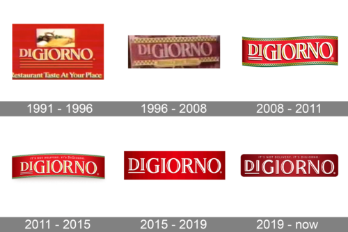
The 1991 DiGiorno logo features a classic and elegant design, showcasing the brand’s commitment to delivering restaurant-quality pizza at home. The logo is predominantly red, which evokes a sense of warmth and appetizing appeal. The brand name “DiGiorno” is prominently displayed in large, serif letters, with a gold outline adding a touch of sophistication and luxury. The font choice is traditional yet bold, conveying reliability and quality. Above the brand name, there is a small image depicting a deliciously baked pizza, reinforcing the brand’s promise of restaurant-quality taste. Below the “DiGiorno” text, three horizontal gold lines provide a balanced and structured look, adding to the overall aesthetic appeal. The tagline “Restaurant Taste At Your Place” is positioned at the bottom, written in a smaller, italicized font, further emphasizing the brand’s key selling point. This logo effectively communicates DiGiorno’s mission to bring gourmet pizza to the home kitchen, combining elegance with a strong visual impact.
The 1996 DiGiorno logo retains the classic red color scheme but introduces a more intricate and visually engaging design. The brand name “DiGiorno” is displayed in bold, white serif letters, outlined in gold, set against a rich red background. The red backdrop is framed by a gold checkerboard pattern at the top and bottom, adding a touch of Italian authenticity and highlighting the brand’s heritage. The font is slightly more modern than its predecessor, yet it maintains a sense of tradition and reliability. The use of gold and red throughout the logo creates a luxurious and inviting feel. Below the brand name, a small, rectangular gold banner adds a subtle yet effective visual element, enhancing the overall design’s balance and symmetry. This version of the DiGiorno logo effectively combines tradition with a touch of modernity, making it visually appealing and reinforcing the brand’s identity as a provider of high-quality, gourmet pizza.
The 2008 DiGiorno logo introduces a fresh and dynamic design, while still maintaining key elements that represent the brand’s heritage. The logo features the brand name “DiGiorno” in bold, white serif letters, prominently displayed against a bright red, wavy banner. This wavy banner adds a sense of movement and modernity to the design. The red background is complemented by green and gold checkerboard patterns at the top and bottom, which add a touch of Italian flair and authenticity. The gold outline around the letters enhances their visibility and adds a premium feel. This logo iteration also includes subtle shadowing behind the text, giving it a three-dimensional effect and making it stand out even more. The combination of traditional elements with modern design touches creates a visually engaging logo that effectively communicates DiGiorno’s commitment to quality and its Italian heritage.
The 2011 DiGiorno logo features a sleek and modern design while staying true to the brand’s core identity. The logo showcases the brand name “DiGiorno” in bold, white serif letters, outlined in gold, prominently set against a red, slightly curved banner. This curvature adds a sense of dynamism and flow to the design. Above the brand name, the tagline “It’s not delivery. It’s DiGiorno.” is written in smaller, uppercase white letters, reinforcing the brand’s well-known slogan. The green and gold checkerboard patterns from previous versions are retained at the top and bottom of the banner, adding a touch of Italian authenticity and heritage. The use of gold outlines and subtle shadowing gives the text a three-dimensional effect, making it stand out. This logo effectively blends modern design elements with traditional touches, creating a visually appealing and memorable brand identity that highlights DiGiorno’s promise of delivering restaurant-quality pizza at home.
The 2015 DiGiorno logo adopts a cleaner and more refined approach, emphasizing simplicity and elegance. The brand name “DiGiorno” is displayed in bold, white serif letters against a rich red rectangular background. The font is modern yet maintains a sense of tradition, with the letters outlined in gold to enhance their visibility and add a premium touch. The red background is solid and deep, creating a strong visual impact and making the white letters stand out prominently. This version of the logo does not include additional graphic elements, focusing solely on the brand name to ensure maximum readability and brand recognition. The clean lines and minimalistic design convey a sense of modernity and sophistication, aligning with the brand’s commitment to high-quality, gourmet pizza. This logo iteration effectively communicates DiGiorno’s brand identity through its simplicity and elegance, making it memorable and easily recognizable.
The current DiGiorno logo represents a modern and streamlined evolution of the brand’s identity. The design features the brand name “DiGiorno” in bold, white serif letters, prominently set against a red rectangular background with rounded corners. The font is clean and contemporary, with a slight curvature to the letters, adding a touch of modernity while retaining a classic feel. The tagline “It’s not delivery. It’s DiGiorno.” is positioned above the brand name in smaller, uppercase white letters, reinforcing the brand’s well-known slogan. The red background is solid and rich, providing a strong contrast to the white text, ensuring maximum visibility and impact. This version of the logo focuses on simplicity and clarity, with no additional graphic elements, making it easily recognizable and memorable. The overall design effectively communicates DiGiorno’s commitment to delivering high-quality, restaurant-style pizza at home, combining modernity with a sense of tradition.