

![]()
The colors chosen for a logo are more than just aesthetic elements; they are integral to a brand’s identity, playing a crucial role in communication and perception. The hues selected can evoke specific emotions, create lasting impressions, and even influence consumer behavior. The right color palette can become synonymous with a brand, transcending its logo to represent the brand’s values and ethos, creating a powerful connection with its audience. In this intricate dance between psychology and aesthetics, the colors of a logo stand as a pivotal component in crafting a brand’s visual narrative and establishing its place in the consumer’s mind.
Psychology of Color
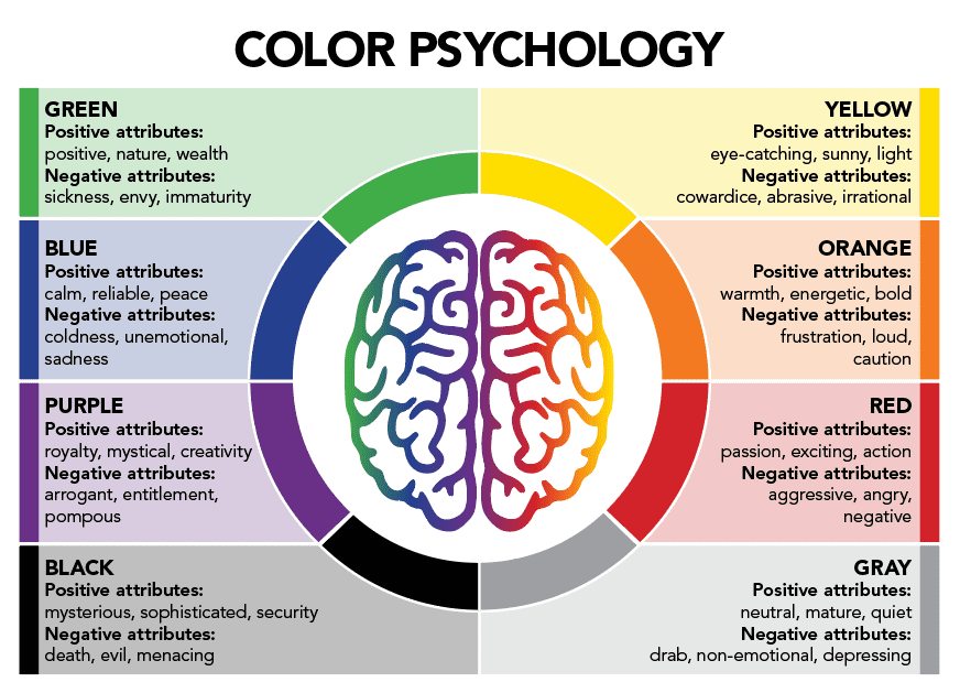
The impact of color on human psychology is profound, with each hue holding the potential to invoke specific emotional responses and behaviors. This psychological dimension of color is a vital consideration in logo design, as it can significantly influence a brand’s perception.
Red, often associated with passion, excitement, and urgency, is a color that grabs attention and is commonly used in logos to evoke a strong emotional response. On the other hand, blue, symbolizing trust, calmness, and reliability, is frequently employed by brands seeking to establish a sense of security and trustworthiness.
Green, commonly linked with nature, health, and tranquility, is another popular choice in logo design, especially for brands emphasizing eco-friendliness or wellness. Yellow, representing happiness, positivity, and energy, is often used to create a sense of optimism and vibrancy.
Moreover, each color can have varying implications based on cultural contexts and individual experiences, adding another layer of complexity to the choice of color in logo design.
In conclusion, understanding the psychological impact of colors is essential for brands aiming to communicate the right message and evoke the desired emotional response from their target audience through their logos.
Analyzing Colors in Renowned Brand Logos
When we delve into the world of iconic brand logos, we see a pattern emerge – a strategic use of color that resonates with the brand’s core message and values. The choice of color in these logos is far from arbitrary; it’s a meticulously crafted decision that plays a vital role in the brand’s identity and consumer perception.
For instance, the vibrant red of Coca-Cola is not just visually appealing, but it also encapsulates the brand’s essence of happiness, energy, and excitement. The golden arches of McDonald’s, another globally recognized logo, use yellow to convey a sense of warmth, friendliness, and positivity, creating a welcoming atmosphere.
Similarly, the calming blue of Facebook’s logo reflects the platform’s aim to foster communication and build a sense of community and trust among its users. The green in the logo of Starbucks signifies not only the brand’s commitment to environmental responsibility but also aims to create a sense of relaxation and tranquility, mirroring the experience they aim to provide in their stores.
Through these examples, we observe that the color chosen for a brand’s logo is an integral component of its storytelling, visually communicating the brand’s values, and connecting with consumers on an emotional level. The strategic use of color in logos can significantly enhance brand recognition, establishing a memorable visual identity that stands the test of time.
Choosing the Right Color for Your Logo
![]()
When it comes to selecting the perfect color palette for a brand’s logo, there are several key factors to consider to ensure that the logo effectively communicates the brand’s message and resonates with its target audience.
Firstly, it’s essential to understand the brand’s core values and personality. What does the brand stand for? What image does it want to project? The chosen color should align with these elements and accurately represent the brand’s identity.
Next, consider the target audience and their preferences. Different demographic groups may have varying associations and responses to certain colors. For example, younger audiences may be drawn to bright, vibrant colors, while older audiences may prefer more subdued tones. Understanding the audience’s preferences and cultural associations with colors is crucial in selecting a palette that will appeal to them.
Furthermore, it’s important to consider the context in which the logo will be used. Will it primarily appear online, in print, or on physical products? The chosen color should be versatile and adaptable to different mediums.
Lastly, don’t overlook the competition. Analyze the colors used by competitors in the market and consider choosing a color that differentiates the brand and helps it stand out in the crowded marketplace.
In summary, choosing the right color for a logo is a complex process that involves careful consideration of the brand’s identity, target audience, context, and competition. The selected color should align with the brand’s values, appeal to the target audience, and differentiate the brand from its competitors, ultimately contributing to a strong and memorable brand identity.
Practical Tips for Color Combination in Logo Design
![]()
The amalgamation of colors in a logo is not just about aesthetics; it’s a strategic decision that can significantly influence the brand’s image. Here are some practical tips for selecting and combining colors in a logo design.
Understanding the Basics of Color Theory
The color wheel, a fundamental concept in color theory, is an essential tool for designers. It helps in understanding the relationship between different colors and how they interact with each other. Primary colors (red, blue, and yellow) can be combined to create secondary colors (green, orange, and purple). Tertiary colors are made by mixing a primary color with a secondary color.
Examples of Harmonious Color Combinations
Analogous Colors: These are colors that are next to each other on the color wheel, such as blue, blue-green, and green. They usually match well and create serene designs.
Complementary Colors: These are colors that are opposite each other on the color wheel, such as red and green. They create a vibrant look but should be used cautiously to avoid a jarring effect.
Triadic Colors: These are colors that are evenly spaced around the color wheel, such as red, blue, and yellow. They offer strong visual contrast while retaining balance.
Recommendations for Testing Color Solutions
Before finalizing the color palette, it’s essential to test it in various contexts. Consider how the colors will appear on different mediums, such as digital screens, print materials, and physical products. Additionally, testing the logo in black and white is crucial, as it ensures the design is versatile and effective even in grayscale.
In conclusion, the combination of colors in a logo requires a thoughtful approach, considering the principles of color theory, examples of harmonious combinations, and thorough testing in different contexts. By following these tips, you can create a visually appealing and effective logo that strengthens the brand’s identity and resonates with its audience.
Common Mistakes in Choosing Logo Colors and How to Avoid Them
![]()
Choosing the right color palette for a brand’s logo is a crucial decision that can significantly impact its perception and success. However, it is also an area where many brands falter. Here are some common mistakes in selecting logo colors and how to avoid them.
Examples of Unsuccessful Color Choices
One common mistake is choosing colors that are too trendy and may not stand the test of time. For example, a brand that selects a color palette based on current design trends may find that their logo quickly becomes outdated as trends change.
Consequences of Incorrect Color Selection
Selecting the wrong colors can have several negative effects on a brand. It can create a disjointed brand image, where the logo colors do not align with the brand’s values and message. This can lead to confusion among the audience and a lack of brand recognition. In some cases, it can even result in financial losses, as customers may be turned off by an unappealing logo.
Solutions for Correcting a Poor Color Choice
If a brand finds that its logo colors are not working, there are several steps it can take. The first is to conduct research to understand the audience’s preferences and associations with different colors. This can provide valuable insights that can inform a more successful color palette. Additionally, brands should consider seeking professional advice from a designer or branding expert who can provide guidance on selecting the right colors to effectively communicate the brand’s message.
In conclusion, while choosing logo colors can be a challenging process, it is also an opportunity for brands to strengthen their identity and connect with their audience. By avoiding common pitfalls, conducting thorough research, and seeking professional advice, brands can select a color palette that enhances their logo and contributes to their success.
Conclusion
In the intricate dance of branding and design, the colors chosen for a logo are not just mere embellishments; they are integral to how a brand is perceived, felt, and remembered. The careful selection and combination of colors in a logo can significantly influence a brand’s identity, emotional resonance, and ultimately, its success in the market.
In conclusion, it is evident that colors play a vital role in logo design and branding. When selected with careful consideration, the right color palette can effectively communicate a brand’s values, appeal to its target audience, and differentiate it from competitors. It is not just about aesthetics; it is about creating a visual language that speaks directly to the consumer’s psyche, evoking emotions and responses that align with the brand’s identity.
The power of colors in branding should not be underestimated, and brands should invest the time and resources needed to make informed and strategic color choices. By doing so, they can ensure that their logo is not just visually appealing, but also a powerful tool that contributes to their brand’s story, identity, and success.


