Camay is the name of the aromatic soap brand, which was established in 1926 by Procter & Gamble, and today is manufactured by the Unilever Group. The Camay soap was extremely popular all over the world in the 1980s and 1990s and was positioned as the soap for women, it also had various scents.
Meaning and history
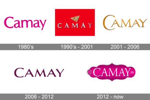
The Camay visual identity was always based on the nameplate, which was sometimes accompanied by a small emblem, and sometimes was enclosed in an ornate frame, but mostly was just used on its own, placed on a bright background of the soap’s package.
1980’s
The 1990’s – 2001
The Camay logo from the 1980s, when the brand was on the peak of its popularity, was composed of a white wordmark with a shadow, placed on a bright solid background and with a small emblem above it.
The popular soap’s emblem from that period featured a dark yellow triangle with an abstract profile of a lady, executed in green and red lines, with her hair waving. It was a symbol of femininity and freedom.
Font
The wordmark in all capitals was executed in a traditional serif typeface, which was taken from the earlier brand’s logotypes and slightly modified. The font is very similar to Trajan Pro Bold, but with both letters “A” slightly elongated and its peaks stretching up. The black shadow of the white lettering added distinction and boldness to the inscription.
2001 – 2006
In the 2000s the logo was redesigned in order to gain more elegant and classy lines. The new inscription features gold color and was drawn with a three-dimensional effect, where the letters had a thin delicate outline and slightly visible shadow. The gradient gold of the nameplate symbolizes luxury and uniqueness.
Font
The typeface, used in the brand’s logo from 2000, is similar to Classica Prestige font, which is a traditional serif font, with its horizontal bars of both letters “A” modified. They are slightly curved and shortened to their left side. The “C” is enlarged and embracing the next “A”.
The font of the inscription is elegant and sophisticated, evoking a sense of softness and a high-end product.
2006 – 2012
The logo of the second half of the 2000s was made stronger and more modern. The brand needed to stand out on the shelf and changed its visual identity in order to be more contemporary and bold.
The new color palette of the Camay logo was based on a deep purple color, which is a symbol or royalty and mystery, it evokes a sense of creativity and shows the brand as reliable and trustworthy.
Font
The brand used a completely new approach to the wordmark during this period of time. The “Camay” inscription in all capitals with the fist “C” slightly enlarged, is now executed in a sharp sans-serif typeface, which is similar to Clique Medium, but stretched and with its lines thickened.
The font has clean and neat lines, which look solid and confident and the sharp distinct angles of the letters show the product as modern and progressive, the one that improves and develops daily.
2012 – Today
The redesign of 2012 brought back the elegant and feminine mood of the logo. Now the inscription is placed into a curved frame, resembling the Arabic ornament. The pink and white color palette symbolizes tenderness and love, showing the customer as the main company’s value. The new Camay logo reflects the brand’s aim — to make your skin silky smooth.
The logo is perfectly balanced, soft lines and pointed angles of the frame repeat the silhouettes of the inscription, and it is the first brand’s version where all the letters are written in one size.
Font
The typeface, used in the logo from 2012, is very similar to Esperanto Roman, a serif font, but with the horizontal bars of two letters “A” arched, one is arched up, the second one — down. It adds playfulness and friendliness to the classic and sophisticated lines of the letters and distinct traditional serifs.
Review
The company’s products became popular in the 1920s, after their first advertising campaigns, where the soap was positioned as “white pure soap for women”, as it was the first on the market, which was not colored in order to camouflage the impurities.
In the 1970s the soap had several versions — white and pink, with scents of different intensity. The brand became truly iconic and was the most sold manufacturer of soap bars ever.
During all the time, the Camay soap was produced by Procter & Gamble company, but in 2016 it was sold to Unilever Group, which was going to rebrand the product. But something went wrong and Camay is not available for sale anymore.


