
Boston Red Sox is one of the most popular baseball teams in the United States, which was established in 1901. At the beginning of its history, the club was nicknamed “Americans” and adopted a today-famous name in 1908. One of the most rewarded professional baseball teams in America, the club is owned by Fenway Sports Group and managed by Brian O’Halloran.


Boston Red Sox is one of the oldest and most famous baseball clubs in the united states. The club was founded in 1901 under the name Boston Americans, coming to its current name by the ned of 1907. The new name was picked by the owner of the club and stayed unchanged for decades.
The baseball club from Boston is quite conservative not only with its naming and visual identity but also with the arena — Boston Red Sox has been playing in Fenway Park Stadium since 1912.
Boston Red Sox is a very strong team with many titles. It is in the third place of all the MLB teams, taking part in the World Series Championships — the club has won nine of them. Boston Red Sox has been on the top of the national championships line-up since the first years, defeating one team after another. And not much has changed by today.
What is Boston Red Sox?
Boston Red Sox is the name of a professional baseball club in the united states, which was established in 1901. Today the famous club competes in the Major League Baseball as a member of the East Division. Boston Red Sox has Fenway Park in Boston as their home arena and Brian O’Halloran as the head coach.
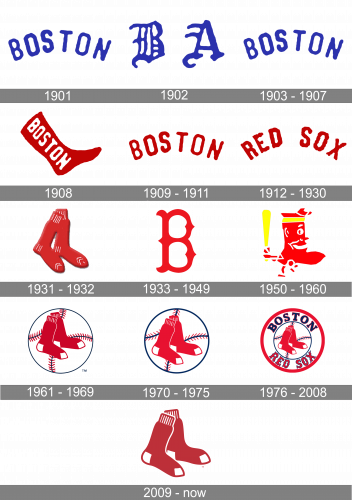
However, the very first logo of the club was blue and white. The arched “Boston” lettering was replaced by a gothic-style “BA” monogram in 1902 and came back in 1903. The bright blue letters on a white background were symbolizing professionalism and stability, along with expertise and reliability.
In 1902, the team adopted two letters ‘B’ & ‘A’ as their emblem. These were written in blue and used an old-fashioned Gothic style with a lot of unnecessary lines.
The following logo is the same as the one they used in 1901.
After the change of the team’s name, the logo was also changed in 1908. A bright red sock with white lettering, placed on its vertical part, that is how the original Red Socks logo looked like. It was playful, modern and memorable.
In 1909 the club decided to go for a logotype instead of a graphical emblem. The same style and shape as the logo from 1901, only in red was the visual identity of the club for the next two years.
The “Boston” inscription was changed to “Red Sox” in all capitals. The nameplate was also arched and fully repeated the style and font of the previous version. There was a big space between the words, making the “arch” a little broken in its middle.
The pair of Red Socks without any inscriptions was the logo for the baseball team from the middle of the 1920s. With some white stripes, the socks looked cozy and funny, making a perfect representative for the club and increasing its popularity.
The 1933 logo is instead a red letter ‘B’ written in an aesthetic of wrought iron. It’s tall and with notches and sharp serifs.
The 1950 design resembled a Native American with a very small body and a big head – in particular, in the chin area. Besides red, there were white bits, as well as a yellow headband and a baseball bat of the same color.
The logo of the next decade was composed of a baseball ball and a pair of socks against the ball had its stitches in black and red, creating a good contrast and adding a professional touch to the visual identity of the club.
The emblem was slightly refined in 1979, the socks were moved into the middle of a circular emblem, creating a better balance and making the logo more harmonized and solid.
One more difference from the previous version — the white lines of the socks was replaced by two white rhombuses, along with the white square on the heel.
Besides thicker, bolder blue lines throughout the ball, not much else changed in this version.
The redesign of 1976 brought the most complex and intense version of the team’s logo. It was composed of the previous version with the ball and socks, enclosed in a rounded frame, consisting of two circles. The “Boston Red Sox” inscription was placed on the frame, around its perimeter. The lettering was executed in a bold custom typeface with some curved lines and pointed angles. The “Boston” part was in black with the red outline, while the name of the club featured a bright red color and a thin black around it.
The current logo of one of the main American baseball teams was designed in 2008. It is the same pair of red socks, but with refined and smoother lines, which make the whole image look more modern and confident.
As an additional logo, the club uses a custom ornate letter “B” in red, which was designed in 1933 and was replicated in the logo version of 1976, used by all the lettering. The signature “B” is usually outlined in white and placed on a dark blue background. It can be a solid circle or a flag with the “Champions” tagline, celebrating the rewards of the club.
The typeface of the emblem is pretty close to Hessian, a special historical font, based on the ancient handwriting.
The team’s three official colors are red, dark blue, and white. However, the Red Sox team logo features only two of them, red and white. Dark blue can be seen on some of the secondary logotypes (the wordmark and the “B” emblem, for instance).
The primary Boston Red Sox logo doesn’t contain any text at all. Taking into consideration the unique image, there’s hardly any need to mention the name of the team – it’s hard not to guess it. However, the team does have a wordmark. The Boston Red Sox logo font, which is called Bosox, is somewhat similar in style to the team’s primary logo. The glyphs in this script have unusual (and unnecessary, from the practical point of view), sharp elements and curves creating a distinctive retro (or, to be precise, Old English) feel.
RED
PANTONE: PMS 186 C
HEX COLOR: #BD3039;
RGB: (189, 48, 57)
CMYK: (00, 91, 76, 6)
BLUE
PANTONE: PMS 289 C
HEX COLOR: #0C2340;
RGB: (12, 35, 64)
CMYK: (100, 60, 00, 56)
WHITE
HEX COLOR: #FFFFFF;
RGB: (255, 255, 255)
CMYK: (0, 0, 0, 0)