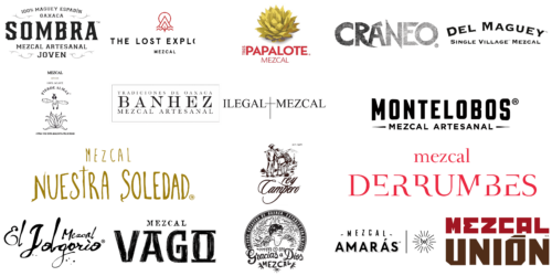
Mezcal, a spirit rich in tradition, has a story. That story starts with its logos. Each logo is a symbol, a narrative of culture and craftsmanship. In the world of mezcal, logos aren’t just branding. They’re a bridge between past and present.
Every logo reflects its brand’s identity, echoing ancient traditions and modern sensibilities. From the rustic valleys of Oaxaca to the rugged terrain of Guerrero, regional influences are evident. These logos are a canvas, displaying Mexico’s diverse heritage.
In the mezcal industry, logos vary widely. Some draw from folklore, showcasing mystical and earthy elements. Others lean towards contemporary designs, highlighting elegance and simplicity. Central to many is the agave plant, mezcal’s lifeline. It’s a symbol of endurance and connection to the land.
These logos go beyond commercial identity. They honor the artisanal spirit. Each design element – a line, a color, a shape – carries significance. The journey through these logos is a journey through Mexico’s cultural landscape.
We see a blend of history, art, and passion in these symbols. They tell of the dedication behind each bottle of mezcal. The logos are not just part of a label. They narrate the essence of mezcal.
Banhez
In the heart of Oaxaca, a community of over 35 families collaborates under the name Banhez, merging age-old artisanal methods to craft a mezcal that captures the essence of regional traditions and collective ethos. The brand’s logo reflects a classical approach to typography. Bold serif letters make a statement, with “TRADICIONES DE OAXACA” elegantly curving above, nodding to long-established customs. At the logo’s heart sits “BANHEZ”, exuding confidence and pride, while “MEZCAL ARTESANAL” at the base emphasizes the handcrafted nature of the product.
Craneo
Turning to Craneo, this brand draws inspiration from the vibrant Day of the Dead festivities. They offer a mezcal made purely from Espadin agave, boasting a smooth flavor that appeals to both aficionados and novices. Craneo’s logo opts for minimalism. Its name appears in textured, grayscale letters that evoke the raw essence of stone and the enigmatic origins of mezcal. The typeface is sleek, modern, and sans-serif, reflecting a brand that prioritizes simplicity and visual impact.
Del Maguey
Del Maguey has been a trailblazer in introducing single-village mezcal to worldwide consumers. Collaborating with local producers in Oaxaca, they create a varied selection of hand-crafted, artisanal mezcals. Their logo embodies this focus on local origins. “SINGLE VILLAGE” surrounds the brand name, underscoring a dedication to community-centric mezcal. The “DEL MAGUEY” letters are bold and black, conveying a straightforward yet powerful approach to quality.
Derrumbes
Derrumbes stands out for its eclectic mezcal range, highlighting distinctive flavors through various agave types and traditional distillation techniques from different Mexican regions. The logo features a typographic design with “mezcal” in a delicate, airy serif font. The unique aspect of this logo is the stylized “DERRUMBES” letters. The deep red color adds an element of passion and intensity, reminiscent of the rich hue of cooked agave.
El Jolgorio
With a dedication to preserving the rich cultural heritage of mezcal, El Jolgorio presents a unique collection of traditionally crafted mezcals, each embodying the distinctive terroir and artisanal expertise from its village of origin. The brand’s logo exudes fluidity and charm, featuring “El Jolgorio” in an informal, cursive script. Beneath it, the smaller word “Mezcal” fits snugly, in a font that enhances the whimsy of the main text. This design communicates a sense of friendliness and accessibility, in line with a handcrafted, artisanal product.
Gracias a Dios
Operating out of Oaxaca, Mexico, Gracias a Dios is celebrated for its meticulously handcrafted mezcals and adherence to traditional distillation techniques, alongside innovative flavor offerings like agave gin. Its logo is a detailed masterpiece, centered around a circular emblem featuring a figure with wings, evoking the imagery of a folk saint. Encircling this figure are the words “Gracias a Dios MEZCAL”, with “LA PURA GOZADERA DE OAXACA. ESTABLECIDA EN 2012” bordering the image. The elaborate line work and classic typeface celebrate the brand’s deep roots in culture and history, showcasing a deep sense of origin and community pride.
Ilegal Mezcal
Ilegal Mezcal, with a history that began in a modest Guatemalan bar, has evolved into a well-known global brand known for its artisanal mezcals, lauded for their smooth and smoky nuances. The logo features “ILEGAL MEZCAL” in a refined, slim sans-serif font. “ILEGAL” sits to the left of “MEZCAL”, connected by a plus sign, playfully referencing the brand’s name. The minimalist design of the logo radiates elegance and simplicity, targeting consumers who prefer a sophisticated, yet understated style.
Mezcal Amarás
Focused on sustainability and social responsibility, Mezcal Amarás crafts a range of mezcals that prioritize both exceptional quality and flavor, as well as the well-being of local communities and the preservation of agave. The logo showcases “MEZCAL” bordered by defining strokes, with “AMARÁS” below in a dynamic, bold font. This is complemented by a sunburst pattern with the initials ‘M’ and ‘A’ at its center, symbolizing both vibrancy and vitality, indicative of a lively, energetic brand.
Mezcal Unión
Fostering unity among small-scale mezcal producers, Mezcal Unión stands committed to preserving age-old mezcal production techniques while also enhancing the socioeconomic well-being of its community of producers. Its logo features imposing block letters, with “MEZCAL” in a striking red and “UNIÓN” in a deep brown, offering a visually compelling contrast. This bold, sans-serif font embodies modernity and robustness, portraying a brand that blends contemporary flair with traditional roots. An ‘M.R.’ tag concludes the logo, subtly implying a signature of excellence or a hallmark of quality.
Mezcal Vago
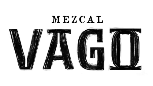
Distinct in its approach, Mezcal Vago is transparent about its production processes and origins, crafting mezcals that uniquely represent the land and the expert skills of the master mezcalero. The brand’s logo captivates with its hand-drawn, black block letters set against a white background. These uneven, heavy strokes create a raw, rustic look, suggesting a deep connection to time-honored craftsmanship, indicative of mezcal produced through traditional methods.
Montelobos
With a focus on artisanal quality, Montelobos proudly holds an organic certification and meticulously produces its spirits from sustainably sourced agave, guided by an experienced agave biologist. Its logo is strikingly straightforward, featuring the brand name in large, block, sans-serif letters. The words “MEZCAL ARTESANAL” are displayed below, explicitly labeling the product as artisanal mezcal. The consistent font style and orderly arrangement of the text present a modern, professional image, appealing to those who appreciate a blend of traditional and contemporary design.
Nuestra Soledad
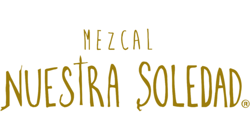
Nuestra Soledad, celebrating the rich variety of mezcal-producing areas in Oaxaca, offers an array of single-village mezcals, each showcasing the distinct terroir and age-old distillation methods of its source. The logo radiates with a playful, informal script in a golden color, evoking feelings of warmth and radiance. The varying sizes and angles of the letters lend a sense of individuality and charm. This light-hearted and engaging design speaks to the brand’s commitment to creating mezcal with unique character and a strong sense of its origins, reminiscent of genuine, local tradition.
Pierde Almas
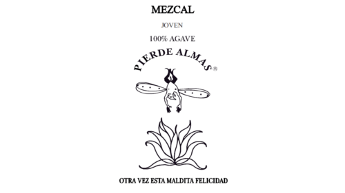
In the realm of boutique mezcal, Pierde Almas stands out for its unwavering commitment to traditional production techniques and a deep respect for cultural heritage, often incorporating wild and rare agave species in its limited releases. Its logo features a humanoid form with dragonfly wings above an agave plant, symbolizing possibly a spirit or deity associated with mezcal. This anthropomorphic image, combined with the name “PIERDE ALMAS”, which means “lost souls”, adds to the brand’s mystique, suggesting a connection to ancient folklore and the spirit’s transformative powers.
Rey Campero
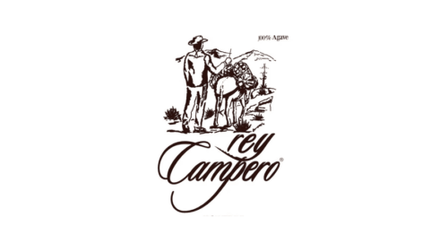
Focusing on traditional production methods, Rey Campero crafts exceptional mezcals using wild agave varieties from the Sierra Madre mountains in Oaxaca. The brand’s logo tells a story through an intricate illustration of a man and a mule carrying agave, reminiscent of the traditional agave harvesting methods. Accompanied by the flowing, cursive script of the brand name and the declaration “100% Agave”, the logo encapsulates the journey of mezcal from harvest to artisanal production.
Sombra
Sombra distinguishes itself with an eco-friendly ethos, employing sustainable agave farming and innovative environmental waste management to produce high-quality, organic mezcal. The brand’s logo, with “SOMBRA” in a striking gothic typeface, exudes age and tradition. Detailed flourishes and a smaller serif typeface, mentioning “100% Maguey Espadin” and “Mezcal Artesanal Joven”, highlight the brand’s allegiance to traditional mezcal-making. The overall robust and classic design signals a product steeped in heritage.
The Lost Explorer
Embodying the essence of adventure, The Lost Explorer crafts its mezcal range sustainably, in tune with nature, leveraging natural fermentation and age-old techniques. Its logo combines minimalism with modernity, showcasing the brand name in a sleek, sans-serif font. Dominated by a red, stylized ‘A’ that echoes a mountain or peak, with a line beneath resembling a horizon or pathway, this design encapsulates the notion of exploration and adventure. It could be seen as a metaphor for the journey through mezcal’s rich flavors or as a nod to the brand’s quest for sustainable and artisanal mezcal creation.
Tres Papalote
In the world of mezcal, Tres Papalote stands out with its unique use of wild Cupreata agave, producing a mezcal that harmonizes sweet and earthy tones, renowned for its smoothness and originating from Guerrero, Mexico. The logo of Tres Papalote is a visual feast, featuring a stylized agave plant in lush gold and green, highlighting the beauty of the raw ingredient and the spirit’s earthy roots. Accompanied by the brand name in a welcoming font, with “TRES” and “PAPALOTE” in a striking red, the logo symbolizes passion or strength. It celebrate the agave plant, the soul of mezcal, and might invoke feelings of happiness and the vibrant culture surrounding the spirit.
Conclusion
In the exploration of the world’s finest mezcal brands and logos, we delve into the intricate tapestry of flavors, aromas, and traditional production methods that define this unique spirit. Mezcal, often shadowed by its cousin tequila, emerges as a complex and richly layered agave spirit, celebrated for its smoky flavor and the artisanal craftsmanship it embodies.
Each batch of mezcal tells a story of its origin, from the heart of the agave plant, often the espadín agave or the blue agave, to the ancestral methods passed down through generations. Unlike tequila, which is primarily made from blue weber agave, mezcal boasts a diversity with different types of agave, each contributing to the spirit’s distinct flavor profile. The type of agave, along with the terroir, significantly influences the mezcal’s tastes, offering notes of tropical fruits, pepper, and even a subtle note of citrus, adding to its complexity.
The traditional production process, which involves cooking the agave in stone or clay ovens, fermenting with wild yeast in open-air conditions, and distilling in copper stills or clay pots, imbues mezcal with its signature smoky aroma. This process, refined over centuries, uses ingredients that highlight the spirit’s connection to its land and culture, from the salt and corn to the banana and vanilla nuances that can be discerned by the discerning palate.
Small batches and the use of copper stills ensure that each bottle of mezcal maintains a high quality, with brands often aging their spirits in american oak barrels or french oak barrels to add layers of caramel, vanilla, and tropical fruit to the flavor profile. Mezcal añejo, aged in these barrels, embodies a perfect harmony between the sweet agave taste and the complex notes acquired from the wood.
Mezcal brands, from those producing the best mezcals to those specializing in ancestral mezcals, create logos that reflect the spirit’s rich heritage and artisanal quality. These logos often incorporate elements that evoke the smoky, earthy qualities of mezcal, as well as its origins in the wild landscapes of Mexico where the agave plant thrives.
In cocktail culture, mezcal has earned its place as a versatile and intriguing ingredient, offering a smoky base that complements a wide range of flavors, from the sweetness of tropical fruit to the sharpness of a pepper kick. Whether enjoyed neat, to fully appreciate its complex flavor profile, or mixed into a refreshing cocktail with a note of citrus, mezcal invites connoisseurs and casual drinkers alike to explore its depth and variety.
As we journey through liquor stores and bars, discovering mezcal brands and their unique expressions, it’s clear that mezcal is not just a spirit but a celebration of tradition, craftsmanship, and the rich biodiversity of agave. Its signature smoky flavor, combined with a kaleidoscope of tastes and aromas, from the vanilla sweetness to the earthy notes of corn and salt, makes mezcal a truly exceptional spirit. Whether you’re drawn to the robust flavor of mezcal añejo aged in french oak barrels, the subtle sweetness of agave distilled in copper stills, or the ancestral charm of spirits produced in small batches using stone ovens and clay pots, mezcal offers a journey of discovery, one sip at a time.


