Have you ever felt like some logos should be age rated?
Nobody is surprised when sexually-oriented stimuli are used in advertising or commercial design. Such logos or ads catch your eye and conjure up emotions. And yet, in some cases, it appears to be overdone.
Many of the logos you’ll see in this article are a mere blunder – the designers didn’t even notice the double entendre. But you’ll also come across designs where the almost explicit sexual symbolism doesn’t seem to be a mistake. Would you call it a successful move or bad taste?
11. Kudawara Pharmacy

Has the Japanese pharmaceutical company benefited from the suggestive logo? Or the number of offended customers turned out to exceed those attracted by the “artwork”? We’ve tried to find a company currently working under this name, but failed. So it’s very likely it had to change not only the logo but the name, too.
10. Institute Of Oriental Studies (Instituto de Estudos Orientais)

This one was supposed to represent the sun rising behind a pagoda. The Brazil-based institute removed the logo when publications about its possible meaning appeared.
9. Junior Jazz Dance Classes

That’s just two people dancing, right? If you have a closer look, though, you may spot an anatomic allusion that couldn’t have been accidental.
8. CatWear

The logo belongs to a company selling clothes supposed to appeal to “Independent women.” Looks like these women actually don’t bother what someone could think about them.
7. Locum

This is an “upgraded” logo of a Swedish real estate company Locum. We should point out, the “upgrade” was made by the author of the article published about the logo, while the real logo didn’t look that suggestive.
6. The Computer Doctors

We can hardly believe this anatomic connotation appeared by mistake. It would be interesting to find out whether it brought commercial success to the company.
5. Clinica Dental San Marcelino

This is another case when the double entendre was probably not intentional. Even if it was, the company decided to get rid of it. Moreover, as of 2019, you can’t find a dental clinic under this name.
4. Arlington Pediatric Center

Probably the only thought crossing your mind when you see this logo is: “The designer wanted to take revenge.”
We can’t think of any other reason why someone could have drawn such a logo for a pediatric center (not a pedophile center!). And also, why someone could have approved the design. Anyway, the center quickly noticed the blunder and introduced a new artwork.
Unfortunately for the company, the new logo hasn’t been as popular as the previous one.
3. Mont-Sat

The Poland-based company, which introduced this optimistic logo, works in the satellite industry. By the way, as of 2019, it still uses the same emblem. Apparently, it works.
2. Office of Government Commerce

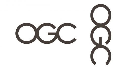
The “artwork” may seem perfectly innocent until you rotate it by 90 degrees. The introduction of the logo in 2008 was followed by an article in the Daily Telegraph. The article informed that the logo cost £14,000. The logo was already placed on multiple mousemats and pens before it was introduced to the OGC’s employees, who noticed the suggestive connotation immediately.
Interestingly, a spokesman for the organization claimed that the effect “was generic to the particular combination of the letters” and went on to explain that it was quite appropriate for “an organization that’s looking to have a firm grip on Government spend.”
Moreover, a brand expert interviewed by the Daily Telegraph pointed out that while the sexual connotation apparently was a blunder, it could turn out to be “an added bonus” for the organization.
The “expert” probably didn’t take into consideration the type of organization the OGC was. While a suggestive logo could offer some benefits for a commercial brand (as you saw in the previous example with A-Style), it could ruin the reputation of a serious organization.
The OGC was closed three years after the release of the logo. While we don’t know the reasons, the branding blunder obviously didn’t help the OGC in any way.
1. A-Style

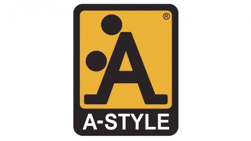
This one is by no means a mistake. If you had happened to be in Milan in 2000, you would have noticed this logo – the stickers could be seen on almost every traffic light around Milan. Then, the suggestive logo appeared in many cities of the world, from Miami to Moscow. Many magazines and newspapers (including GQ, Men’s Health, and Cosmopolitan) tried to trace the roots until its author, Marco Bruns, was eventually introduced to the public. In fact, Bruns created the logo in the 1980s.
Guerilla marketing attracted so much attention that by 2006, the brand achieved a turnover of twenty million euros. The logo can be seen on a variety of products, from clothing to helmets for motorcycles.
And yes, in case you don’t see the abusive part of the logo – some don’t – imagine the two circles are human heads.


