
Xilam Animation is the name of an animation studio, which was founded in Paris at the end of the 1990s. The studio is known for its tv-series, which include both original and collaboration projects with such industry giants as Disney and Classic Media. Established as a part of the famous Gaumont group, today Xilam is a separate company, which has nine subsidiaries itself.


Unlike many other companies in the industry, connected to animations and filming, Xilam has been very consistent and conservative with its logo. But, probably, it is just a matter of time, as the company was established on the edge of the centuries, so can’t be called an old one.


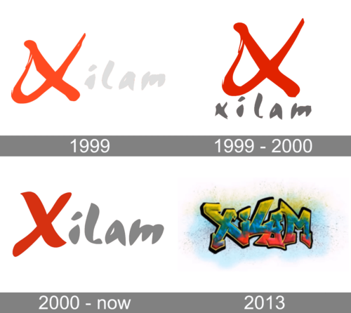
The very first badge was created for the animation studio in 1999, but this version has never been in official use, although it became a basis for all the following redesigns of the Xilam visual identity. It was a sharp and strong handwritten logotype in red and light gray, with the intense and enlarged “X” followers by a light lowercase “ilam”.
A few months later the original version was refined into the first official insignia of Xilam Animation. It was the same style and typeface, but in different composition and with an intensified and darkened up color palette: the calmer and darker red “X” was now placed above the lowercase “Xilam” in a cool handwritten typeface with its bold letters written in dark gray.
The redesign of 2000 brought back the concept of the first unused logo, but changed the typeface of the lettering and made the color palette something in between the first and second versions. The intense logotype in red and gray got all the letter contouring modernized and cleaned. Now the logotype was smooth and clean, with the first bold “X” looking elegant and very friendly.