
X-Men is the name of one of the most popular superhero comics, created by Marvel. The first issue about the mutants was released in 1963 and the first movie about the superhero team — in 2000.


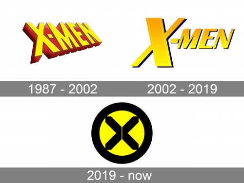
The X-Men logo was first designed in 1987 and consisted of a single wordmark. The emblem was created only in 15 years and had many versions. The last redesign of 2019 brought a new grease visual identity to the famous superhero team.


The original X-Men logo was a bright three-dimensional wordmark, executed in yellow with a red outline. All the capital letters of the inscription were written in a strict sans-serif typeface with straight lines and angles and a slightly shortened “-“ sign.
The yellow and red color combination is a symbol of power and energy, which is a brilliant palette for the superheroes’ image.
The new visual identity was created in 2002. Now it was composed of a wordmark and an emblem, which were used on their own. The modified wordmark consisted of an enlarged extra-bold “X” with a smaller “Men” part. All the letters of the nameplate were capitalized and italicized.
The X-Men emblem from the 2000s depicted a circle with an “X” inside. Its color palette changed throughout the years — from red and yellow, to red and white and even blue and black.
The X-Men heroes didn’t have a unified signature until 2019.
The modern X-Men visual identity was designed in 2019 by Tom Muller. The current emblem consists of a bright yellow circle with a thick black outline and an enclosed “X” sign, consisting of two equal parts.
Two parts of the “X” resemble two arrows pointing to the center in the negative space.
The X-Men logo is strong and modern, it reflects the extraordinary abilities of the hero team and shows the value of heritage as well as celebrates progress and moving forward.