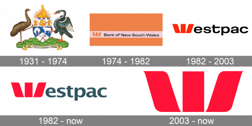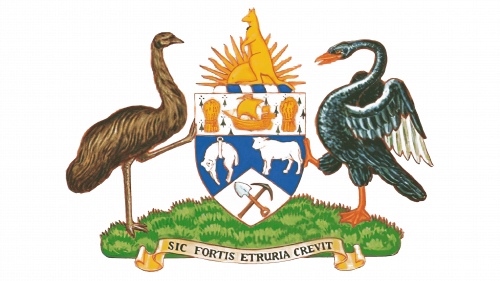

The history of the Australian financial company started in 1817 when the bank was established under the name The Bank of New South Wales. And for the first years of its existence, the bank used a heraldic symbol as its logo, which was later replaced by a modern emblem, staying with the company even after its name change in 1982.


Although the Westpac logo is based on an emblem introduced in 1974, it looks pretty modern due to its minimalistic style.


The logo, adopted by the company in 1931 featured a monochrome heraldic crest with three birds and a traditional ribbon with the wordmark placed under it. It was a symbol of the bank’s strong link to its roots and legacy, which only left its visual identity concept in 1974.


The modern era of the visual identity started for the Bank of New South Wales in 1975, with the creation of a minimalist yet bright composition, consisting of a black Sana’a serif lettering, placed on a white stripe inside an orange rectangle, with the red emblem on the left from the inscription. The emblem depicted a stylized letter “W”, formed by three bold petals, the straight vertical rectangle in the middle, and two smooth wide lines on the sides. This signifier could be seen both in red and orange when drawn with the wordmark, but then used on its own it has always been colored red.
The name of the bank was changed to Westpac Banking Corporation in 1982, after the merger of the bank with the Commercial Bank of Australia, so the need for the new logo occurred in the same year.
The new visual identity boasted a refined red emblem, replacing the first letter of the “Westpac” wordmark. The lettering was written in the lowercase using an extended sans-serif typeface with the horizontal bar of the “T” elongated to the right.
The black color of the letters was changed to a dark gray, which looked fresher yet didn’t lose its professionalism and confidence. The typeface of the wordmark was also changed, making the letter contours slightly narrower and more traditional. The bar of the “T” is now in its normal size. Another version of the Westpac logotype uses a monochrome palette, and the emblem, replacing the “W” looks very elegant in black.
The red stylized “W”, introduced in 1982, is still used by the bank as its official emblem, and there are several options of how the company uses it. The emblem can be seen in red, black, or white, and there is also a three-dimensional version of it, executed in gradient red and placed in ¾, reflecting from the glossy white surface it is standing on.
The typeface used for the word “Westpac” on the 1982 logo was the same as the one featured on the previous emblem. In 2003, it was replaced by a more generic font.
The palette of the Westpac logo sports a vibrant shade of red and a muted grey.