
Texaco is the USA petroleum company, which was established in 1901 in Texas and is a significant part of Chevron Corporation since 2001. The brand is widely known for its fuel stations, performing all over the globe.


Texaco, one of the world’s most reputable gas and oil companies, traces its origins to March 28, 1901, when, at the height of the Texas oil rush, veteran oil field development entrepreneur Joseph S. Cullinan established The Texas Company.
As early as 1919 the Texas Company patented a revolutionary method of treating oil, later called the Holmes-Manley thermal cracking process, which for the first time provided continuous and more efficient production of gasoline. The process doubled the amount of gasoline produced per barrel of crude oil.
As a result of its active development, the company entered the Norwegian and Danish markets in 1995, where together with Norsk Hydro it opened a network of 850 filling stations under the Hydro Texaco brand.
Today Texaco produces high-quality oil products for passenger cars, public transport, and some types of special equipment. After long scientific and technological research, two lines of lubricants have been developed, which have become the benchmark of impeccable quality.
What is Texaco?
Texaco is a large American gas and oil company, which was established in Texas at the beginning of the 20th century. Today there are more than 150 official Texaco trading areas and sites around the world. The company is known for the high quality of its products, which have become the benchmark for high standards in the lubricants and industrial fluids segment.
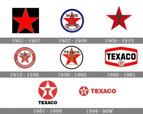
The original logo featured a red five-pointed star. While the design was iconic and impressive, it was also too impersonal. The fact it has been associated with communist ideology is not a positive connotation, too.
The connotations problems were resolved in a very simple way: the logo was loaded with so many new details that they almost hid the star. In addition to the words “Made in Texas” that appeared over the star, the authors of the emblem added the smaller lettering “The Texas company” and a blue ring.
The visual “rubbish” mostly disappeared from the design leaving only the red star and the stylized “T.” We should mention, though, the “T” was positioned in a slightly awkward way, with its top bar partly coinciding with the outline of the star.
The “T” adopted more logical proportions. Yet, this time, the designers cluttered the logo with the word “Texaco” hiding the shape of the upper ray of the star.
The lettering around the star disappeared leaving the emblem slightly cleaner and easier to grasp, although it still felt overloaded.
The word “Texaco” in a simple sans became the centerpiece of the logo, while the star moved below.
Once again, the star moved to the forefront. The “T” across it looked very much like a hammer. This only reinforced the communist connotation as it reminded the hammer and sickle, the Soviet emblem.
The name of the company disappeared from the Texaco logo leaving only the star and the “T.”
The bold and strict sans-serif logotype from the Texaco visual identity evokes a sense of power and stability, with its clean straight lines and distinct cuts. The typeface of the wordmark is very close to such modern yet simple fonts as TT Hoves Black and Genera Alt Heavy.
The combination of red and white colors in the Texaco emblem is a celebration of passion and power, which also shows the company as a professional and trustworthy one, and points to its value of quality in everything.