
Power BI is the name of Microsoft’s cloud-based business intelligence software, which is used to transform raw data into meaningful information through intuitive visualizations and tables. The first version of the software was introduced by Microsoft in 2011.


The BI part of the name in the Power BI software stands for Business Intelligence, analytics systems that combine data from different information sources, transform them, and present them in a visual form, convenient for analysis.
Microsoft Power BI is a collection of software services, applications, and connectors that work together to turn disparate data sources into coherent, visually immersive, and interactive analytics.
Power BI is a suite of business intelligence and data visualization tools, such as software services, applications, and data connectors, that altogether make up Power BI.
This free program can recognize and connect to more than 70 data sources. It can also clean the data or process it and bring all one million tables into a single data model. The main advantage of the Power BI platform is that it allows you to make graphically beautiful and understandable reports.
The program is quite easy to use, so learning the functionality will be useful not only for analysts. All reports created in the program can be stored in the cloud storage.
What is Power BI?
Power BI is a set of Microsoft software services that work together to turn unrelated company data sources into holistic, interactive reports. It is a user-friendly tool that offers drag-and-drop features and self-service capabilities. The user can deploy Power BI on both on-premises and cloud platforms.
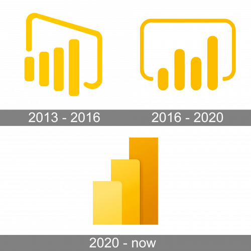
In terms of visual identity, Microsoft Power BI has had three emblems, created for it throughout the years, and all three of them reflect the purpose of the software, at the same time showing its affiliation to Microsoft and its corporate style. The brand color of the platform has always been yellow, bright, and intense.
The original icon was designed for Microsoft Power BI in 2013 and stayed unchanged for three years. It was an abstract composition, consisting of four columns of different sizes, placed from the smallest on the left to the largest on the right. The columns were enclosed into a frame with rounded angles and a bottom side overlapped by the four vertical bars. This schematic graph perfectly represented the purpose of the software.
In 2016 the Power BI logo was redesigned, following the corporate Microsoft visual identity changes, and creating a more stable and progressive look of the icon. The screen from the badge got turned straight, and the four columns of the abstract graph were now placed not in ascending order, but scattered — the first was short, the second — tall, the third — short again, and the last was the tallest. Apart from the new lengths, the vertical bars of the logo got thicker, and hole the framing became more confident and wide, creating a professional and stable look for the Power BI badge.
With the redesign of 2020, the concept of the Power BI logo got changed dramatically. Now it is a voluminous icon with three wide and tall columns, drawn in different shades of yellow and slightly overlapping each other. The columns are set in ascending order — from the shortest to the tallest, and from the lightest to the darkest. The composition is placed on a transparent background without any framing.
The Microsoft Power BI logo is almost always used without any lettering, although, in rare cases, it can be accompanied by a simple black wordmark, set in a modern sans-serif font. The closest fonts to the one, used by Microsoft for its icons are, probably, Praxis Next Pro Medium, or HS Gold HS Gold, with some minor modifications.
As for the color palette of the Microsoft Power BI visual identity, it has always been based on shades of yellow, which is a symbol of energy, dynamics, and progress. Yellow evokes a sense of trust and happiness and makes the Power BI application easily recognizable on the screen.