
Piaggio is a famous Italian manufacturing company of scooters and motorcycles, which was established in 1884. Piaggio owns a few different brands and operates in more than 50 countries across the globe.


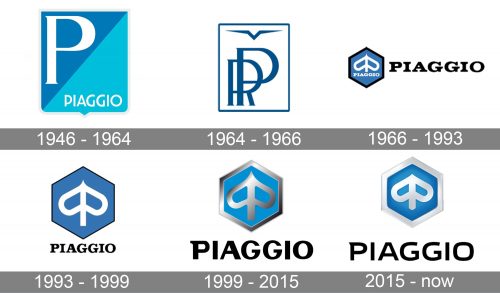
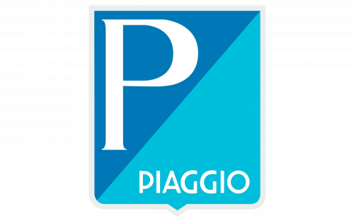
The initial Piaggio badge, designed in 1946, was bright and airy, executed in a blue color palette, it made the classic square crest shape look modern and unique, even without any additional elements. The body of the crest was diagonally split into two triangles — the upper one with a darker shade of plié and a sans-serif uppercase “P” on it, and the bottom one in a lighter tone, with the full name of the brand written along with the framing, in a custom modern sans-serif.


In 1964 the badge became white and the framing — dark blue. The “PR” monogram was written in the same dark shade of blue over a white background and accompanied by an abstract triangular symbol, resembling a bird, placed above it, along the top line of the frame. It was depicted there as a symbol of speed and freedom.
The redesign of 1966 introduced a new official symbol of the brand, which became iconic in no time. It was a stylized wasp, drawn like a heart turned upside-down, and a vertical bold line. Both elements were drawn in white and set on a calm blue background of an emblem, repeating the hexagonal shape of the honeycomb. The emblem was outlined in black and was accompanied by a bold black uppercase wordmark on its right. The lettering was executed in a smooth serif font, looking elegant and sleek.
The emblem was enlarged in 1993. Now it became the main element of the logo, being placed above the cleaned and modified logotype in a black serif font. The outline of the blue honeycomb was still black but got a lot thinner in comparison to the previous version of the logo. As for the wasp image, it was still there, with no changes.
The redesign of 1999 introduced a three-dimensional silver and blue badge, executed in glossy gradient shades, and a new black wordmark, written under it in large capital letters. The new typeface was strong and confident, with solid sand-serif letters and geometrically clean contours.
The Piaggio logo was inspired by its iconic Vespa label, which means “the wasp” the logo is composed of a wordmark with an emblem, which is placed above it.
The wordmark is executed in a custom sans-serif typeface, which has a pointed angle of the letter “P”, resembling of the wasp sting, and square shape of the letter “O” with rounded corners.
The Piaggio emblem is a hexagon, that repeats the shape of the honeycomb, with the brand’s symbol in the middle. The symbol is a stylized wasp, which is composed of two-letter “P”, placed back-to-back. It is a strong work in terms of showing the company’s heritage in a modern and stylish way.
The color palette of the Piaggio logo features light blue and silver-white for the emblem and black for the wordmark. This scheme makes the logo look light and fresh, showing the brand as professional and trustworthy. The black color of the lettering reflects the power and authority of the Piaggio company.