


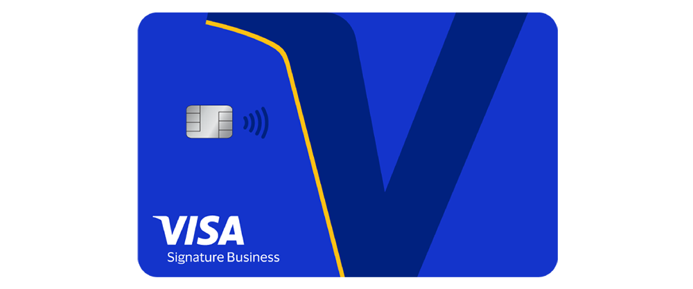
Visa now has a new symbol. Just one letter.
The payments giant has refreshed its visual identity, and the headline change is a standalone “V” that can stand in for the brand on its own. No full name needed. It’s already showing up on some cards and in Visa’s digital spaces, and it’s designed to look sharp even at the size of a tiny app icon.
Before anyone panics, the classic Visa logo isn’t going anywhere.
That blue wordmark you’ve seen on half the cards in your wallet? Untouched. Visa was pretty clear about it, the name, the logo and the values all stay put. Where there’s room, Visa will still spell itself out in full. The new “V” is more of a shortcut, a compact sidekick for places where the full name just doesn’t fit.
So this isn’t a rebrand. It’s more like giving a very famous brand a nickname.
The single letter actually replaces something. A few years ago, Visa introduced a little flag-like symbol made of blue, white and yellow bars, a nod to the striped look of the old Visa cards. The bars were arranged to form an equal sign, meant to stand for access and inclusion. A nice idea. But it never quite became as recognizable as the wordmark itself, and now it’s being retired after only about five years.
Five years is nothing in the life of a brand this size.
Happens all the time, to be fair. Somebody comes up with a clever extra mark, it gets applause in a meeting room, and then the public mostly shrugs. The shortcuts that survive are usually dead simple, the kind of thing you could doodle on a napkin in two seconds. Visa seems to have figured that out.
Why the change? Mostly because of where people now meet the Visa brand.
A lot of shopping has moved onto phones. People pay inside apps, buy things from creators’ videos, tap through online stores and click “buy” in a few seconds. Visa’s own logo often appears there as a tiny icon squeezed between other tiny icons. A full wordmark at that size gets small fast. A single bold letter holds up much better.
Then there’s the robot question.
Some people already let a chatbot hunt down the cheapest sneakers or find a hotel for the weekend, and a few let it pay as well. The industry calls it agentic commerce. In that world, a brand isn’t just something a human glances at. It’s something that has to make sense in all kinds of new interfaces, screens and chat windows. Visa says it wants to stay recognizable across experiences built for both people and technology. A clean one-letter symbol is easy to drop into pretty much any of them.
Visa also has a strong card to play here, so to speak. Its own research found that many American shoppers would trust Visa to handle purchases made by AI agents, far more than they’d trust generative AI tools to handle payments on their own. In other words, people are nervous about robots spending their money. Seeing a familiar Visa mark in the middle of that process could make it feel a lot safer.
Chief marketing officer Frank Cooper III put it bluntly. “We do not have an awareness issue. We have deep trust.” Everyone already knows Visa. The goal now is to keep that trust and, as he said, “make it feel fresh, particularly for the next generation of consumers.”
Now let’s go through the logo itself.
Not much mystery here. A single letter V, compact and confident, built to work at icon size. It appears on some credit cards and on Visa’s digital platforms, and it shows up in the brand’s new film sitting on a dark card. It’s simple on purpose. One letter is easy to remember, easy to spot and easy to place almost anywhere.
Alongside it comes a custom typeface called Visa Sans. Owning a font means no more borrowing someone else’s letters. Ads, the website, the app, the tiny print under a checkout button, all of it ends up speaking in one voice. Tech giants figured this out ages ago. Payment companies are only now catching on.
Photos, illustrations, animations and the whole digital look got a polish as well. Nothing wildly dramatic, but all of it tuned for screens rather than print. Visa calls it an evolution, not a revolution.
Picture a wedding photo hanging on grandma’s wall. That’s the wordmark. The V is the quick snapshot you send to friends. Same person, different situation.
The work took about a year. Visa’s in-house creative studio teamed up with the agency Base Design to pull it together.
It’s hard not to compare all this with Visa’s biggest rival.
Mastercard went down a similar road a few years ago. Its logo, two overlapping circles in red and yellow, became so famous that the company dropped the word “mastercard” from the main symbol entirely. Just the circles. That move was a big statement of confidence, basically saying “you already know who we are.” Visa’s new V follows the same logic, though it keeps the wordmark in its toolbox instead of removing it.
PayPal is another example from the same world. On phone screens it usually appears as a compact double-P monogram rather than the full name, especially as an app icon. Short marks like that are the norm in fintech now, because that’s where customers actually see the brands.
Visa was a bit late to that party. Now it has its own entry ticket, and with a name as short as Visa, cutting it down to one letter was always going to be easy.
There’s also a practical bonus. A single letter scales easily. On a contactless terminal, on a smartwatch screen, inside a checkout button that’s barely the size of a thumbnail, the V should still read clearly. Full words can’t always do that.
Will people notice? Not straight away, no. Who actually studies the logo on their card while paying for a coffee? The old blue wordmark is still sitting right there anyway, and the V will creep in from the side, one app icon after another.
That’s usually how the best brand shortcuts work. You don’t notice them arriving. One day you just realize you’ve been seeing them everywhere.


