

American wrestling came from the spectacular circus wrestling, and still, no one can understand – it became an independent sport or remained a show. Special popularity wrestling, in the form in which we are used to seeing, and know about it, received in the 70s of the twentieth century, although the history of wrestling began in the XIX century. The progenitor of modern professional wrestling was the so-called “French wrestling”, which was a highlight of circuses and summer theaters and had a wide distribution in Europe.
After the revolution, wrestling migrated from Europe to America, where it began to develop with a new force, which was enough for this sport to have a lot of fans and fans around the world. With the popularization of professional wrestling, each of the countries appeared with their federations. Nowadays, wrestling is widely spread as a kind of sports entertainment show, especially in North America, Mexico, Japan, and some European countries, primarily thanks to the American World Wrestling Entertainment (WWE) — the leading wrestling federation in the World, whose programs are watched weekly by millions of people around the world.
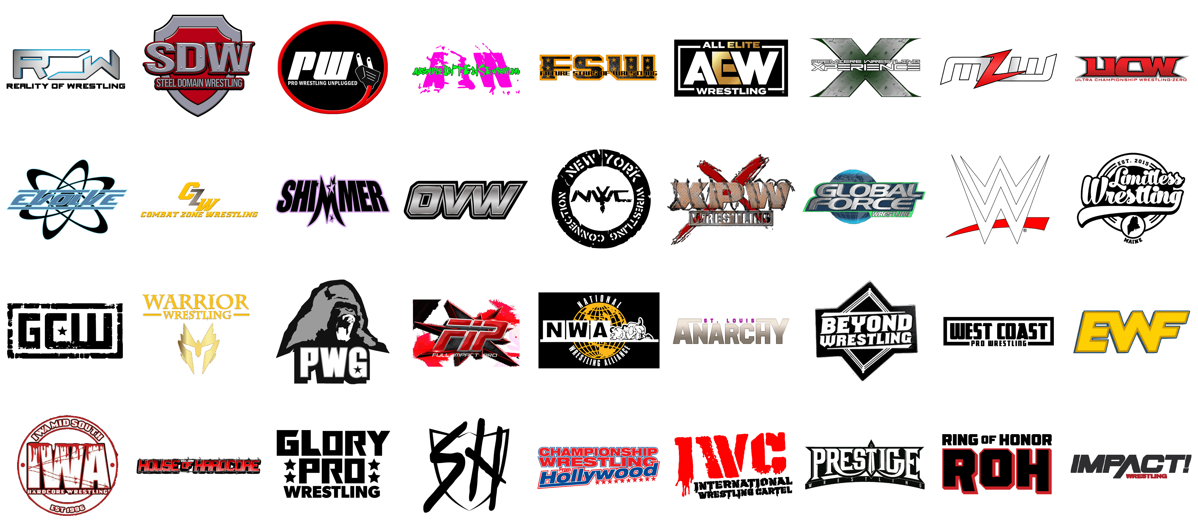
Today we have gathered for you a selection of logos of the leading wrestling leagues and championships. Like the sport itself (or is it still a show?), the logos in the list below look very brutal and powerful. And now you will see for yourself.
All Elite Wrestling
![]()
The visual identity of the All Elite Wrestling uses gradient matte gold color for the emphasis on the “Elite” part in the name. The strict and stable composition, executed in white, gold, and black, looks distinctive and strong due to the use of straight lines and massive shapes of the stylized abbreviation. The “AEW” with the golden “E” between two white capitals is enclosed into a white rectangular frame, with the full name of the brand written on the top and bottom borders, all in white, but the gold “Elite”. The modern geometric sans-serif typeface of the full wordmark supports the shape of the frame and balances the image.
Combat Zone Wrestling
![]()
The Combat Zone Wrestling logo is edgy and powerful due to the use of a proper typeface, which perfectly represents the essence and spirit of the promotion. Set in bright yellow and rusty metallic, the Combat Zone Wrestling badge is based on the lettering, executed in a slanted geometric serif typeface with edgy elements and geometric serifs. The inscription is accompanied by the enlarged CZW abbreviation, where the uppercase characters are placed diagonally, and the metallic “Z” is placed between the solid yellow “C” and “W”. The logo looks equally good in light and dark backgrounds, evoking a sense of energy and speed.
Empire Wrestling Federation
![]()
Another organization from the list, which has chosen yellow color for its logo is the Empire Wrestling Federation. The badge has just one element in it — a stylized EWF abbreviation, executed in an extra-bold geometric sans-serif typeface with all three uppercase characters merged, and the “W” sharing its right diagonal bar with the “F”. The abbreviation has its body colored in a bright shade of yellow, a color of energy and determination, while the double outline of the logo is set in a calmish darker shade of yellow, closer to gold, and an intense blue. These two tones add distinction to the composition and make it more readable on contrasting backgrounds.
Full Impact Pro
![]()
The visual identity of the Full Impact Pro promotion is very bright and powerful. Executed in an intense red color palette, the badge is composed of three elements: the stylized three-dimensional FIP abbreviation with a silver outline of the massive characters, and a horizontal cut-out in the upper part, creating a sense of motion and speed; a geometric ornament on the background, a sharp voluminous “boom” in a red outline, and a light silver lettering at the bottom. The inscription is set in the uppercase of a slanted medium-weight sans-serif typeface, which adds a balancing touch to the badge.
Game Changer Wrestling
![]()
The logo of the Game Changer Wrestling promotion looks like an army badge from the movies. It is a black-and-white rectangular banner with a thick frame and a massive stylized GCW abbreviation in the center. The first “G” is disconnected from the merged “C” and “W”, which makes an interesting geometry of the logo. The negative space of the “C” is decorated by an image of a small five-pointed star, which, depending on the logo version, can be drawn in white, light silver, or red. Overall, the badge of the promotion looks very brutal and stylish.
House of Hardcore
![]()
The House of Hardcore logo perfectly lives up to the name of the promotion. The badge is composed of massive uppercase lettering in a bold geometric sans-serif typeface with the stable characters in gradient red and a thin silver outline glued to each other, and a graphical element, which makes up the frame from the inscription. But it is not a simple frame, it is two horizontal lines, drawn as a barbed wire, looking very realistic in black and gray shades. There is nothing else on the badge, but it already is super memorable and brutal and represents the essence of the brand.
Limitless Wrestling
![]()
The visual identity of the Limitless Wrestling stands out from the list of the promotion’s competitors’ badges. It is executed in a retro style, with bold and smooth script lettering written over a circular medallion. The top part of the logo’s frame has the “Est. 2015” datemark engraved on it, while the bottom part of the medallion is decorated by a smaller roundel with the stylized silhouette of the Maine state, the motherland of the promotion. The black-and-white color palette adds elegance and timelessness to the badge, but sometimes you can see the yellowish version of the logo, with some volume and gradients added to the roundel.
Southern Honor Wrestling
![]()
The logo of the Southern Honor Wrestling promotion could decorate the cover of a grunge album. It’s quite simple in terms of composition and colors, but it has a style and makes the brand stand out from the list of its competitors. It is a distinctive shield outlined in black, with the top part featuring three peaks, and the bottom — traditional, overlapped by an enlarged “SH” abbreviation, also in black. The abbreviation is executed in a cool handwritten font with thick bars having their ends softened. It looks like it was written with a black crayon over a whiteboard.
WWE
![]()
One of the most recognizable wrestling logos in the world is, definitely, the badge of WWE, World Wrestling Entertainment promotion. It is a sharp and strong insignia with the stylized double “W” monogram overlapping a bright red horizontal stroke. The main thing about this composition, which is, actually, quite simple, is the edginess and sharpness of the lines and angles. This is what makes the badge look extremely powerful and brutal, and the black, white, and red color palette of the WWE visual identity only amplifies these qualities.
Warrior Wrestling
![]()
The visual identity of the Warrior Wrestling promotion is based on a glossy gold emblem depicting a geometric mask, which resembles both the Transformers franchise style and the medieval knights. The enlarged emblem is located under a two-leveled inscription, written in solid yellow capitals of a classy serif typeface. The upper, “Warrior”, line is enlarged; while the bottom “Wrestling” is enclosed between two thick straight horizontal strokes, which stabilize the whole image and add a sense of strength and masculinity, as all other elements of the badge are more about edginess and triangular geometry.
Championship Wrestling from Hollywood
![]()
The logo for Championship Wrestling from Hollywood stands out with its bold and dynamic design, perfectly capturing the essence of professional wrestling entertainment. Dominated by the colors red, white, and blue, the logo features “CHAMPIONSHIP WRESTLING” in large, impactful red letters with a white outline, exuding strength and vigor. Below, “From” is written in a smaller, more modest red font, emphasizing its connection to Hollywood. The word “Hollywood” is the centerpiece, showcased in a flowing, cursive blue font with a white outline, creating a sense of motion and excitement. A series of red stars beneath the text further emphasizes the glamorous and star-studded nature of Hollywood, while also adding a patriotic flair. The overall design is bold and eye-catching, making it clear that this is a premier wrestling promotion known for high-energy matches and top-tier talent. The logo successfully blends the allure of Hollywood with the intensity of championship wrestling, making it a memorable and recognizable emblem in the wrestling community.
Pro Wrestling Unplugged
![]()
The logo for Pro Wrestling Unplugged is both modern and striking, capturing attention with its unique and clever design. The primary feature is a large, bold “PWU” acronym, rendered in a stark white font that contrasts sharply against the black circular background, giving it a clean and contemporary look. Surrounding the text is a vivid red border that adds a pop of color and frames the logo effectively. The most distinctive element is the depiction of a power plug, integrated into the design with the cord wrapping around the edge of the circle and the plug itself positioned near the bottom. This visual pun on “unplugged” adds a layer of creativity, suggesting a raw, unfiltered wrestling experience that sets this promotion apart. Below the acronym, “PRO WRESTLING UNPLUGGED” is written in smaller, white capital letters, providing clarity and reinforcing the brand identity. The overall effect is modern, edgy, and memorable, indicating a wrestling promotion that is both innovative and grounded in a fresh, unorthodox approach to professional wrestling.
New York Wrestling Connection
![]()
The New York Wrestling Connection logo is a powerful emblem that encapsulates the gritty and energetic spirit of New York’s wrestling scene. The design is monochromatic, using black and white to create a stark, high-contrast image that immediately catches the eye. At the center of the logo is the stylized acronym “NYWC,” where the letters are interlocked and slightly distressed, conveying a sense of toughness and resilience. Surrounding this central element is a bold circular border with the full name “NEW YORK WRESTLING CONNECTION” inscribed around it in uppercase letters. The text appears to be weathered and worn, adding to the gritty, streetwise aesthetic. This design choice reflects the raw, no-nonsense attitude associated with New York and its wrestling culture. The circular format of the logo suggests unity and connection, which aligns with the promotion’s aim of bringing together wrestling enthusiasts and athletes in the New York area. Overall, the NYWC logo is a robust and impactful representation of a wrestling promotion deeply rooted in the hardcore and passionate wrestling community of New York.
Premiere Wrestling Xperience (PWX)
![]()
The logo for Premiere Wrestling Xperience, commonly abbreviated as PWX, is a visually striking representation of a wrestling promotion known for its high-quality production and intense matches. The central feature of the logo is a large, metallic “X,” rendered in a rugged, industrial style with textures that evoke the look of worn steel. This design choice gives the logo a sense of strength and durability, reflecting the tough and resilient nature of the wrestlers and the matches they engage in. The letters “PWX” are prominently displayed across the “X,” using a sleek, modern font in white that stands out against the metallic background. Beneath the acronym, the full name “Premiere Wrestling Xperience” is written in a smaller, yet equally bold font, ensuring that the brand identity is clear and unmistakable. The overall color scheme of green, white, and grey adds a fresh and dynamic feel to the logo. This powerful combination of elements makes the PWX logo a memorable and fitting representation of a promotion that prides itself on delivering top-tier wrestling entertainment with a unique and professional edge.
Ring of Honor (ROH)
![]()
The Ring of Honor (ROH) logo is a bold and commanding emblem that encapsulates the prestige and tradition of this renowned wrestling promotion. The design features the full name “RING OF HONOR” in black, blocky capital letters with a modern and sharp font, positioned above the large acronym “ROH.” The acronym is the centerpiece, rendered in an imposing, three-dimensional style that gives it a strong visual impact. Each letter of “ROH” is filled with a solid black color and bordered with a striking red outline, enhancing the logo’s visibility and making it pop against any background. The use of red and black conveys a sense of power, aggression, and authority, perfectly aligning with the high-stakes, intense nature of professional wrestling. The geometric precision and clean lines of the letters give the logo a contemporary and professional feel, suggesting that ROH is a serious, top-tier wrestling organization. Overall, the ROH logo is a memorable and powerful representation of a wrestling promotion known for its dedication to excellence and honor in the sport.
Global Force Wrestling (GFW)
![]()
The Global Force Wrestling (GFW) logo is a dynamic and futuristic emblem that reflects the international scope and ambitious vision of the promotion. At the heart of the design is the text “GLOBAL FORCE” rendered in a sleek, metallic silver font that conveys strength and modernity. This text is angled slightly, adding a sense of motion and energy. Below “GLOBAL FORCE,” the word “WRESTLING” is displayed in a smaller, green font, which provides a vibrant contrast and emphasizes the athletic focus of the organization. The backdrop features a stylized image of the Earth, depicted in shades of blue and green, symbolizing the global reach and influence of GFW. The globe is partially encircled by the text, which gives the logo a cohesive and integrated appearance. The use of metallic and earth tones, combined with the bold and energetic font, creates a visually striking logo that communicates GFW’s commitment to bringing high-quality wrestling entertainment to audiences around the world. This logo effectively captures the essence of a promotion that aims to be a dominant force in the global wrestling landscape.
Prestige Wrestling
![]()
The logo for Prestige Wrestling is a striking representation that combines elements of elegance and power, befitting the name of the promotion. The design features the word “PRESTIGE” in a bold, serif font that exudes authority and sophistication. Each letter is carefully crafted with sharp edges and clean lines, creating a sense of precision and excellence. Above the text, there is a stylized crown-like shape, which adds a regal and distinguished touch, reinforcing the theme of prestige and high status. Below “PRESTIGE,” the word “WRESTLING” is displayed in a smaller, matching font, ensuring that the focus remains on the primary name while clearly indicating the nature of the organization. The monochromatic black and white color scheme enhances the logo’s classic and timeless appeal, while the overall design suggests a promotion that values tradition, quality, and honor in the sport of wrestling. The Prestige Wrestling logo is a powerful visual statement that effectively communicates the promotion’s commitment to delivering top-tier wrestling experiences with a sense of grandeur and respectability.
Pro Wrestling Guerrilla (PWG)
![]()
The logo for Pro Wrestling Guerrilla (PWG) is a distinctive and edgy emblem that captures the rebellious spirit and unique character of the promotion. The central feature of the logo is a menacing gorilla head, depicted in grayscale with a fierce expression, symbolizing strength, ferocity, and the wild, untamed nature of the promotion’s wrestling style. The gorilla’s open mouth and bared teeth add an element of intensity and aggression, making it clear that PWG is all about high-energy and hard-hitting action. Below the gorilla, the acronym “PWG” is displayed in bold, block letters with a subtle gradient, enhancing its three-dimensional appearance. A small star is incorporated into the letter “G,” adding a touch of flair and suggesting excellence and star power within the promotion. The monochromatic color scheme gives the logo a sleek, modern look while maintaining a sense of rawness and authenticity. The overall design is bold and eye-catching, perfectly representing a wrestling promotion known for its innovative matches, passionate fanbase, and independent spirit.
Ultra Championship Wrestling-Zero
![]()
The logo for Ultra Championship Wrestling-Zero is a bold and dynamic representation of the wrestling promotion. Dominated by the initials “UCW” in a large, blocky font, the logo immediately captures attention with its strong and commanding presence. The letters are filled with a vibrant red gradient, transitioning from a deeper red at the top to a lighter shade at the bottom, giving the logo a sense of depth and energy. Each letter is outlined with a thick, black border, further enhancing their prominence and providing a sharp contrast against the red. Surrounding the black border is a thin, grey outline that adds a touch of sophistication and balance to the design. Below the initials, the full name “Ultra Championship Wrestling-Zero” is written in a sleek, capitalized font, also in red, complementing the main initials while maintaining a clean and professional appearance. This logo embodies the fierce and competitive spirit of Ultra Championship Wrestling-Zero, making it instantly recognizable and memorable to fans and newcomers alike.
Steel Domain Wrestling
![]()
The Steel Domain Wrestling logo features a robust and shield-like design that embodies the strength and resilience associated with the wrestling promotion. Central to the logo is a stylized shield in shades of red and grey, symbolizing protection and honor in the wrestling arena. The initials “SDW” are prominently displayed across the shield, in a bold, metallic grey font with rivets, giving the impression of steel construction and durability. The letters are outlined in black and have a slight shadow effect, adding depth and a three-dimensional feel to the design. Beneath the initials, the full name “Steel Domain Wrestling” is written in a clean, capitalized font, also in grey, aligning with the metallic theme and enhancing the cohesive look of the logo. The red background of the shield contrasts sharply with the grey letters, making them stand out while maintaining a balanced and visually appealing composition. This logo perfectly encapsulates the gritty, no-nonsense ethos of Steel Domain Wrestling, presenting a powerful and enduring image.
Glory Pro Wrestling
![]()
The Glory Pro Wrestling logo is a striking and powerful design, characterized by its bold typography and minimalist color scheme. The logo features the words “GLORY PRO” in large, black, uppercase letters, set in a custom, angular font that exudes strength and determination. The letters are tightly spaced, creating a compact and unified look that commands attention. Below the main text, the word “WRESTLING” is written in a slightly smaller, yet equally bold font, ensuring the promotion’s focus is unmistakably clear. Flanking the text are three black stars on each side, adding a touch of elegance and symbolizing excellence and prestige within the wrestling world. The monochromatic black color scheme provides a timeless and classic appearance, emphasizing the seriousness and intensity of the sport. This logo is a testament to Glory Pro Wrestling’s commitment to high-quality, competitive wrestling, delivering a memorable and impactful visual identity that resonates with fans and athletes alike.
National Wrestling Alliance
![]()
The National Wrestling Alliance (NWA) logo is a classic and globally recognized emblem in the world of professional wrestling. At its heart is a stylized globe in gold, symbolizing the international reach and influence of the NWA. Superimposed on the globe are the initials “NWA” in bold, white, uppercase letters set within black rectangular blocks, creating a striking contrast and ensuring the organization’s name stands out prominently. Flanking the globe are two wrestlers grappling, depicted in white, adding a dynamic and action-oriented element to the design. The wrestlers are outlined in black, providing definition and emphasizing the athletic aspect of the logo. Encircling the globe are the words “NATIONAL WRESTLING ALLIANCE” in white, capitalized letters, reinforcing the organization’s prestigious identity. The overall color scheme of gold, black, and white conveys a sense of tradition, excellence, and professionalism. This logo encapsulates the rich history and esteemed reputation of the National Wrestling Alliance, making it instantly recognizable and respected within the wrestling community.
Xtreme Pro Wrestling (XPW)
![]()
The logo of Xtreme Pro Wrestling (XPW) captures the raw, edgy spirit of the promotion. Dominated by the bold, metallic “XPW” letters, this design evokes the rugged texture of rusted steel, indicative of the hardcore, no-holds-barred nature of the wrestling matches it represents. The letters are accentuated by barbed wire, symbolizing the brutal and extreme environment within the ring. The background features a striking red “X,” painted in a rough, almost blood-like fashion, further emphasizing the intensity and violence that XPW is known for. This crimson mark not only adds a dramatic flair but also highlights the rebellious and underground vibe of the promotion. The word “WRESTLING” below the main logo is encased in a rectangular frame, grounding the chaotic elements above with a sense of structure and clarity. Overall, the XPW logo is a powerful visual statement that communicates the fierce and unrestrained nature of its brand, appealing directly to hardcore wrestling fans.
West Coast Pro Wrestling
![]()
The logo of West Coast Pro Wrestling is a clean, modern design that exudes professionalism and sophistication while maintaining a strong, bold presence. The monochromatic black and white scheme gives it a timeless quality, ensuring it stands out in any setting. The words “WEST COAST” are prominently displayed in large, blocky letters, creating a sense of solidity and strength. This is complemented by the words “PRO WRESTLING” in smaller, but equally bold lettering below, indicating the organization’s focus on professional wrestling. The overall rectangular frame around the text adds a sense of containment and balance, reinforcing the structure and organization within the promotion. This design choice reflects West Coast Pro Wrestling’s commitment to delivering high-quality wrestling entertainment while maintaining a polished and professional image. The simplicity of the logo makes it easily recognizable and versatile, suitable for a wide range of applications from promotional materials to merchandise.
IWA Mid-South
![]()
The logo of IWA Mid-South perfectly encapsulates the gritty and hardcore essence of the wrestling promotion. Encased in a circular design, the bold “IWA” letters are at the forefront, dripping with what appears to be blood, symbolizing the intense and often brutal matches that the promotion is famous for. The barbed wire interwoven through the letters adds an additional layer of danger and toughness, reflecting the no-nonsense attitude of the wrestlers and the matches. Above the main logo, “IWA MID-SOUTH” is written, clearly indicating the regional pride and identity of the promotion. The words “HARDCORE WRESTLING” below the primary text leave no doubt about the style and nature of the matches fans can expect. The “EST 1996” at the bottom signifies the long-standing history and tradition of the promotion, reinforcing its legacy in the hardcore wrestling scene. The overall red and white color scheme enhances the aggressive and raw energy of the logo, making it a fitting representation of IWA Mid-South’s identity.
Impact Wrestling
![]()
The logo of Impact Wrestling is a sleek and modern design that reflects the dynamic and high-energy nature of the promotion. The bold “IMPACT!” text is the focal point, written in uppercase letters with a strong, forward-leaning italicized font, symbolizing movement and action. The exclamation point adds a sense of excitement and urgency, capturing the thrilling and unpredictable essence of professional wrestling. The use of black for the main text conveys power and authority, while the white background ensures the logo stands out clearly in any setting. Below, the word “WRESTLING” is written in a smaller, bold red font, adding a pop of color and drawing attention to the core of what Impact represents. This touch of red also introduces an element of intensity and passion, which are key attributes of the brand’s identity. The clean lines and professional appearance of the logo make it easily recognizable and versatile, suitable for various marketing and promotional materials. Overall, the Impact Wrestling logo is a powerful visual statement that effectively communicates the promotion’s commitment to delivering high-impact, thrilling wrestling entertainment.
Beyond Wrestling
![]()
The logo of Beyond Wrestling is a striking design that captures the innovative and boundary-pushing spirit of the promotion. The bold, white “BEYOND WRESTLING” text is prominently displayed within a black, diamond-shaped background, creating a high-contrast effect that ensures immediate recognition. The font is thick and angular, exuding strength and resilience, perfectly aligning with the tough, competitive nature of professional wrestling. Surrounding the text is a stylized wrestling ring, depicted through simple yet effective lines that form a diamond shape, symbolizing the central stage where all the action happens. This clever incorporation of a ring element not only reinforces the wrestling theme but also suggests the idea of pushing beyond traditional limits, which is a core philosophy of Beyond Wrestling. The monochromatic color scheme adds a timeless and classic feel, while the overall design remains modern and sleek, reflecting the promotion’s commitment to innovation and quality. This logo effectively communicates Beyond Wrestling’s dedication to delivering cutting-edge and exciting wrestling entertainment.
International Wrestling Cartel (IWC)
![]()
The International Wrestling Cartel (IWC) logo exudes a raw, powerful aesthetic, capturing the essence of intense wrestling action. Dominated by the large, bold letters “IWC” in a striking red, the design immediately draws attention. The red letters are heavily stylized with a rugged, almost bleeding effect, symbolizing the gritty, no-holds-barred nature of professional wrestling. Below the primary “IWC” text, the full name “International Wrestling Cartel” is written in a strong, blocky black font. This secondary text retains a distressed, weathered look, reinforcing the hardcore, underground feel of the organization. The contrast between the aggressive red and the stark black creates a visual impact that is both fierce and memorable. This logo perfectly encapsulates the spirit of the International Wrestling Cartel, promising viewers an experience filled with intensity, drama, and high-octane wrestling entertainment. The design’s simplicity combined with its boldness makes it an iconic symbol within the wrestling community.
Major League Wrestling
![]()
Logo of Major League Wrestling (MLW), a professional wrestling organization based in Chicago, Illinois. The logo is a red lightning bolt, also known as the letter L, on a white background. The red lightning bolt is the most noticeable element of the logo. Red is a color that is often used to convey the excitement, energy, and power that are the hallmarks of professional wrestling. Lightning itself can be interpreted in different ways. It could represent the electric atmosphere of MLW competition or the sudden strikes and high-flying maneuvers that wrestlers are known for.
Evolve Wrestling
![]()
The Evolve Wrestling logo is a dynamic representation of the promotion’s commitment to innovation and evolution in professional wrestling. Featuring a sleek, modern design, the logo is composed of bold, clean lines and a futuristic font that exudes a sense of progress and forward momentum. Central to the design is the stylized word “Evolve,” which is often rendered in a metallic or gradient effect, giving it a high-tech, polished appearance. The letters are slightly tilted, suggesting movement and flexibility, key attributes of the athletes who compete under the Evolve banner. Complementing this is an abstract shape, incorporating interconnected lines, symbolizing the global reach and interconnected nature of the wrestling community. The color scheme is a blend of cool tones like silver, blue, and black, conveying professionalism and cutting-edge entertainment. Overall, the Evolve Wrestling logo embodies the essence of a promotion that prides itself on pushing the boundaries of traditional wrestling, offering fans a fresh and exciting alternative to mainstream offerings. It’s a visual testament to the brand’s mission to continuously innovate and adapt in the ever-evolving landscape of professional wrestling.
Absolute Intense Wrestling
![]()
The logo of Absolute Intense Wrestling (AIW) is a striking symbol of raw energy and fierce competition. The design is characterized by its bold, aggressive typography and high-contrast color scheme, featuring a mix of pink and light green colors. The central element is the abbreviation “AIW,” rendered in a powerful, distressed font that evokes a sense of grit and toughness. The full name “Absolute Intense Wrestling” is usually incorporated above the initials, maintaining the same rugged style. Surrounding elements like jagged edges, splatter effects, and dynamic shapes add to the intense, action-packed feel of the logo. This visual identity captures the essence of AIW’s brand—an unfiltered, hardcore wrestling promotion that promises adrenaline-pumping matches and unrelenting action. The logo’s design speaks to fans who crave the raw, unrefined excitement that only AIW can deliver, making it a memorable and impactful representation of the promotion’s unique character.
Reality of Wrestling (ROW)
![]()
The Reality of Wrestling (ROW) logo exudes a modern and dynamic aesthetic, perfectly encapsulating the vibrant and energetic spirit of professional wrestling. The design is dominated by the bold, stylized initials “ROW” rendered in a sleek, metallic finish, giving it a robust and impactful appearance. The use of gradients and shading within the letters adds depth, making them appear three-dimensional and almost tangible. This effect is enhanced by subtle blue accents that outline parts of the letters, adding a pop of color and a futuristic feel to the logo. Below the initials, the full name “REALITY OF WRESTLING” is displayed in a clean, sans-serif font, which contrasts nicely with the intricate design of the initials, ensuring readability and reinforcing the brand identity. The overall composition of the logo is balanced and visually appealing, making it easily recognizable and memorable. It conveys strength, professionalism, and a cutting-edge approach to the wrestling entertainment industry.
Future Stars of Wrestling (FSW)
![]()
The Future Stars of Wrestling (FSW) logo is a striking representation of the brand’s ambition and dynamic presence in the wrestling world. The design prominently features the bold initials “FSW,” crafted in a robust, geometric font that exudes strength and resilience. These initials are rendered in a metallic black texture, reminiscent of industrial steel, which gives the logo a gritty, tough aesthetic. The edges of the letters are highlighted with a vibrant orange outline, adding a layer of vibrancy and energy that makes the logo stand out. Embedded within each letter are golden stars, symbolizing the “future stars” that the organization nurtures and promotes. These stars not only add a touch of elegance to the design but also serve as a visual metaphor for the rising talent in the wrestling industry. Below the initials, the full name “FUTURE STARS OF WRESTLING” is displayed in a bold, black font with intricate detailing, further enhancing the logo’s powerful and authoritative appearance. The overall design is balanced and visually engaging, making it an effective emblem for a brand dedicated to showcasing the next generation of wrestling talent.
St. Louis Anarchy
![]()
The logo for St. Louis Anarchy, one of the most renowned wrestling promotions, stands as a bold and striking emblem within the wrestling community. Dominated by the word “ANARCHY” in large, robust capital letters, the logo conveys a sense of power and rebellion, embodying the fierce and unpredictable nature of its wrestling events. The metallic gradient effect on the lettering adds a three-dimensional aspect, giving it a solid, formidable appearance. Above “ANARCHY,” in a smaller yet prominent purple font, sits the name “ST. LOUIS,” tying the logo to its roots in Missouri. The juxtaposition of the smaller, vivid purple text against the massive, silver-gray letters of “ANARCHY” creates a dynamic visual contrast that captures attention. This design choice reflects the promotion’s identity, merging the city’s rich cultural heritage with the raw, unrestrained spirit of professional wrestling. The overall aesthetic is both modern and gritty, appealing to hardcore wrestling fans and newcomers alike, making it an iconic representation of the St. Louis Anarchy brand.
Ohio Valley Wrestling
![]()
The Ohio Valley Wrestling (OVW) logo is a testament to the promotion’s prominence and legacy in the wrestling world. Featuring the bold acronym “OVW” in a large, metallic font, the logo exudes strength and professionalism. The letters are rendered with a sleek, silver gradient that gives them a polished, almost chrome-like finish, reflecting the high standards and shining achievements of the organization. Each letter is outlined in black, adding depth and ensuring the text stands out with a crisp, clean look. The sharp angles and strong lines of the typography suggest power and resilience, qualities that are synonymous with the wrestlers and events associated with OVW. Set against a simple black background, the focus remains solely on the striking emblem, making it instantly recognizable and memorable. This minimalist yet impactful design speaks to the organization’s dedication to excellence and its influential role in developing future wrestling superstars, solidifying OVW’s status as a cornerstone in the wrestling community.
Shimmer Women Athletes
![]()
The Shimmer Women Athletes logo is a striking and bold design that embodies the spirit and strength of women’s professional wrestling. The name “SHIMMER” is prominently displayed in large, black, capital letters, creating an immediate visual impact. The font is robust and commanding, symbolizing the power and resilience of the athletes. Adding a unique flair to the design, the letter “M” is replaced by a stylized silhouette that resembles an abstract starburst, signifying energy and brilliance. This starburst also subtly integrates additional star shapes, further emphasizing the “shimmer” or sparkle effect, which ties in beautifully with the brand’s name. The entire text is outlined with a soft lavender glow, adding a touch of elegance and femininity while maintaining the fierce undertone. This juxtaposition of strength and grace encapsulates the essence of Shimmer Women Athletes, highlighting the dynamic and multifaceted nature of its wrestlers. This logo stands as a powerful emblem of empowerment, excellence, and the shining talent of women in the wrestling world.


