
Over its 80 year-old history Mopar has had an array of logos. On the whole, there have been 10 of them so far. The company is constantly developing and expanding its range of products, so a need for a new logo often arises.


Throughout the brand’s history, it has had several very interesting designs of its logo, based on various elements, such as bright color combinations or modern minimalistic symbol. Though all the Mopar emblems were stylish and contemporary.


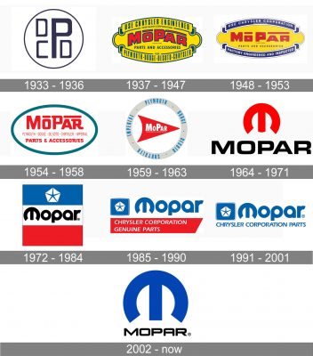
The very first emblem of the brand was executed in a strict and strong gray color palette with the stylized monogram placed on a white background and enclosed in a circular frame. The badge looked simple yet very modern and evokes a sense of confidence and value of style and quality.
The redesign of 1937 adopted a bright and delightful color palette — with the bold red lettering placed in a horizontally stretched refunded yellow banner with lots of additional lettering in blue and the outline in the same color. It was a memorable and eye-catching badge, which evokes a sense of passion and energy.
The logo was slightly refined in 1948, cleaning the contours and removing extra details from the badge. The upper and bottom arched lines of the emblem became blue circular with delicate white inscriptions on them, while the main wordmark was now set in a straight line, looking more solid than the arched one from the previous version.
The yellow color was removed from the Mopar logo in 1954. The new emblem featured a simple and strict horizontal oval badge with a red inscription, enclosed in a sea-blue frame. The wordmark was executed in a bold rounded sans-serif typeface with the letters featuring different sizes, though placed evenly.
In 1958 the logo was redrawn again, and now the badge became more professional and sleek. It was a red stylized arrowhead with the white “Mopar” nameplate on it, enclosed in a thick circular frame executed in light gray and having blue lettering “Imperial. Plymouth. Dodge. Desoto. Chrysler.” Written around its perimeter.
The new era of the Mopar visual identity started in 1964 with the creating of a modern and chic emblem with the bold stylized “M”, which looked like a horseshoe or a buckle. The red “M” was placed above the bold black “Mopar” inscription in all capitals of an extended sans-serif tour face with its letters square and solid.
In 1972 the Mopar logotype is getting its first letter replaced by a stylized “M” from the previous emblem. The wordmark in black is placed on the white line in the middle of a square, composed of three wide horizontals stripes — blue, white, and red. The upper, blue, part of the emblem has a white Chrysler pentagon on it, showing the Mopar affiliation with the large corporation.
The link with Chrysler becomes more visible in 1986. The new Mopar badge is composed of a bold blue logotype, with the first “M” still stylized, placed on the right from the blue Chrysler emblem and underlined by a red banner with the white “Chrysler Corporation Genuine Parts” lettering on it.
The red banner with the tagline is being replaced by just a blue “Chrystler Corporation Parts” lettering, executed in the brand’s custom typeface and balancing the calm and fresh color palette of the badge, adding professionalism and seriousness to the whole image.
The redesign of 2002 brought back the logo version from 1965, refining its contours, and switched the color palette from red to blue. The new Mopar logo is composed of a blue enlarged iconic “M” placed above the black capitalized inscription with its modern sans-serif letters slightly flattened and extended.