
Mapfre, S.A. is an international insurance company based in Madrid, Spain. It was established in 1933, but its period of real growth came only after the Second World War. The company underwent several regroupings and purchased several other firms. In 1983 it was graded as the insurance company number one and six years later Mapfre started its expansion to Latin America, where it became the leading insurance agency.
Today the company operates in both Americas, many European countries, Asia and Australia serving about 29 million customers. By 2011 Mapfre’s revenue reached the level of 23,5 billion euros.


Mapfre, a notable insurance company, was founded in Spain in 1933. Originally established as a mutual insurance provider for the agricultural sector, it has since evolved into a global insurance giant. This transformation is marked by a series of strategic expansions and acquisitions, a key aspect of Mapfre’s history. During the late 20th and early 21st centuries, the company aggressively expanded its international presence, entering markets in Latin America, Europe, Asia, and the United States. These ventures were pivotal in establishing Mapfre as a significant player in the global insurance industry.
Among its main achievements, Mapfre’s successful adaptation to changing market conditions and its ability to integrate new technologies into its service offerings stand out. The company has been recognized for its customer-centric approach and innovative insurance solutions, which have contributed to its strong market position. Additionally, Mapfre’s commitment to sustainability and corporate social responsibility has garnered acclaim, further enhancing its reputation.
As of now, Mapfre continues to hold a formidable position in the insurance industry. It is known for its extensive range of insurance products, financial services, and a network that spans across various continents. With its focus on innovation and customer service, the company remains a key player in the insurance sector, adapting to new challenges and opportunities in the dynamic global market.
What is Mapfre?
It’s a leading multinational insurance company, offering a diverse range of insurance products and financial services across multiple continents, known for innovation and customer-centric solutions.
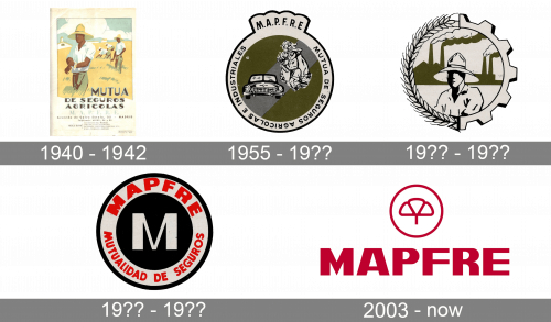
The original logo is an illustration performed like a stamp. The central element is a picture of several agricultural workers working the yellow field under the blue sky. It’s joined in the bottom by then-name of the company – ‘Mutua de Seguros Agricolas’. Even further below, there are minor details depicted on a white frame around the illustration.
In the 1950s, they instead introduced a sort of badge of dark yellow. It was confined by a white frame with text not it, and there were several monochrome pictures inside this yellow space. That included an agricultural worker doing an undetermined job, as well as the front of a car.
The text around said ‘Mutua de Seguros Agricolas e Industriales’. Also, a little extension above hosted the acronym ‘M.A.P.F.R.E’.
The following logo is conceptually a combination of two previous ones. It’s a round emblem with a boundary of two halves. The left one resembles a wheat ear, and the other one looks like a big gear. Inside, there’s the same worker seen on the forefront in the first logo, except now he’s colored black-and-white. Behind him, there is a factory complex colored dark yellow.
The following emblem turned out much simpler. It hosts a white letter ‘M’ in the middle of a black circle, which is then outlined by a white ring with text on it. The written part said ‘MAPFER’ above and ‘Mutualidad de Seguros’ (‘Mutual Insurance’) below.
The current Mapfre logotype consists of the brand name written in block letters and an emblem to the right of it. It was created in 2003 by a Spanish designer Alberto Corazón. The letters of the wordmark resemble the commercial font Acme Gothic Extrawide Black with slightly modified graphics. Thus, the leg of the letter “R” is more rounded.
The emblem is a circle with a symbolic image of a clover, which reminds that the company at the outset was specialized in rural insurance operations. The colour of the emblem, as well as the wordmark, is bright crimson red tone on a white background. The logo exists in two versions: white letters and the emblem on a red background and red letters and the emblem on a white background.
The name of the company, which forms the main part of its logotype is actually an abbreviation of the initial name of the firm: Mutualidad de la Agrupación de Propietarios de Fincas Rústicas de España (Mutual Union of the Owners of Rural Real Estate of Spain).
For the customers of Mapfre, its logotype is associated with the slogan of the company “we are people who take care of people”. According to the firm’s web site, its main principles are professionalism, innovation and commitment.