
L&M is a cigarette label established in 1873 in the USA by Liggett Group. Today the brand is a part of Altria, the biggest American tobacco corporation, and the cigarettes under its tag are distributed all over the globe.


L&M was established (and named after) by the American company Liggett & Myers, which today is a part of Philip Morris, the worlds leading tobacco company, which owns the most famous cigarette brands.
The cigarettes under the L&M label are distributed all over the globe and available for n various options. Currently, L&M produces the following lines: Filters, Lights, Menthol flavored, Super Lights, X-Slims Linx, and Slims Super MIXX (the lightest in the selection).
What is L&M?
L&M is the name of an American brand of cigarettes, which was established by the Liggett & Myers company (hence the name). Today L&M is considered to be one of the top10 most popular tobacco brands in the world, with its cigarettes exported all over the globe.


The L&M cigarettes logo hasn’t changed much since it was first designed. The strict and modes wordmark is enclosed in a circle and the brand’s heraldic symbol is placed on its left.
The L&M lettering in capitals is executed in a classic serif typeface with bold straight lines. The “&” symbol is smaller than the letters and placed in the upper part of the free space between “L” and “M”. It adds delicacy and elegance to the inscription.
The framing of the circle emblem is split into two parts — the thick right half is colored silver, while the thinner left uses orange or blue, depending on the type of the cigarettes.
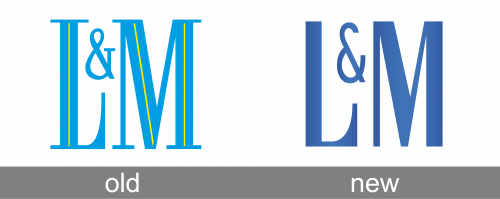
After the redesign, the L&M badge was graphically simplified, but its style and mood were elevated, making up a very elegant and stylish composition in a smooth gradient blue color, evoking a sense of professionalism and excellence. The letters gained cleaner shapes, and more even texture. The overall minimalistic approach to L&M badge design made it look progressive and cool, and the open contour of an “unfinished” ampersand has let more air into the logo, making it fresh and light.
The L&M icon is composed of two rampant lions holding a shield with the brand’s monogram. There is an ornate crown above the shield and a curved ribbon under the lions.
The background of the monogram also varies from pack to pack — it can be coloured light blue on the light L&M cigarettes and orange — on the classic strong.
The bold and slightly narrowed lettering from the primary L&M badge is set in a custom geometric sans-serif typeface with some elegant details in the “L”. The closest fonts to the one, used in the L&M insignia, are, probably, Rafiski Bold, Chieftain NF, or Nouveau Titling JNL, but with the contours modified.
As for the color palette of the L&M visual identity, it is set in gradient blue, which looks fresh and smooth, evoking a sense of professionalism, excellence, and safety. The calm and intense shade of blue creates a bright contrast with a plain white background, which is usually used for the cigarette packs of the brand.