
Krusovice is one of the oldest Czech breweries, which was founded at the beginning of the 1580s. There are eight different kinds of beer produced under this brand, and they all are well-known across the globe. The brand is owned by Heineken since 2007.
The Royal Krušovice Brewery is considered to be one of the oldest in the Czech Republic. It was founded in 1517 by Jiří Birka, and the first official mention of the brewery dates back to 1581. It is this date that we see on the label of the famous beer today. Over the past few centuries, Krušovice has acquired the status of the “Gold of the Czech Crown”, and its beers are truly a national treasure of the Czech Republic.
The small production of Krušovice was founded in 1517 in the village of the same name, not far from the Czech town of Rakovník. In 1583, Jiří Birka sold his property to King Rudolf II of Bohemia, which is why this name appears in the column “Founder of Krušovice” in many sources. It was after this event that the brewery received royal status. The monarch added his own notes to the recipe of the magical composition, and the taste of beer became truly refined, worthy of kings.
After Rudolf II, the brewery’s ownership changed frequently. The turning point came in 1773 when the brewery was acquired by the princely Fürstenberg family from Swabia. They were able to take the company to the next level and introduce its products to the German market as well.
After the Second World War, the brewery was nationalized, but in 1992 it received the status of a joint-stock company. Since 2007 the brewery has been under the ownership of Heineken International Corporation, thanks to which it has become more accessible to lovers of the Krusovice flavor in many countries and has become world famous.
The secret of the success of the hop drink lies in the preservation of the classic old recipe, as well as in the use of the best ingredients. In addition to spring water, the company uses the best varieties of Jatec hops and several types of Bohemian malt.
The visual identity of the Royal Brewery has always been based on the principles of traditionalism and elegance. The badge, which has not that many graphical elements, looks confident and sleek, and its color palette evokes a sense of confidence and high quality.
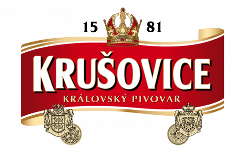
The Krusovice logo is composed of a scarlet red banner in a gold and white outline, with a golden crown above it. The crown is a tribute to the acquisition of the brewery by Emperor Rudolf the Second in the middle of the 1580s.
The year of the company’s establishment, 1581, is written around the crown in gold or black, depending on the placement. The wordmark in white bold letters with a black outline is placed on the red banner. The inscription in all capitals has its first letter enlarged and is executed in an elegant serif font with sharp and delicate serifs, which pointed ends add a sense of sophistication and luxury.
Under the white nameplate, there is another lettering placed — “Karlovsky Pivovar” in gold with a black shadow is written in all capitals of the traditional sans-serif typeface.
The red, gold, and white color palette with black accents represent the passion and power of the legendary brand and celebrated its royal history, evoking a sense of exclusiveness and the highest quality possible.