
Kickstarter is a famous crowdfunding online platform, which was created in 2009 in the United States. For 10 years of its operation, the platform received almost 5 billion USD on various projects. The company is based in New York and has more than 29 million users worldwide.


The Kickstarter visual identity is text-based. Its logotype executed in an extra-bold typeface is well recognizable across the globe due to the use of super bright color.
The Kickstarter wordmark in all capitals is written in a rounded sans-serif typeface, which is similar to Frankfurter Normal and RNS Baruta Black. The extra-thick letters of the inscription are smooth and solid with no spaces left inside, but enough between the letter lines.


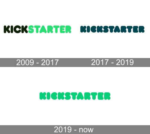
If you compare the current logo with its predecessor, you will come to the conclusion that the original one was somewhat leaner. Although the letters still were in no way thin and had the familiar rounded ends, the current version only emphasizes this.
Also, the previous logo was broken down into two parts by the color (black for “Kick” and green for “Starter”).
The bright green color of the Kickstarter logo is a symbol of a new life, which the online service gives to artists all over the world and their projects.
Green also symbolizes energy and longevity. And the platform fully demonstrates these two qualities.
The Kickstarter logo is modern and remarkable. It evokes a happy and playful feeling, yet it shows a stable and professional company with huge expertise in funding and innovations.
The redesign of 2019 has changed the color palette of the Kickstarter logo, bringing back the neon shade of green from the original version, but making it a bit darker, which created a very lively and energetic mood of the uppercase logotype in a heavy rounded sans-serif font. Green is the color of growth and wealth, and this is what the platform aims to give to its users, helping them get support in their startups.