
In today’s reality, it is quite difficult to create a brand that stands out in the market. However, it is even more challenging to stay in the leading positions if they were won several decades ago. Fruit of the Loom, an American casual wear brand, whose history dates back to the 50s of the 19th century, is one of the famous names that managed to do it. To this day, this brand stands apart due to its unique style and inimitable quality. Generations of people all over the world choose this brand’s products, appreciating them for their comfort, durability, and timelessness.


As we have already mentioned above, the history of the legendary American brand Fruit of the Loom began in the middle of the 19th century when two brothers, Robert, and Benjamin Knight, decided to create their own small clothing production. Initially, the company was called by the brothers’ names, though in a shortened version – B.B and R. Knight. But already five years after the foundation of the first weaving factory the Fruit of the Loom brand was founded. By the way, the name of the brand, as well as its main inspiration, is the merit of the young daughter of Rufus Skeel, with whom the Knight brothers joined forces in the creation of the new company.
This fateful collaboration began when Rufus Skeel, who owned a small clothing store in Rhode Island, was selling goods produced in the brothers’ Knight factory, and his daughter drew pictures that were applied to the clothes. Most of all the girl liked to draw still lifes with fruit, and the customers liked them very much too. This is how Fruit of the Loom was born.
The meaning of this name is not as simple as it seems at first glance. The fact is that the expression “Fruit of the Loom” is similar in meaning to the biblical phrase “Fruit of the Womb”, which means “Children”. As far as the brand is concerned, it rather means all the variety of products that can be imagined to come out of the loom. So, in 1871, when the U.S. Federal Patent Office became operational, the trademark was registered under the number 418.
Over time, the range of products of the brand expanded, and the popularity of Fruit of the Loom grew. The company produced underwear, sportswear, and, of course, t-shirts. Today Fruit Of The Loom is a global manufacturer of underwear and casual clothing for women, men, and children, with outlets worldwide.
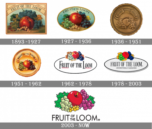
In terms of visual identity, the most notable thing about the Fruit of the Loom logo is probably the horn of plenty of controversy. While the brand’s website states the logo has never featured a horn of plenty (cornucopia), many people have claimed the opposite. Although this phenomenon could be explained by the so-called Mandela effect, it is more likely a marketing trick. However, we still can see the direct reference to the original company’s logo, designed at the end of the 19th century in the modern badge of the brand.
What is Fruit of the Loom?
Fruit of the Loom is an American brand of basic clothing and underwear, which was established in 1851, and this makes it one of the oldest brands in the world. Today the products of the brand are available all over the globe through dozens of physical locations and an online store.
The oldest logo on the list was so detailed that it looked more like a painting. The still life depicted an apple, green and blue grapes, and light berries in a pretty realistic manner.
The background alone would have been impossible for a modern logo. It featured various shades of blue paired with white, which resembled the clouds in the sky.
The most notable alteration was the shape of the logo – the rectangle was replaced by an ellipse. The fruits were redrawn, although their positions and colors were preserved almost unchanged. The banner disappeared leaving the wordmark written just over the blue background.
While the previous two versions resembled painting, this one looked more like a seal. The background adopted a noble gold shade, while the fruits had a pronounced 3D touch.
The design was updated without changing its structure. The most notable alteration was the background – it grew lighter, due to which the fruits grew more visible.
The “seal” was replaced by a white ellipse. The name of the brand grew larger and better legible (although it was still far from being perfectly legible).
While the structure of the Fruit of the Loom logo preserved, the fruits lost the white highlights. The writing “Fruit of the Loom” grew a little easier to read again.
The redesign of 2003 has changed the composition of the legendary Fruit of the Loom logo, making it more progressive, simple, and suitable for the digital needs of the brand. The fruit image is now enlarged and placed in the center of the composition, directly in the plain transparent background with no framing. The colorful image in flat strokes is accompanied by medium-weight black sans-serif lettering in a distinctive and laconic typeface with straight angles and cuts of the bars.
The minimalistic uppercase lettering from the primary version of the Fruit of the Loom logo is set in a stylish geometric sans-serif typeface, which is quite similar to such legendary fonts as Futurareg BT and Futurareg Paneuropean.
As for the color palette of the Fruit of the Loom visual identity, for decades it has been based on the intense shades of the fruits, which were drawn by Rufus Skeel’s daughter: red, purple, green, and yellow. The colors also represent the variety of the products, introduced by the brand.
The oval has disappeared. The type has become simpler. The fruits have been redrawn.
What is the original Fruit of the Loom logo?
The original Fruit of the Loom logo was executed in a very classic style, with a very naturalistic drawing of fruits on a lively blue background, enclosed into a horizontally oriented golden frame with the arched ribbon, containing the name of the brand in the uppercase, placed in the top part of the banner.
How old isthe Fruit of the Loom brand?
Fruit of the Loom was established in 1851, when two brothers, Robert and Benjamin Knight, founded the B.B. and R. Knight Corporation, a textile business, which gained its current name after the production of muslin fabric started.
Is Fruit of the Loom trademarked?
Yes, the Fruit of the Loom brand is trademarked. Moreover, it is one of the oldest American trademarks, which was registered by the Knight brothers in 1870. The Fruit of the Loom trademark got the number 418.
Did the Fruit of the Loom logo ever have a cornucopia?
According to the company, the logo of the Fruit of the Loom brand has never had a cornucopia image on it. Cornucopia is the horn of plenty, a symbol, that stands for abundance and nourishment.