
Chicco is an Italian company producing toys and clothing for kids. Its parent company is the Artsana Group.
While some brands keep experimenting with their visual brand identity all the time, the Chicco logo has remained pretty much the same over its more than 60-year history.


The founder of this children’s brand is Pietro Catelli, an Italian entrepreneur who was originally involved in supplying various sanitary products to local pharmacies. His first “brainchild” was called Articoli Sanitari e Affini (Italian for “sanitary and related products”). Pietro Catelli spent 10 long years trying to bring the company to the proper level, and in 1958 Articoli Sanitari e Affini registered the Chicco brand.
Within a few years the company’s products gained the trust of all Italy, and then Chicco stores began to open in other countries.
Nowadays the company is managed by Pietro Catelli’s children, who continue to produce goods, sticking to the views and values of their father. Chicco owns 16 factories, with more than 45 000 products. The brand’s own laboratories cooperate with the world’s leading universities in the development of safe products for children.
What is Chicco?
Chicco is the name of a renowned Italian brand of goods for children, a subsidiary brand of Artsana. The main products of Chicco brand are all-purpose strollers, high chairs, car seats, rocking chairs for walks, baby walkers and much more. The products of the brand can be found in more than 100 countries across the globe.
Chicco was established in 1958. The original logo already had quite a few things that have been preserved through the years and have formed the core of the brand’s visual identity.
Firstly, it is the playful and bold type. While the shape of the majority of the letters is rather simple, the way they are positioned (above and below the line) creates a fun effect that brings to mind childhood, the age when you never care to place things (and letters) in a straight line.
Another important part of the visual core is the palette: the combination of red, the specific shade of blue, and white.
The exaggerated red dot above the “i” adds a unique touch. In a way, the “i” here looks like an exclamation mark turned upside down. The different length of the ends of the “h” is another feature making the design recognizable.
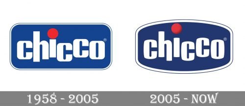
The updated version looks pretty much like the old one. Chances are, most customers didn’t even feel the difference. Yet, if you compare them side-by-side, you will immediately notice the fact that the shape of the emblem has grown more rounded. While the previous logo was a rectangle with rounded corners, the current one is more of an oval with its longer sides cut.
The design team has added a gradient to the red dot to make it better merge with the blue background. While the “h” used to have a longer left end, the current version has a longer right end.
A less obvious alteration has taken place in the shape of the glyphs. They have grown slightly narrower, leaving more breathing space. As a result, the Chicco logo looks less cluttered than its predecessor.
The bold jumping lettering from the primary Chicco badge is set in a heavy sans-serif font with the slightly arched sides of the characters, straight cuts of the bars and rounded angles. The closest typefaces to the one, used in this insignia, are, probably, Siesta N4, or Shelflife Or spandex, but with some visible modifications of the contours.
As for the color palette of the Chicco visual identity, it is composed of blue, white and red, the classy and elegant tricolor, which looks professional, and represents the brand as a reliable, stable and trustworthy one, with a small red detail symbolizing joy and love.