
Ashley HomeStore is a brand of furniture retailer from the USA, which was founded in 1997 and today has a thousand stores across the globe. The brand specializes not only on furniture but also on upholstery and homeware items.


Established by Carlyle Weinberger in 1997, Ashley HomeStore embarked on a journey to revolutionize the furniture retail industry. Weinberger’s vision centered on providing customers with affordable yet stylish furniture options, setting the stage for Ashley HomeStore’s meteoric rise. Throughout its history, the company has continually expanded its product offerings, introducing innovative designs and incorporating cutting-edge technology to enhance the shopping experience.
Amidst accolades and milestones, Ashley HomeStore has solidified its position as a leader in the home furnishings sector. With numerous awards for excellence in design and customer service, the company remains dedicated to exceeding customer expectations. Today, Ashley HomeStore continues to thrive as a global powerhouse, serving millions of customers worldwide with its commitment to quality, affordability, and unparalleled service.
What is Ashley Furniture Homestore?
Ashley Furniture Homestore is the name of the American retail chain of home interior goods, including large and small furniture, accessories, and fancy design items, which can change the style of the house with just one touch.
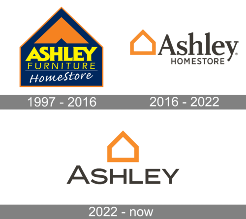
The logo was set in four lines on a dark blue background, which had a shape of the house silhouette and a thin orange outline. The upper part of the logo had a bright orange emblem on it. Under the emblem, there was the main “Ashley” part of the nameplate in bold yellow letters. It was placed above the uppercase “Furniture” in the same shade of yellow but written with thin straight lines. The yellow part of the logo was underlined by a thin white horizontal line and had a white diagonally placed cursive “HomeStore” written as a tagline.
The Ashley HomeStore visual identity is direct and simple. The logo of the American leading furniture retailer is composed of a wordmark and an emblem on its left.
The nameplate is written in two levels with “Ashley” in a bigger size, with the capital “A” and all the test letters in the lowercase. The serif typeface looks strong and modern due to the bold lines and diagonal cut of the letters.
The “HomeStore” in all caps is placed beyond the “Ashley” inscription and is executed in a strict sans-serif with clear neat lines. Both words of the nameplate use a dark gray color, which is a symbol of stability, confidence, and trustworthiness.
The Ashley HomeStore emblem is a geometric contour of the house executed in thick orange lines. The boldness and color of the emblem evoke a sense of warmth and safety, which are the two most important qualities for any home. The logo creates a happy feeling of a comfortable and cozy interior.
The updated logo was a perfect blend of modern and recognizable brand image. The designers took the orange house outline and made it bolder and larger as it was now centered above the name. The latter was done using a different font, which resembled ITC Blair or Organetto Bold Semi Ext, and lost the “Homestore” line. Although all the letters appeared uppercase, the first “A” was made larger to look like a capital letter. The logo looked confident and well-balanced.