
The Swedish Football Premier League, which we all know today as Allsvenskan, was established back in 1924, and today it is the main league in the country. For a long time, until 1987, the name Allsvenskan was unofficial. Officially, the Swedish championship was called Division I. Even today, it is often referred to as the Swedish First League, Swedish League 1, Swedish Premier League, or even Swedish Super League.


The logo of Allsvenskan, the main league of the Swedish football league system, can be given in two versions: with or without the lettering.
The Allsvenskan logo is based on a stylized letter “A,” the initial of the name of the league. The “A” is formed by an “open” ring (a ring with a gap) with a vertical bar. The light grey letter is encircled by a thin yellow ring. Both the elements are positioned inside a dark blue circle. The All-Swedish logo has a barely discernible gradient texture providing a subtle 3D feel.


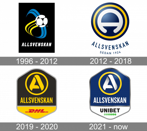
The original Allsvenskan logo was designed in 1996 and stayed with the league for almost sixteen years. It was a yellow, blue and white image set on a solid black background, which usually had a rectangular shape. The graphical part of the badge boasted a stylized white football surrounded by smooth lines in blue and yellow, and a slanted uppercase “Allsvenskan” logotype in a narrowed Sans-serif typeface, set on the bottom part of the badge.
In the full version, the name of the league in dark blue can be seen under the pictorial emblem. Below, there’s s the lettering “Sedan 1924.”
Their next logo is a tall hexagon shape, divided into two general sections. About ¾ above is occupied by the black space. Here, they’ve put their emblem – a yellow circle with a big, bold ‘A’ inside. Right below it, there was the word ‘Allsvenskan’ (means ‘All-Swedish’). The other section was yellow and contained a red wordmark of ‘DHL’ – the contemporary sponsor.
In 2021, they changed the color scheme. The upper bit changed to a combination of yellow, white and blue (after the Swedish flag). They also added a bit of lighting and other 3D elements here. The sponsor part was now occupied by a Unibet logo, placed against a white background.