
After Effects is a motion-graphic program created by Adobe. It is used to make visual effects in films, tv, and animation. After Effects is one of the most popular visual-effect software.


What is After Effects?
After Effects is the name of professional software for designers, which helps create special effects for movies and cartoons. The software is widely used in the cinematographic industry and is considered to be one of the most reliable and useful in the industry.


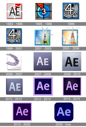
The very first logo for After Effects software was introduced after the launch of the product, in 1993, and stayed with it for a couple of years. The logo featured a square badge in gray, red, and white, with two black letters “AE” in the uppercase of a simple medium weight sans-serif typeface. The main color of the badge was light gray, with a small red triangle in the upper-right part of the square, a double white circle, and a white cross in the middle.
The redesign of 1995 introduced a brighter version of the previous logo, with the light gray replaced by its darker shade, and the white circle — by the one in two shades of blue. The thin white details on the badge were now colored black, and the “AE” lettering was replaced by the bold white digit “3” in a thin black outline.
The logo used by the After Effects in 1999 was executed in a monochrome color palette, with the gray color as the main one. No red was used in the new badge design. The bold “3” was replaced by the “4”, which was taller, and was drawn in thinner white lines, with a thinner black outline. The “4.0” version number was set in the bottom right corner of the badge, pointing to the version of the software.
A few months later, the 4.1 version of After Effects was released, hence the logo had to be redesigned again. The only difference between the new and the previous badges was in the number in the bottom right corner of the gray square. Everything else remained untouched, including the double blue and black square framing of the logo.
In 2001 the After Effects logo was redesigned again. This time it was a bright and colorful insignia with a gradient blue and green background and an image of the electric tower with several lighting bolts around it. The image was enclosed into a gradient blue square frame and had a corporate gray Adobe logo in the bottom left corner of the badge.
The redesign of 2003 switched the color palette of the After Effects visual identity to orange and yellow and kept the blue for the framing. As for the main element of the logo, the tower, it was redrawn and gained a more geometric, triangular shape, white the lighting bolts around its top became thinner and more elegant.
A completely new design concept was adopted by Adobe for After Effects visual identity in 2006. Though this new badge only stayed with the software for a few months, it got a huge influence on all the following emblems of the product. The new three-dimensional badge was executed in gradient white and gray for the background (a square with rounded angles) and transparent gradient purple for the stylized graphical part. It was a structure of several transparent layers, which resembles a mirrored letter “C”.
In 2007 the After Effects logo gets a new life — the color palette remained the same, light gray and light purple shades, but they were now used in reverse. The square got colored purple, while the “Ae” lettering in a bold sans-serif typeface, placed in the middle of the badge, was white with a slight gray gradient.
The redesign of 2008 made the badge stronger and stricter by changing the color of the “Ae” lettering to black and emboldening the lines. As for the main purple color of the badge, it became lighter and gained a gray tone, which looked cold and modern. The new badge stayed with the software for two years.
In 2010 Adobe brings back the softer purple and gray color palette, though slightly changes the shades of both colors. And the flat square shape of the After Effects badge gained some geometric volume and started looking like a thick book. The new purple shade of the “cover” was cold and calm, while the lettering was set in a new gray-blue shade, which resembles a sky on a rainy day.
In 2012 the After Effects logo becomes flat again. The background gets new color — dark blue, and the lettering gets colored in violet purple. The new bright shade of the wordmark is balanced by a thick square frame of the logo, which was also executed in fluoro-violet. This was the first version of the After Effects visual identity, where the “E” was set in the lowercase.
The redesign of 2013 kept the composition and the color palette from 2012, but cleaned and refined the lines of all the elements, making the letters taller and finer, and the square framing — thinner. This version of the logo looked more professional, though managed to keep its energy and dynamics.
In 2015 the After Effects logo was redesigned again, and this time it was mostly about the color palette of the square badge. The violet shade of the lettering and the framing got some pink shade and now the fluorescent purple pink was truly eye-catching.
The corporate visual identity concept of Adobe is the core of the After Effects logo.
The square emblem is framed in a light purple and featured a dark violet background. The lettering “Ae”, which stands both for “After Effects” and “Adobe” uses the same color as the frame.
The clean and neat sans-serif typeface of the logo makes it look simple and laconic, yet bright and confident.
The two-tones of purple color combination is unique and uncommon for visual identity design. Purple usually symbolizes mystery and spirituality, but on its own, it is a very strong and eye-catching color, which evokes a sense of creative approach and loyalty.
The After Effects logo is minimalist and modest, as all the Adobe logos, but instantly recognizable. The brand aims to provide its users with the best features and possibilities of the motion effect software, without distracting on ornaments and curves of the emblem. It just does its work and does it brilliantly.