
Wayfair Inc. is a leading e-commerce company primarily known for its extensive selection of home goods, including furniture, décor, and other home-related items. Founded by Niraj Shah and Steve Conine in 2002, the company quickly grew in prominence and transformed the online home shopping experience. Wayfair is headquartered in Boston, Massachusetts, USA, but its reach is global. Serving customers in the United States, Canada, the United Kingdom, and Germany, the platform offers over 14 million products from over 11,000 global suppliers, making it a go-to destination for many seeking to enhance their living spaces.


Established in 2002, Wayfair Inc. was the brainchild of entrepreneurs Niraj Shah and Steve Conine. Pioneering in the online furniture and home goods market, the duo effectively revolutionized the way consumers shopped for their homes. Throughout its history, Wayfair has achieved notable milestones, expanding its product offerings to over 14 million items and partnering with thousands of suppliers from all over the globe. In recent years, Wayfair’s technological advancements have also enhanced the online shopping experience with augmented reality features and sophisticated search tools. Today, Wayfair stands as a dominant force in e-commerce, boasting significant revenue growth and maintaining a substantial presence in major markets worldwide.
What is Wayfair?
Wayfair is a renowned e-commerce platform specializing in home goods, from furniture to décor. Established in 2002 by Niraj Shah and Steve Conine, the company has transformed online home shopping, offering millions of products to a global audience.
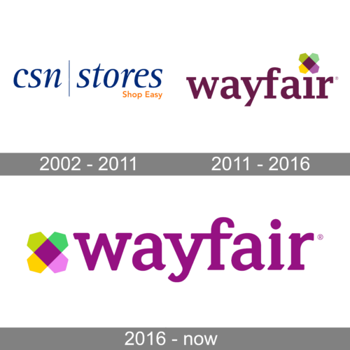
The CSN Stores logo presents a simplistic yet contemporary design, exuding a sense of trustworthiness and reliability. Dominated by a deep royal blue hue, the bold “CSN” letters stand out prominently, with each letter connecting to the next in a fluid and harmonious manner. This interconnectedness may symbolize the unity and comprehensive range of products they offer. To the right, there’s a vertical divider that elegantly separates the brand’s name from the tagline. The words “stores” in the same royal blue hue follow, and beneath it, the tagline “Shop Easy” in a contrasting orange color adds warmth and approachability. The tagline is not just a mere statement, but an assurance to customers about the effortless shopping experience they can expect. The font choice is modern, and sans-serif, which lends a clean and uncluttered feel, reflecting a user-friendly interface.
Following the rebranding that accompanied the company’s expansion into international markets, the logo underwent a transformative redesign to become more approachable. The once intense seriousness has faded, giving way to an inviting graphic feature, which consists of two intertwined hexagons. These hexagons boast elongated dimensions and showcase a contrasting palette: hues of purple, olive, mint, and sunny yellow. Nestled at their confluence is a deep purple diamond, echoing the hue of the brand’s name. Moreover, a uniquely shaped geometric symbol takes the place of the dot atop the letter “i.”
In the updated version of the Wayfair logo, a distinctively gentler and more curvaceous typeface has been adopted compared to its predecessor. The signature linkage between the letters “yf” remains intact, accentuating its unique brand identity. The vibrant geometric component, previously placed elsewhere, now proudly stands before the company’s name, retaining the traditional dot atop the “i.” Furthermore, the once deep purple hue has been gracefully transitioned to a lively shade of lilac.