
Vivasan is a multi-level marketing (MLM) company offering skincare and body care products, make-up, and products for health and well-being. The roots of the company go to Switzerland, where it was established at the end of the 1990s. Today Vivasan operates all over the globe, offering products of different Swiss manufacturers.
Vivasan is the brand synonymous with health and well-being, beauty, and balance. The MLM company from Switzerland unites under one roof several reputable cosmetic and healthcare brands, which are also Swiss-based.
Vivasan products – premium natural therapeutic and decorative cosmetics, essential oils, hair and nail care products, multivitamin syrups, and many others. This is the highest Swiss quality at an affordable price.
For each country, the company has several representatives, which work independently and mainly offer online sales, which makes it easier to get to know the full assortment of products, offered by the company.
What is Vivasan?
Vivasan is the MLM (Multi-Level Marketing) company from Switzerland, which was established at the end of the 1990s, and specialized in the distribution of beauty and healthcare products from several Swiss brands. The main focus of the company is natural ingredients and balanced formulas.
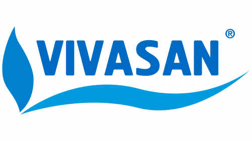
In terms of visual identity, the Swiss company chooses softness and freshness, decorating its stable bold logotype with a modest and elegant graphical element, and using a clean blue and white color palette, which evokes a sense of professionalism and trustworthiness.


The Vivasan logo has been inspired by the natural ingredients that are supposed to be used in the products. Its tender emblem balances the massive lettering, making the badge harmonious, and evoking a sense of unity. Unity of shapes, unity of ingredients, unity of a person with nature.
The centerpiece of the design is the word “Vivasan” in an elongated sans serif type. The blue shapes to the right and below look like leaves or waves. The shape to the right is darker, while the shape below the word “Vivasan” features a lighter shade of blue.
The custom sans-serif typeface of the uppercase Vivasan logotype looks friendly and delicate due to the softened angles of its narrowed letters. The closest font to the one used in the logo of the Swiss multi-level marketing company is, probably, Hermes, or Brilk Black.