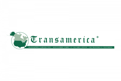

Transamerica is an American insurance corporation, which consists of several companies of the same profile. The group was established in 1928 and specializes in life and health insurance policies. Today it is a subsidiary of a European financial group Aegon and has its operating offices all over the USA.


The Transamerica visual identity is probably one of the most recognizable insurance firm’s logos ever. Composed of a wordmark and an emblem, its last version was designed in 1989 and remains untouched until today.
The sharp and stylish company’s logo has no age and looks contemporary and actual. Undoubtedly, it will remain the same in the nearest future, as its perfect execution and style have no reason to be changed.


The earliest versions of the company’s logo features a monochrome wordmark with a monogram. The lettering was placed around a circular perimeter and a bold symbol was placed inside.
The lowercase letters of the “AT” symbol were executed in an extra bold serif typeface, which looked professional yet friendly and memorable. As for the company’s name, it was written in all capitals with the use of a thin and clean sans-serif font, evoking a sense of lightness and balancing the emblem.
The 1961 logo depicts the company’s name written in a ring around a bigger ‘TA’ monogram. Both parts used regular sans-serif fonts, and were colored black.
The 1965 logo was similar to the previous one, except the name ring was replaced with a proper circular line.
The logo was redesigned in 1968 by Don Erwin from Sandgren & Murtha design bureau. Now it was a modern and minimalist emblem, executed in a calm shade of green. The image was composed of six lines, which were placed vertically in two groups of three lines each.
Their ends were curved to the sides from the center, resembling a fountain or an Art-Deco column.
It was a contemporary and remarkable design, reflecting progress and power of the company and showing it as a professional and reliable one, aiming to protect their customers.
The elegant green column, created for the insurance company in 1968 was significantly redesigned in 1970, with just the idea kept in the designers’ minds. The new emblem featured a sharp geometric image in black and white, with the new column set straight and vertically, and made of six black lines, which were wider at their bottoms and narrower at the tops, hence the image was almost triangular. This minimalistic badge evoked a sense of growth and progress, showing the innovative approach of the company.
The new emblem was created in 1983 by the same agency, but different designer — Thomas Bond. The new image became a prototype of the company’s logo, officially registered in 1989.
The emblem depicted an image of the Transamerica Pyramid, which was built in 1972 in San Francisco. The pyramid was designed by William Pereira and is 260 meters high. Until 2018 it was the tallest building in the city and in 1972 it was on the 18th place in the world’s ranking.
The architecturally perfect image was drawn in red in order to reflect innovation and longevity of the firm, showing its power and passion.
The distinctive emblem became a part of the company’s official logo in 1989. The red image was placed on the left of the wordmark, which was colored blue.
The blue red and white color palette of the firm’s visual identity is a tribute to its roots and heritage. The colors of the American flag represent justice, purity and hardiness, making a perfect eye-catching combination.
In 2025 the visual identity of Transamerica was modernized, yet is still based on the concept, introduced in 1989. The red and white architectural emblem was redrawn in a triangular pattern, with the sharp column sticking out of the solid slanted square. As for the lettering part, it was also rewritten and now features a title case wordmark, executed in a modest sans-serif typeface with medium-weight black bars. Both elements are set against a plain white background without any additional outline or framing.
The Transamerica wordmark in all capitals has its first “T” enraged and is executed in an elegant and traditional serif typeface, which is Classical Garamond Std Roman font, designed in the beginning of the 1920s. This old-style font is a reflection of traditional approach and timeless beauty and sophistication.
Transamerica is a corporation, which provides insurance and financial services and offers retirement, and investment products to its individual and corporate clients across the globe.
The company’s range of services includes mutual funds, annuities, employee benefits, exchange-traded funds, retirement, and insurance solutions. The financial services department generates the most part of the groups’ earnings and is mainly focused on leasing and lending. The group also offers Real Estate services, which include mortgage and property management.
The company operates through its numerous offices and subsidiaries across the world as well as through the website and the Transamerica app, which enables customers to track their accounts and get all the necessary information on the company’s plans and products.