
Sun Life is a Canadian corporation, located in Toronto, Ontario. They’re best known for life and property insurance operations, as well as financial planning, investment administration, and retirement saving services. The company’s branches are spread across Canada, United States, Bermuda, UK, Ireland, and Asian Countries. This is one of the oldest Canada-based insurance companies, established in the mid-1860s.


The business began in 1865, when Matthew Hamilton Gaulthas established The Sun Insurance Company of Montreal, although the operations began only 29 years later.
Since the start, the company has been managing various insurance services, although now it operates asset administration for businesses. The company lived through the WWI and WWII difficulties, taking part in the Great Flu Pandemic, and Operation Fish, which consisted of a secret transit of British wealth and securities from the UK to Canada.
The conscious development strategies made the company the largest life insurance corporation in Canada, and an international business player. In the 1960s, Sun Life began providing wealth management services. During the 70s, the company started to maintain the operations both in French and English. In 1978, the main office was moved from Quebec to Toronto.
During the 90s and 2000s, it also started opening new branches – in the US, India (2005), Malaysia (2013), China (1999), Indonesia (1995), and others.
What is Sun Life Financial?
Sun Life Financial is a Canadian company, specializing in life insurance, financial planning, retirement management, and asset administration services. This is the largest life insurance corporation in Canada, operating in Canada itself, Caribbean region, Asia, US, UK, and Ireland. The company was established in 1865 by an Irish-born businessman, named Matthew Hamilton Gaulthas.
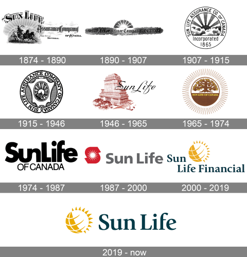
Their initial logotype was rather an image to put in ad pages of magazines and on posters. It featured a horseman riding four horses. Above him, there was the brand’s name, ‘Sun Life’, written in large serif characters. To the right, they put the ‘assurance company’ inscription, placed above the company’s address.
The next image read the company’s ‘Sun Life Assurance Company of Canada’ inscription in a gothic typeface. It was located on something like a sea background, and above it was a sun.
The 1907 logotype was a circle with the brand name, placed at the top of the circle. The central image depicted the sky with a shining sun, under which was the ‘incorporated 1865’ lettering.
The 1915 circular badge can be split in three parts: the outer area, the central zone, and the central shield. In the external part, they wrote the name. The inner part has a striped pattern. Over this pattern, they placed the shield with a small oval on it, which depicts a horseman standing on a mountain in front of the sun.
The first post-WW2 logo imaged the Sun Life building in Quebec with its near yard. Over the image, there was their name.
The 1965 signature was a circle, split in two halves: one of them was white, and it depicted an oak with many branches and leaves. The rest part was brown, and it featured the yellow name of the brand. The thin contour for the circle is made in the shape of a sun.
The first sole-nameplate logotype depicted the black-colored brand name executed in a sans-serif typeface. The upper ‘Sun Life’ is bold, with ‘u’ and ‘n’ characters combined, and the ‘f’ joined to the following ‘e’ with it small element. Below it, the capitalized ‘of Canada’ lettering is situated.
Then, they removed the ‘of Canada’ inscription, changed the font of ‘Sun Life’ to a more typical one, and drawn an ‘s’ sign with a sun on it.
The following signature pictured the brand name, ‘Sun Life Financial’. They placed it under the emblem of a sun with a grid supposed to show that it was a rolling sphere. There is also a fully horizontal version of this logo, which shows the name to the right from the sun.
In 2019, they’ve deleted the ‘financial’ word from the nameplate.
The modern logotype depicts an elegant yet simple sans-serif nameplate with all letters having small gaps in between, and the first ‘s’ and ‘l’ capitalized. Actually, the brand has a long history of typeface reinventions – they changed the name font in every new logo.
The modern color palette consists of rich black, white, and marigold shades, whereas the name is black, and the sun is half white, half gold.