
Mandom is the name of a cosmetic production company, established in Japan at the end of the 1920s. The company was founded under the name Kintsuru Perfume Corporation, and by today has grown into a huge mother-brand, with several cosmetic lines in its portfolio.


Mandom is a famous company, which owned such successful skin- and haircare brands as Gatsby by Lucido for men, and Bifesta, Pucelle, and Pixy for women. As a mother brand, Mandom has always been very attentive and accurate with its visual identity, and the logo was only redesigned twice since the beginning of the 1970s.


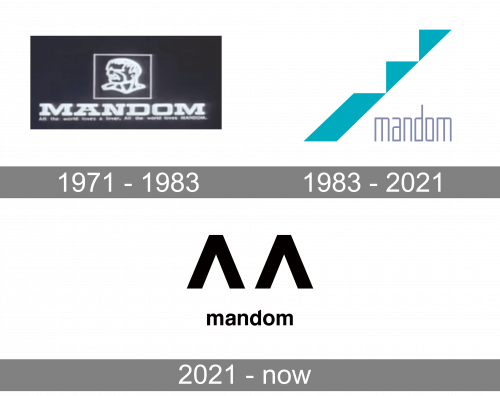
The logo, created for Mandom in 1971 stayed with the company for a decade and was a representation of Men-oriented cosmetics, which was the main specialization of the brand during its first era. The badge was executed in a monochrome color palette with the emblem and the logotype drawn in white lines over a black background. It was a contoured man portrait in a square frame set above the bold and stable uppercase wordmark in a geometric font with heavy and long serifs.
The redesign of 1983 introduced a super modern geometric badge, created to represent the progress and development of the company. It was an abstract minimalist emblem, composed of three solid turquoise figures forming kinds of straits: one elongated parallelogram with two triangles attached. The emblem was set diagonally on the left from the lowercase sans-serif wordmark in a modern narrowed typeface, in light gray. The logo was also used in a black-and-white color palette, and in this case, it looked more powerful and sleek.
Another redesign was held by Mandom only in 2021, and again the company introduced something more stylish and contemporary. Each new logo of the cosmetic producer is elevated compared to the previous one. The new emblem is executed in a black-and-white color palette, with the emblem, formed by two strict geometric elements, placed above the lowercase logotype. The new Mandom emblem is two arrowheads pointing up. They also look like two incomplete letters “A”, or two fragments of the “M”, set on distance from each other. As for the wordmark, it is executed in a traditional and elegant sans-serif typeface; with thick lines and rounded shapes of the letters, with the vertical bar of the “D” diagonally cut on top.